Anatomy
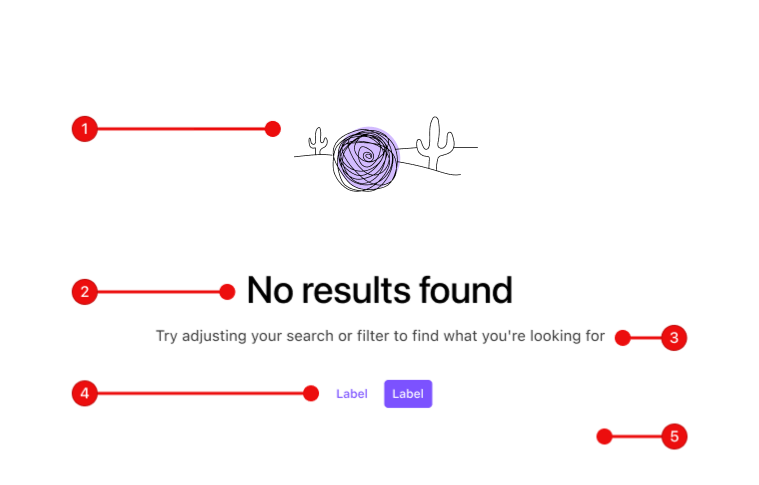
- Illustration or Icon (optional)
- Title
- Description (optional)
-
Action (optional)
- Secondary
- Primary
- Surface (optional)
- Empty states fill the space of its surrounding container and is always centered vertically and horizontally.
- Actions are optional if there is no direct action to be taken.
- The primary action is always to the right when presenting multiple actions.
- Action buttons are usually
kind="default"(aka "primary"), though may bekind="muted". Do not mixkinds. - Surface color most often will be transparent, deferring to its parent container's surface color.
Usage
Guidelines
Do
- Offer clear and actionable guidance so the user has the bare minimum amount of information necessary to proceed.
- Use scannable, concise, informative, and useful titles that reinforce why this state is empty.
- Provide a description that complements the title, offering additional context or guidance.
- Choose visuals that complement the message, its tone, and do not distract from the real task. The content is primarily what should gain their attention.
- Provide relevant actions that guide the user on how to proceed.
Don’t
- Avoid creating a dead-end. Always provide actionable guidance and/or actions.
- Don't overload with information or unnecessary details. Keep messaging brief and to the point.
- Do not use technical jargon or proprietary terms. Keep the language user-friendly and straight-forward.
- Avoid customizing its style. It should inherit the surrounding container's style when not in an empty state.
Scenarios
The four most likely scenarios for an empty state are Zero State, No Results, New Feature, and Not Enabled. This is not an exhaustive list, but a good starting point for most use cases.
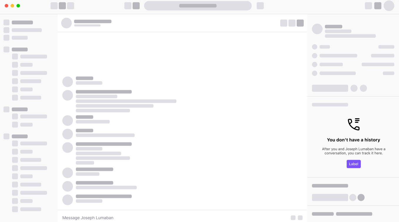
Zero State
The Empty State should guide the user on how to achieve a non-empty state. You might provide a useful tip, such as a shortcut or explanation of what needs to occur if no direct action can be taken.
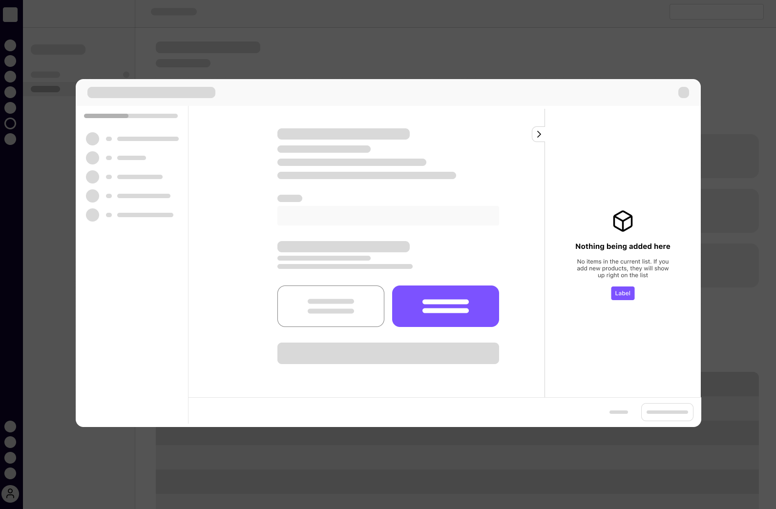
No Results
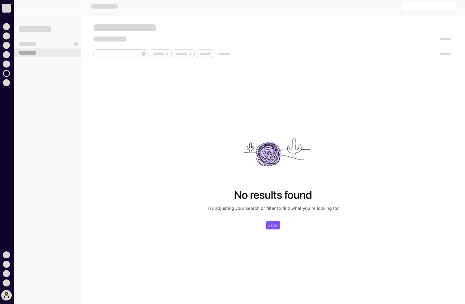
When an action results in no data or information to display, recommend alternate steps to take. For example, suggest an alternative filter if a table search yields no results, or guide the user on creating a new entry with the desired properties.
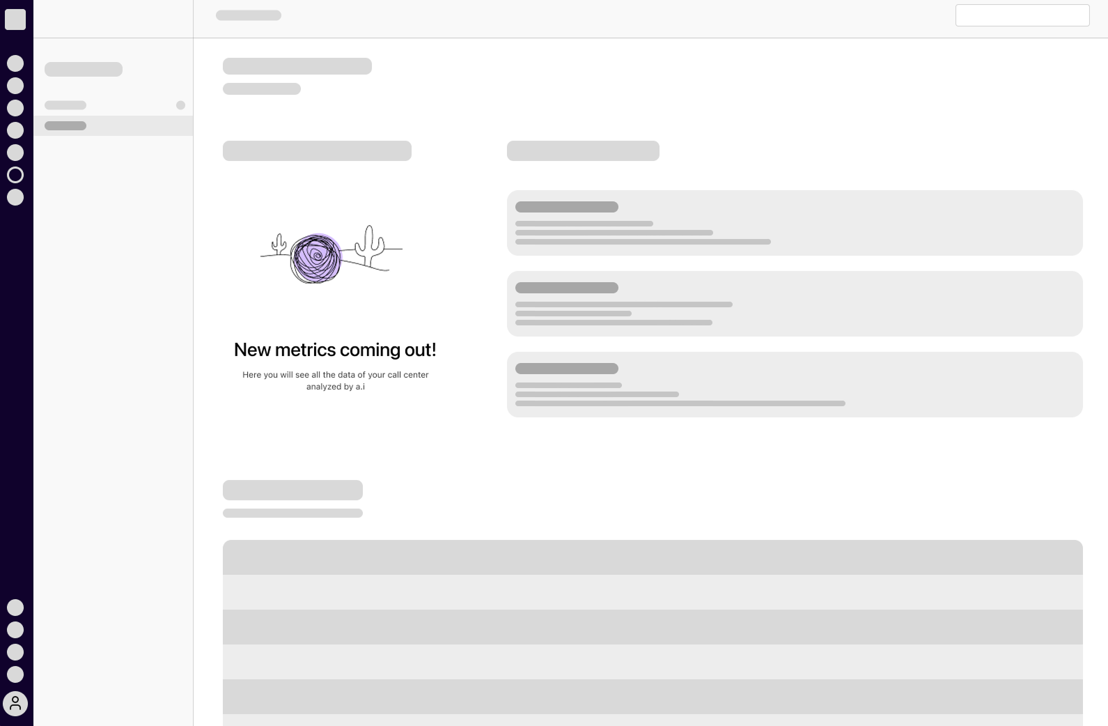
New Feature
An opportunity to introduce something new or not yet take advantage of. If it includes a plan change, clearly inform the user. Use this space to entice the user to explore and utilize the new feature.
Not Enabled
Appropriate for indicating that something is currently unavailable to them. Provide guidance on how they can gain access or why the feature is not enabled.
Variants
A few rules to keep in nothing-to-see-here when choosing a size variant.
- Choosing a size adjusts the relative width, padding, and font size.
400and300sizes- The visual may be an Illustration or an Icon.
- If both are chosen, the Illustration takes precedence.
200size- Illustrations are not available, an Icon is the only visual available.
- If both are chosen, the Icon takes precedence.
Large with Illustration
Large with Icon
Medium with Illustration
Medium with Icon
Small
Examples
No Actions
No Description
Everything
Small, with Muted Actions
Writing Guidelines
Empty State Parts
Title
- Should be scannable and informative.
- Short and concise.
Description
- Short and to the point.
- Avoid repeating the title's message, favoring complementary and useful information.
- Inline text links (i.e.
<a class="d-link">...</a>) may be appropriate given its use case, though first consider if it should be an action button.
Actions
- Follow existing writing guidelines for Dialtone's Button commponent.
- Connect its labels to the paired Title and Description.
Scenarios
Zero State
Encourage and guide the user through product engagement.
Title: No Ai recaps yet
Description: Enable Ai for calls and meetings and check back here!
Action: [Show me how]
No Results
Consider the user's intent and provide guidance to resolve in a useful result.
Title: No matching results
Description: Try adjusting your search criteria or filters.
New Feature
Call out interesting new features or services, and entice the user to explore them.
Title: Discover Ai recaps
Description: Enable Ai for calls and meetings to view and share a recap.
Action: [Tell me more]
Not Available
Be direct in communicating the unavailability of a feature or service, and provide quick actions.
Title: Restricted access
Description: Permission required. You can request access from the owner.
Action: [Cancel] [Request access]
Vue API
import { DtEmpty_state } from '@dialpad/dialtone-vue';Classes
At a minimum, empty state requires a body of content. It can optionally contain a header with buttons, or a footer with buttons/text.
Empty State documentation last updated Friday, September 4, 2026