Components
Reusable components solving common UI needs, designed and built to be assembled in countless combinations.
Newest Components
DtBox
Primitive container for surface, border, spacing, and sizing.
DtFilterPill
Filter control with selectable options in a popover.
Mode Directive
Directive for scoping light, dark, or inverted color mode.
DtMotionText
Animated text for reveal, shimmer, and loading moments.
DtResizable
Layout primitive for adjustable panels and split views.
DtSegmentedControl
Single-select control for switching views, scopes, or modes.
DtText
Token-based typography for semantic text styles.
DtTextList
Semantic bullet, numbered, nested, and custom-marker lists.
All Components
Avatar
Visual identifier for a user, object, or participant group.
Badge
Compact marker for status, metadata, or short labels.
Banner
High-visibility message for system or engagement updates.

Box new
Primitive container for surface, border, spacing, sizing, and positioning.
Breadcrumbs
Navigation trail that shows the current page location.
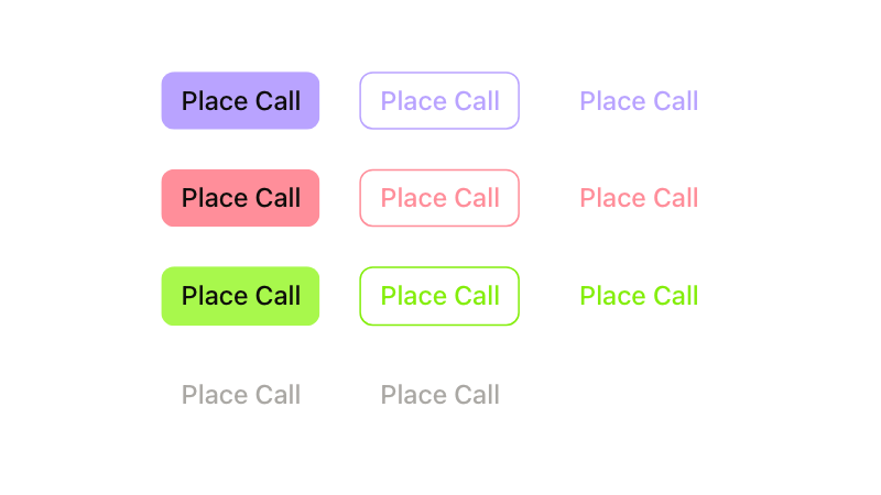
Button
Interactive element for single-step actions.
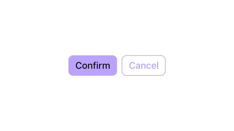
Button Group
Grouped actions with shared context and visual alignment.
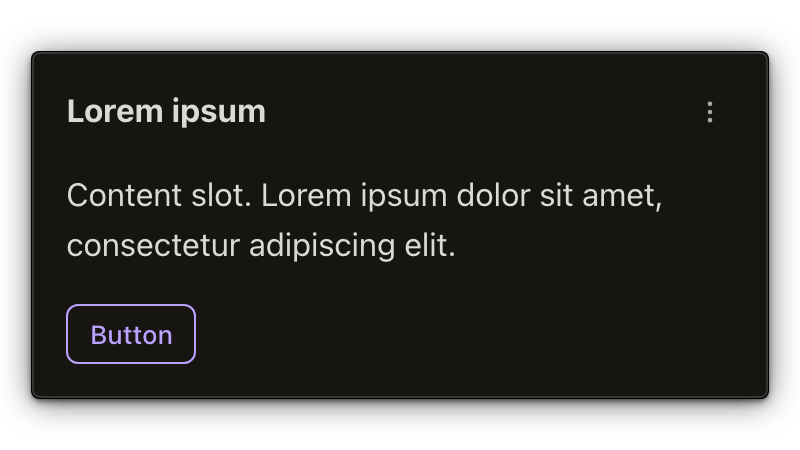
Card
Container for related content, metadata, and actions.
Checkbox
Form control for selecting zero, one, or many options.
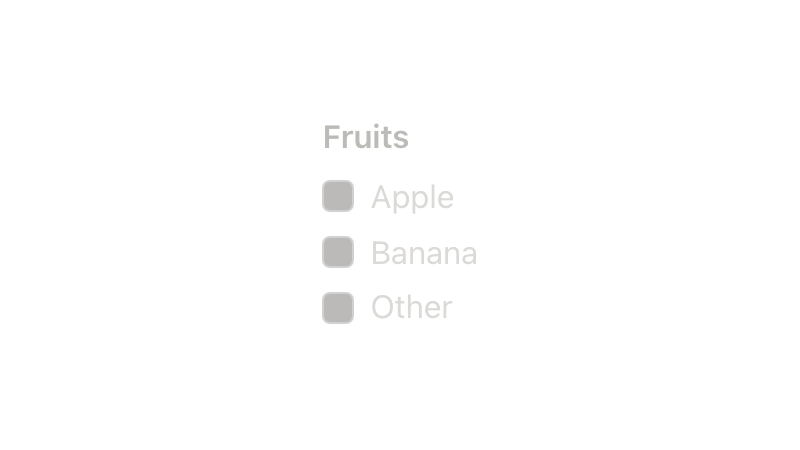
Checkbox Group
Related checkbox options with shared labeling and validation.

Chip
Compact token for selected values, filters, or dismissible items.
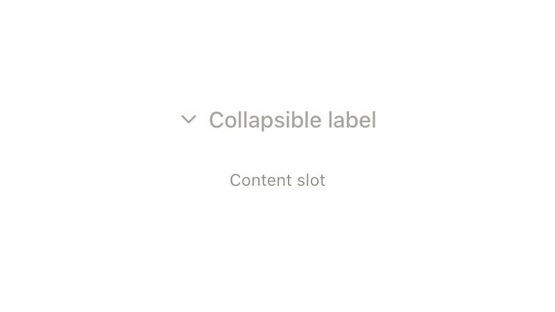
Collapsible
Expandable region for showing or hiding related content.
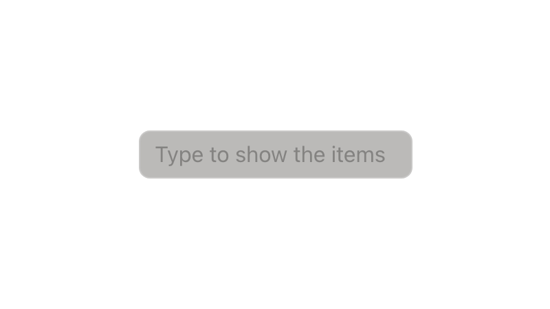
Combobox
Searchable input for choosing from a list of options.

Combobox Multi-Select
Searchable input for selecting multiple options.
Combobox With Popover
Searchable input paired with popover-rendered option content.
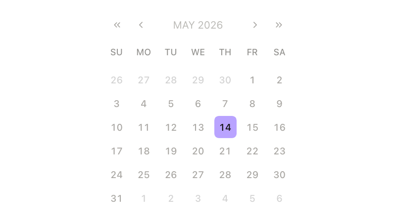
Datepicker
Calendar control for selecting a date.

Description List
Structured label-value pairs for terms, metadata, and details.
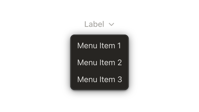
Dropdown
Triggerable menu for actions or choices.

Emoji
Renderer for emoji shortcodes and Unicode characters.
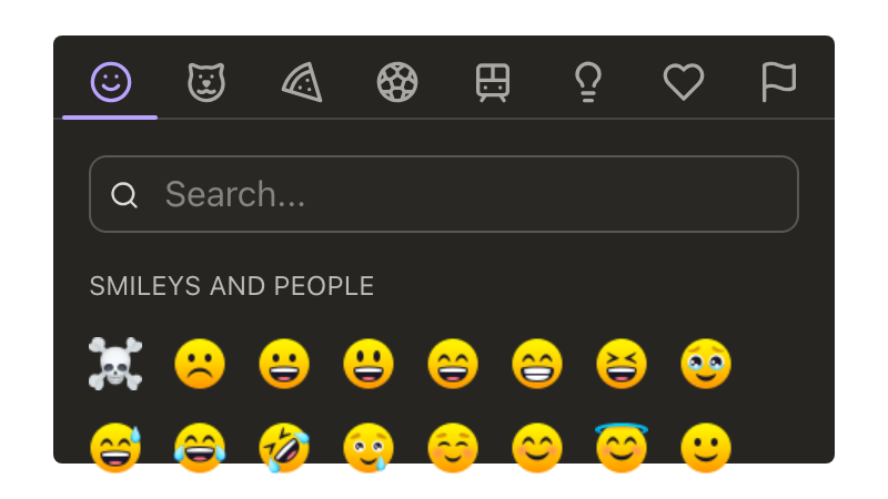
Emoji Picker
Searchable picker for browsing and selecting emoji.
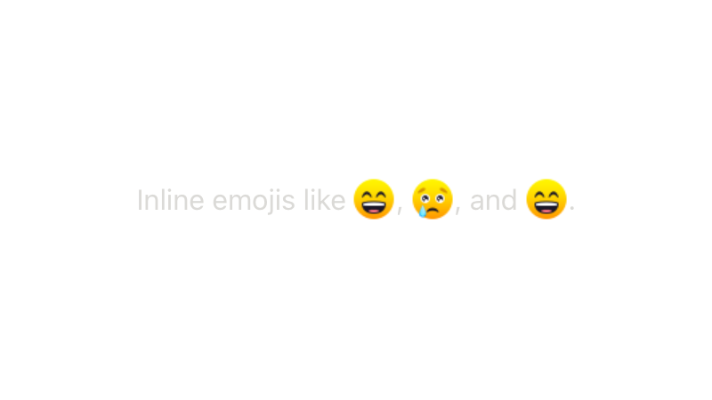
Emoji Text Wrapper
Text wrapper that replaces emoji shortcodes and Unicode characters.
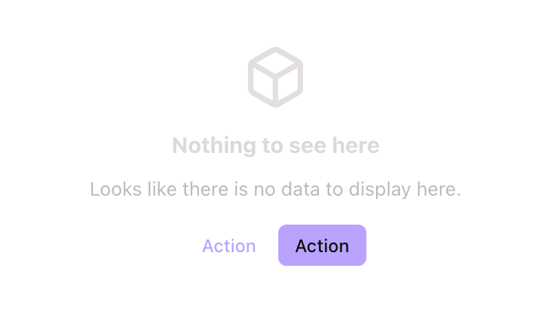
Empty State
Placeholder content for views with no data or next steps.
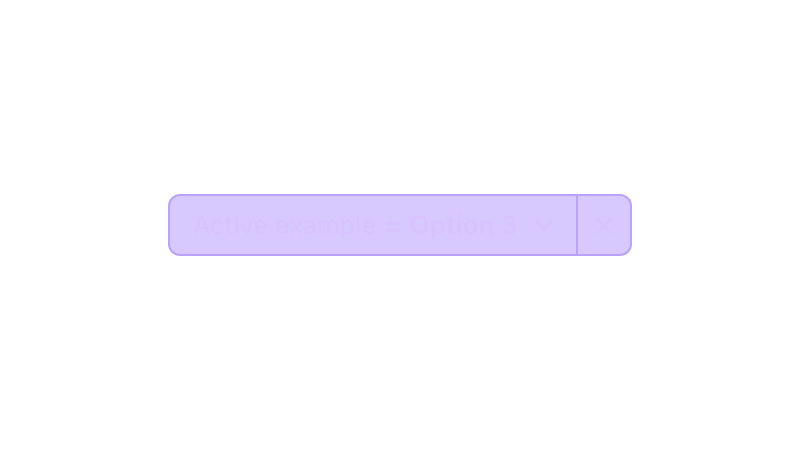
Filter Pill new
Filter control with selectable options in a popover.
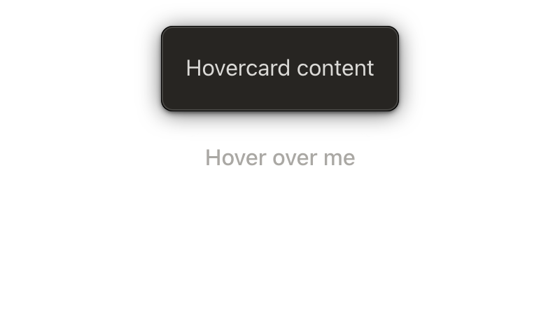
Hovercard
Contextual preview revealed from a hover or focus target.

Icon
Customizable symbols for actions, objects, status, and navigation.

Illustration
Contextual artwork for empty states, guidance, and visual support.

Image Viewer
Full-screen preview for browsing image attachments.
Input
Text field for entering short or long-form values.
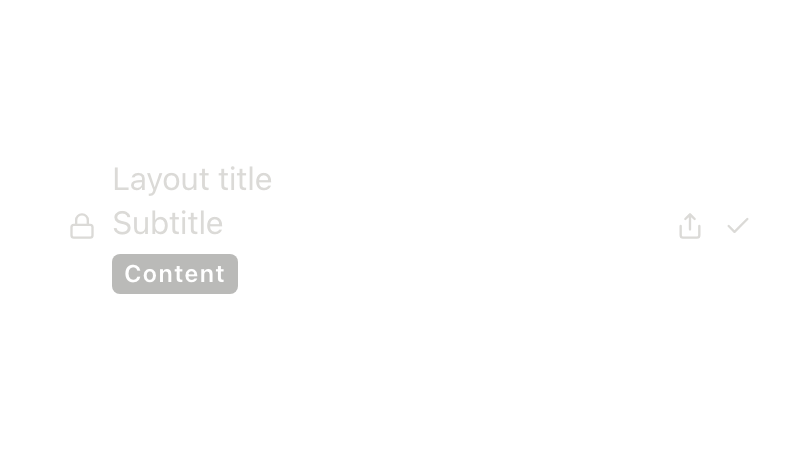
Item Layout
Reusable layout foundation for list-style rows.
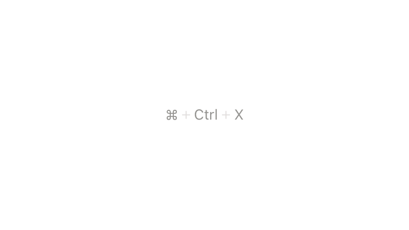
Keyboard shortcut
Visual treatment for keyboard commands and key combinations.

Lazy Show
Defers rendering child content until it is first shown.
Link
Navigation element for inline text or adjacent content.

List item
Structured row for choices, navigation, or actions.
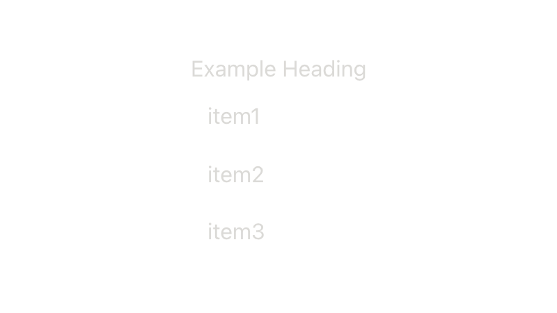
List Item Group
Non-interactive heading that organizes related list items.

Loader
Animated indicator for indeterminate loading or progress.
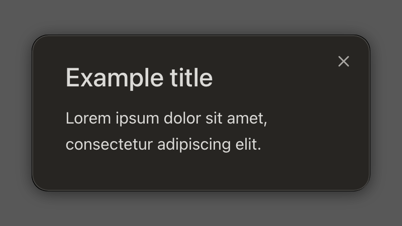
Modal
Blocking dialog for focused tasks or decisions.
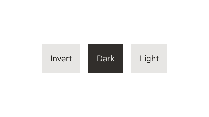
Mode new
Directive for scoping light, dark, or inverted color mode.
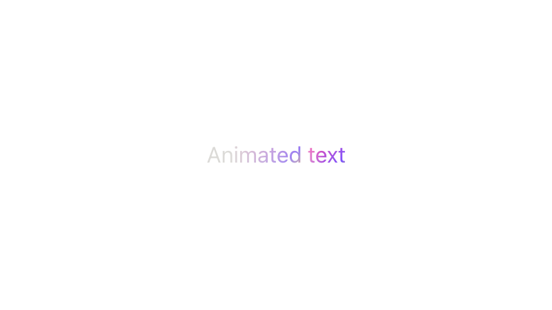
Motion Text new
Animated text for reveal, shimmer, and loading moments.
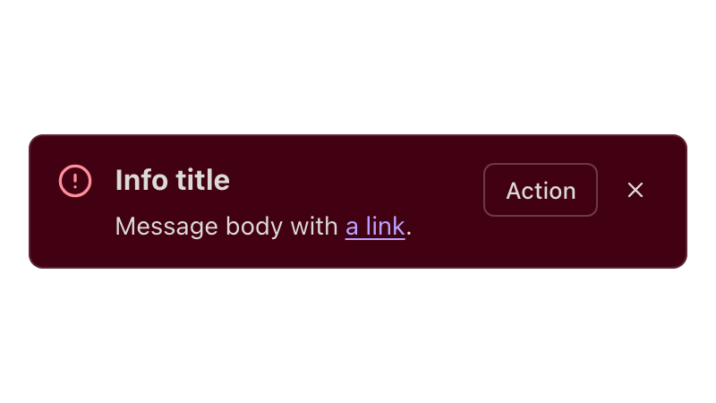
Notice
Inline message for guidance, feedback, or status.
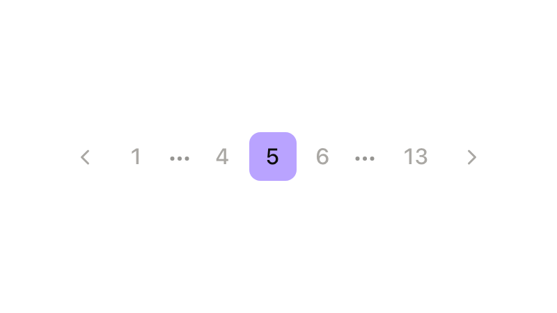
Pagination
Navigation for moving through large sets of paged content.
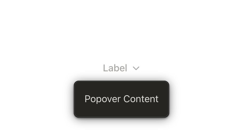
Popover
Floating surface for supplemental content or controls.

Presence
Status indicator for user availability.

Progress Circle new
Circular indicator for upload or processing progress.
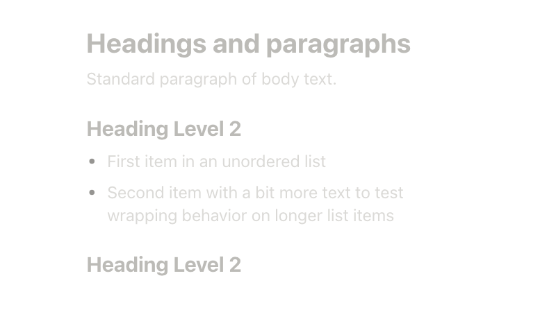
Prose beta
Typographic wrapper for rich HTML content affected by reset styles.
Radio
Form control for choosing one option from a set.
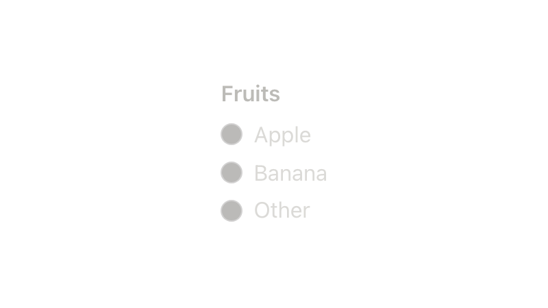
Radio Group
Related radio options for choosing a single value.
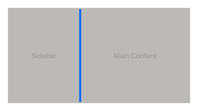
Resizable beta
Layout primitive for adjustable panels and split views.
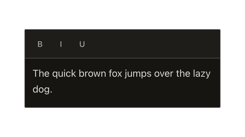
Rich Text Editor
Text editing surface with formatting, links, and mention support.
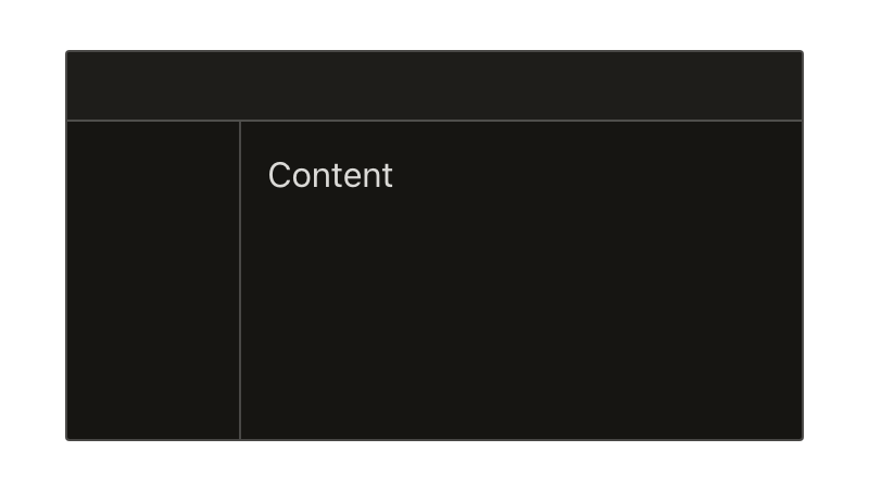
Root layout
Page-level container structure for consistent root content layout.

Scrollbar
Directive for adding a custom overlay scrollbar to scrollable regions.
Scroller
Virtualized list for efficiently rendering large datasets.
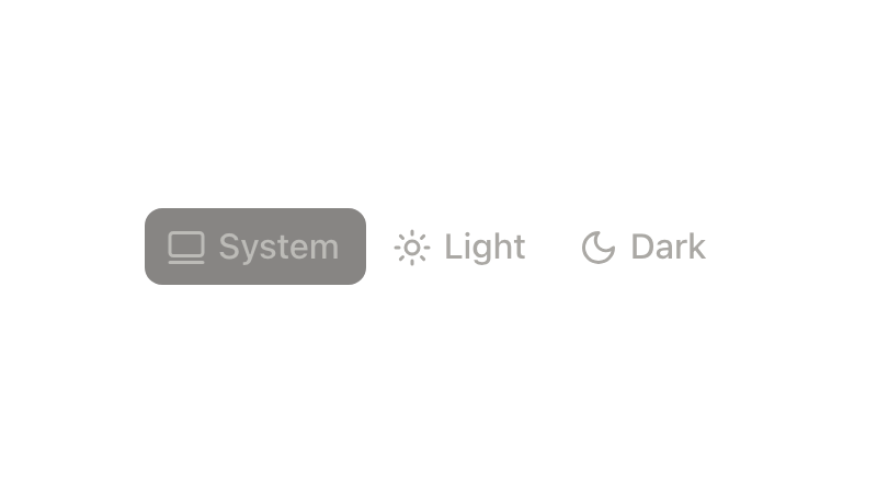
Segmented Control new
Single-select control for switching views, scopes, or modes.
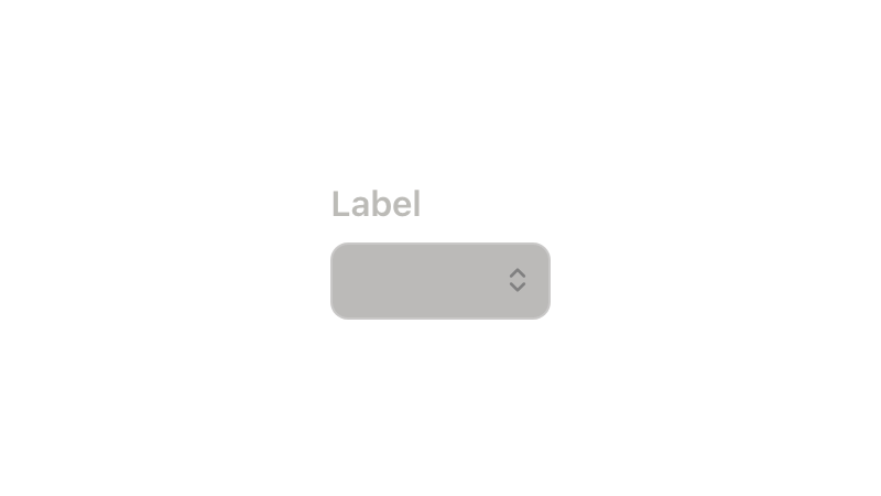
Select menu
Dropdown field for choosing one option from a list.

Skeleton
Placeholder preview of content while a view is loading.
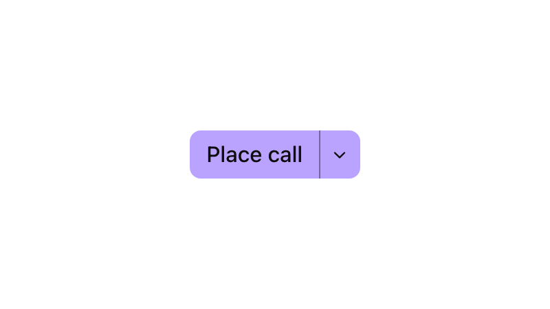
Split Button
Primary action paired with a menu for related actions.
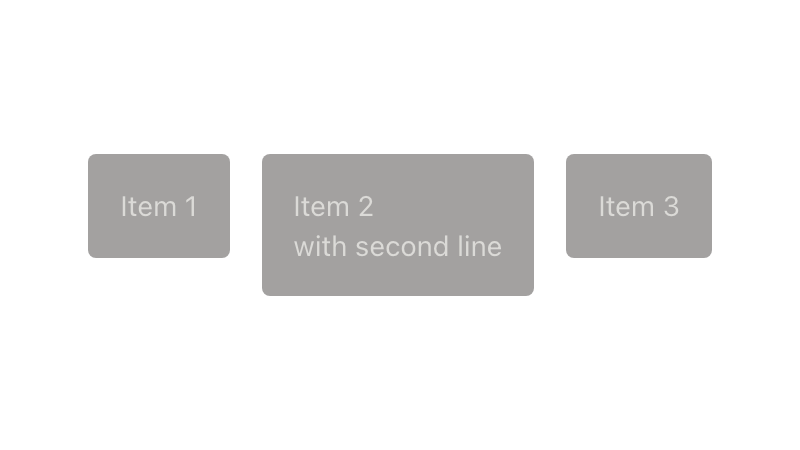
Stack
Layout primitive for arranging children with direction and gap.
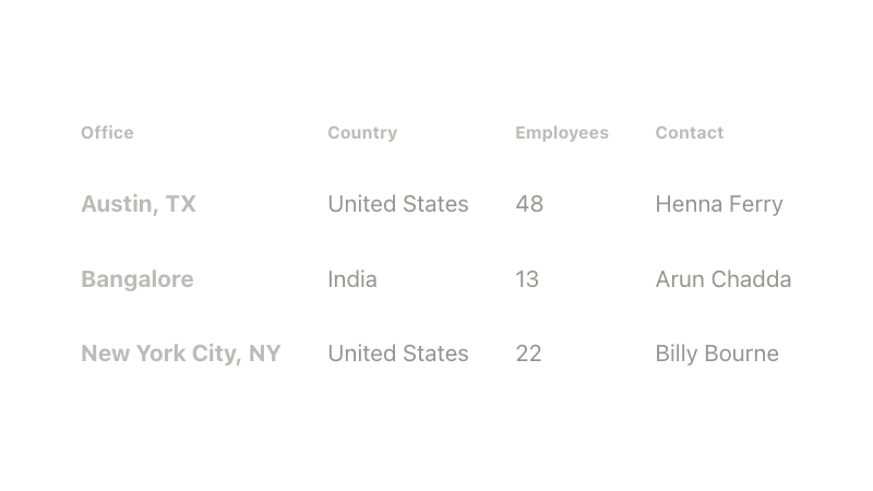
Table
Structured data grid for comparing and analyzing rows.
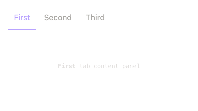
Tabs
Navigation for switching between related panels on one page.
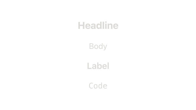
Text new
Consistent typography styling through text variants and raw font-size tokens.
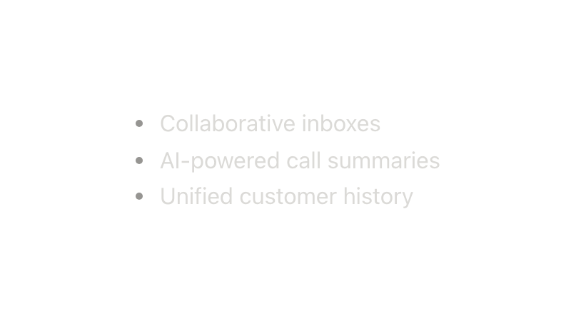
Text List new
Semantic bullet, numbered, nested, and custom-marker lists.
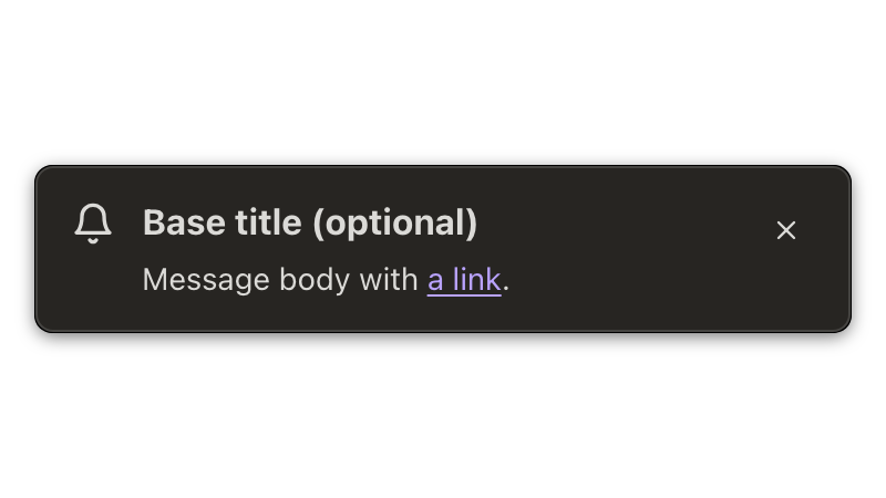
Toast
Temporary notification shown above page content after an action.
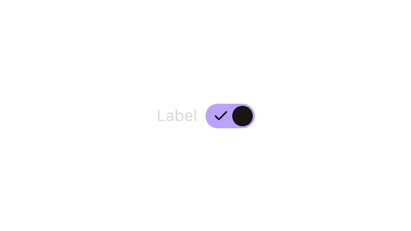
Toggle
Switch control for turning a setting on or off.
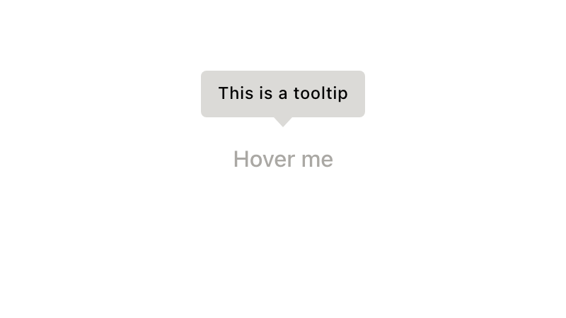
Tooltip
Brief helper text shown when an element receives hover or focus.
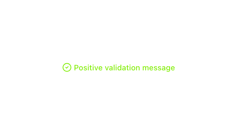
Validation messages
Form feedback for errors, warnings, success, or guidance.
Components documentation last updated Friday, September 4, 2026