Core Color
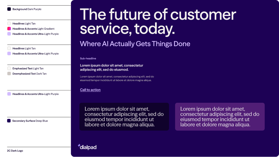
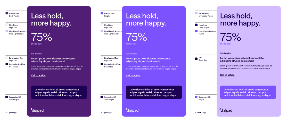
Dialpad’s color theory is organized into three schemes depending on usage.
Primary
For most general brand communications use light and dark neutrals for backgrounds with purple and a warm gradient tone used for accents.
Secondary
For specialty brand communications use one of the Dialpad brand purples for backgrounds.
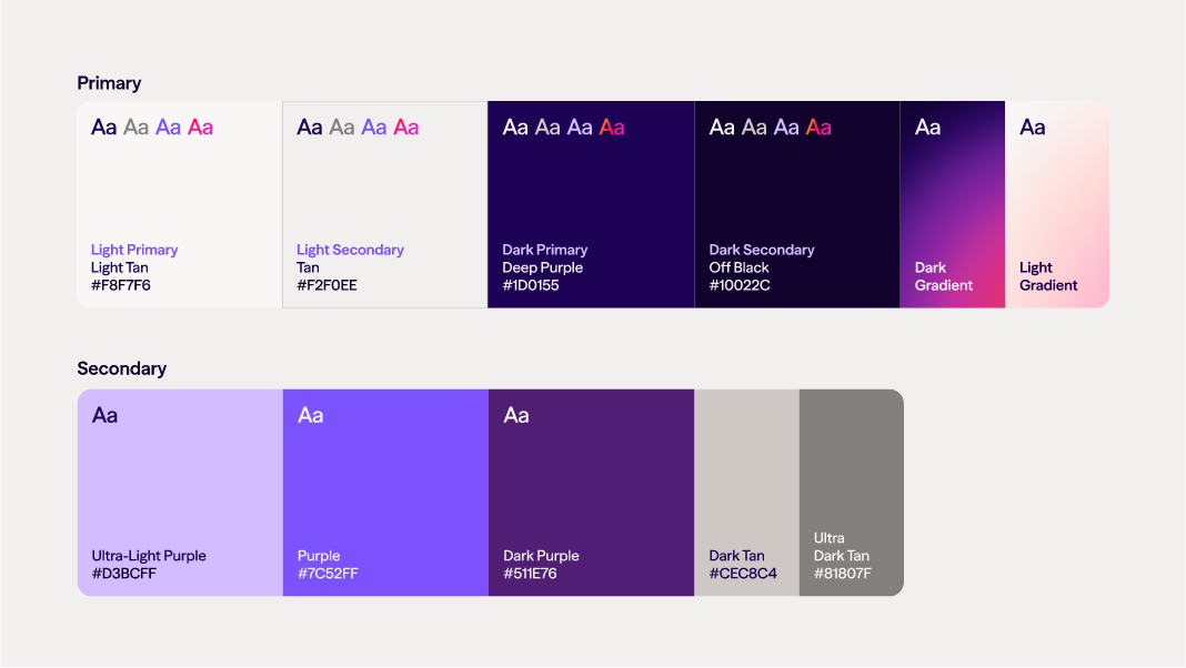
#F8F7F6
Primary Light
Use for most light backgrounds and light text on dark backgrounds.
#F2F0EE
Secondary Light
Use as a background for variety or as contrast with primary light.
#CEC8C4
Tertiary Light
Use in graphics, or as a background for UI.
#FFFFFF
Contrast Light
Use as a background for variety or contrast with primary light.
#10022C
Primary Dark
Use for most dark backgrounds and dark text on light backgrounds.
#1D0155
Secondary / Contrast Dark
Use as a background for variety or as contrast with primary dark.
#7C52FF
Purple
Use as an accent or highlight color for text or graphics on light backgrounds.
#D3BCFF
Light Purple
Use as an accent or highlight color for text or graphics on dark backgrounds.
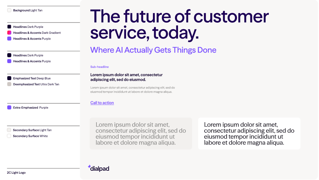
When creating attract and engage level communications, especially when using an increased amount of text, use the light background.
When creating attract and engage level communications, especially when using a limited amount of text or featuring the AI sub-brand, use the dark background.