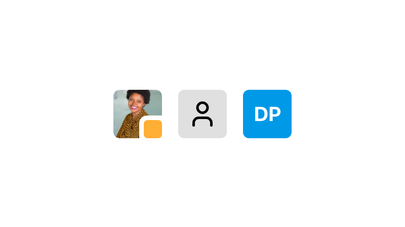
Avatar
An avatar is a visual representation of a user or object.
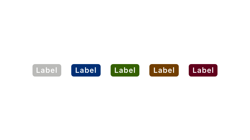
Badge
A badge is a compact UI element providing brief, descriptive information about an element and its surrounding context. It is terse, ideally one word.
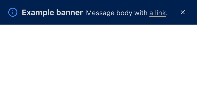
Banner
A banner is a type of Notice, delivering system and engagement messaging. It is highly intrusive and should be used sparingly and appropriately.

Box new
Low-level surface and spacing primitive for building token-constrained containers.
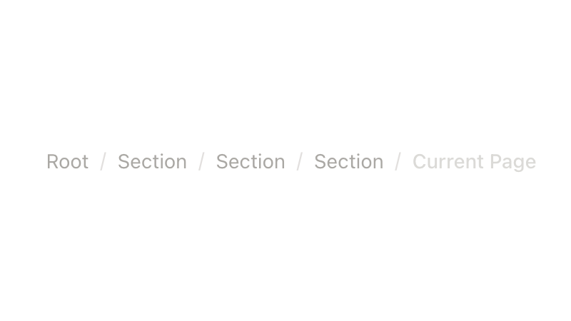
Breadcrumbs
Breadcrumbs are links used to provide context for the currently-viewed page and where it is located within the overall site structure.
Button
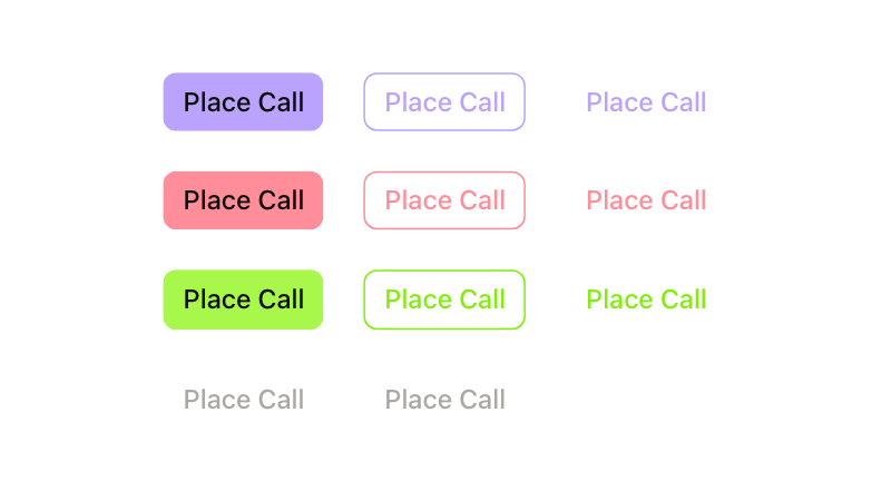
A button is an UI element which signals key actions to take an action throughout an app. It is important a button is identifiable, consistent, communicates its actions clearly, and is appropriately sized to its action.
Button Group
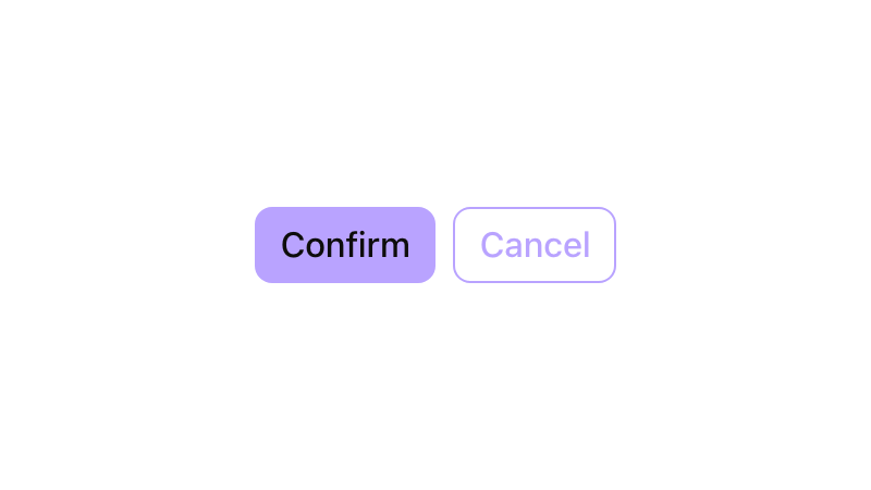
Used for grouping buttons that share a relationship or perform similar actions.
Card
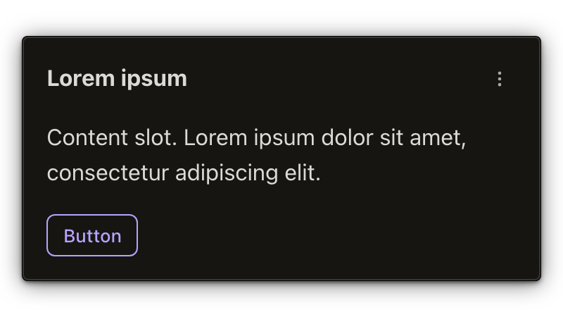
A card contains summary content and actions about a single subject. It can be used by itself or within a list, and is generally interactive.
Checkbox
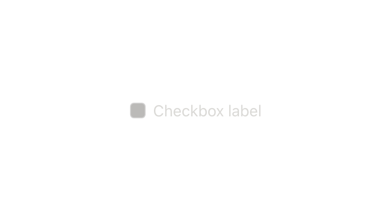
A checkbox is an input control that allows users to select zero, one, or more options from a number of choices.
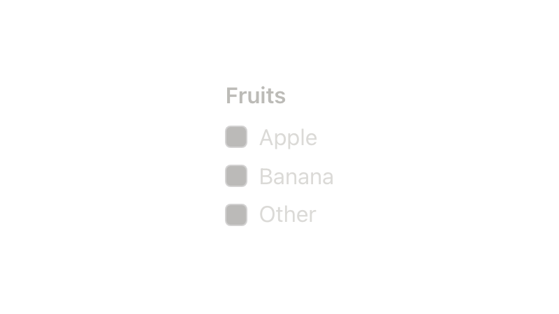
Checkbox Group
Checkbox groups are convenient components for a grouping of related Checkboxes.
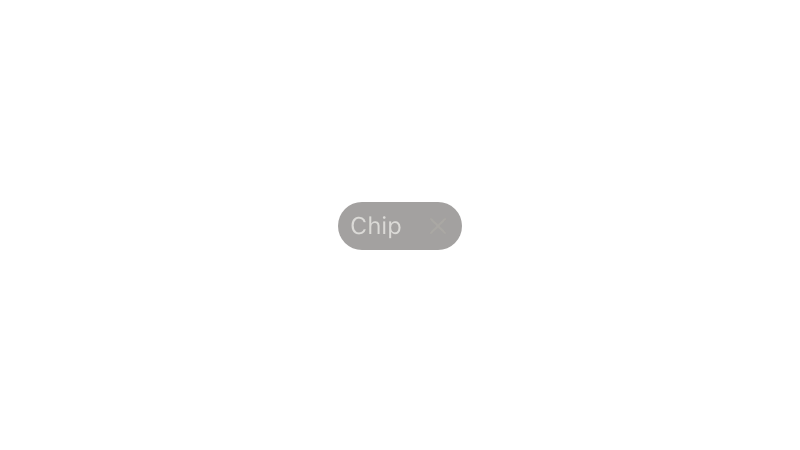
Chip
A Chip is a compact UI element that provides brief, descriptive information about an element. It is terse, ideally one word.
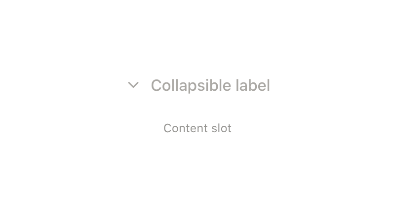
Collapsible
A collapsible is a component consisting of an interactive anchor that toggled the expandable/collapsible element.
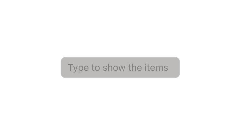
Combobox
A combobox is a semantic component that displays an input element combined with a listbox, which enables the user to select items from the list.

Combobox Multi-Select
Select allows users to make a single selection or multiple selections from a list of options.
Combobox With Popover
A combobox that renders the listbox inside a popover therefore the listbox is rendered at the root of the document.
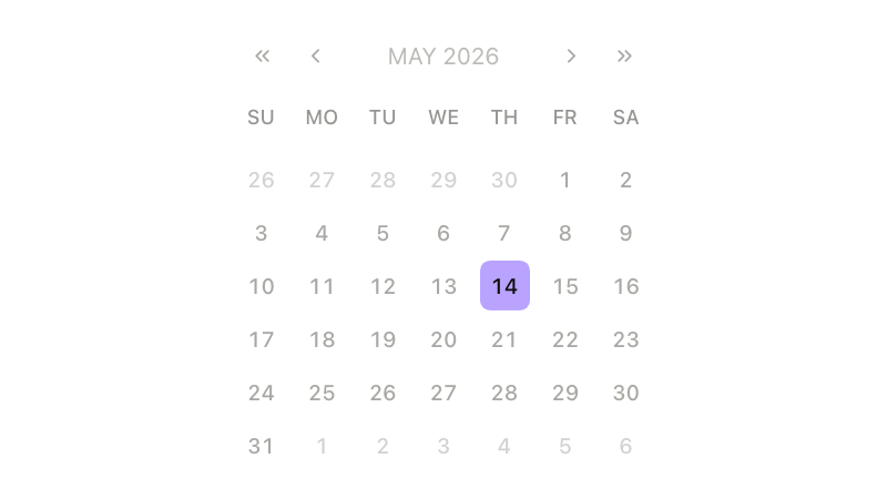
Datepicker
Datepicker component will provide a calendar to select a date.
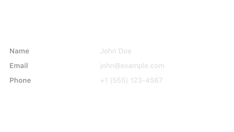
Description List
Description lists are a way to group and clarify associated ideas. They are notably useful when outlining and explaining terms, like those in a glossary.
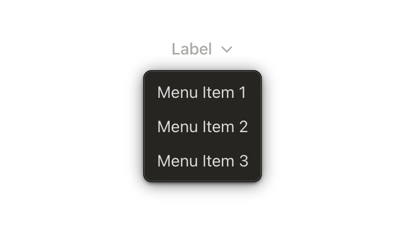
Dropdown
A Dropdown presents a list of options or actions.
Emoji
Renders an emoji from a shortcode such as :smile: or unicode character such as 😄.
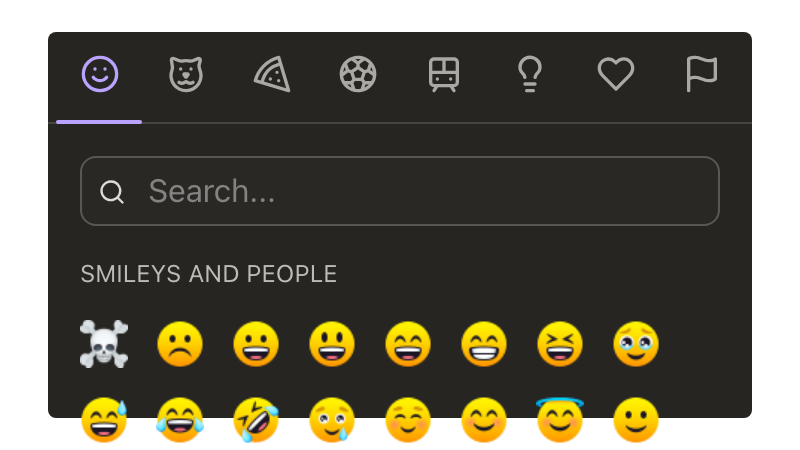
Emoji Picker
A emoji picker component that allows you to view and select an emoji from a list.
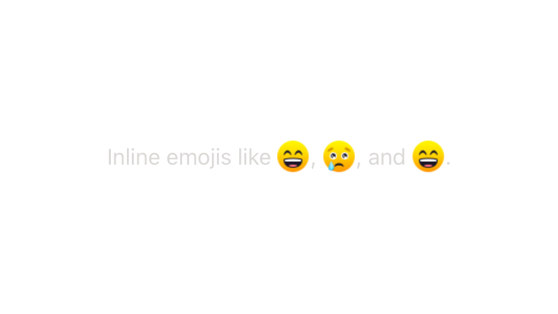
Emoji Text Wrapper
Wrapper to find and replace shortcodes like :smile: or unicode chars such as 😄 with our custom Emojis implementation.
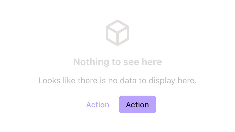
Empty State
Indicates no data is available to display, provides clarification, and guidance on how to proceed.
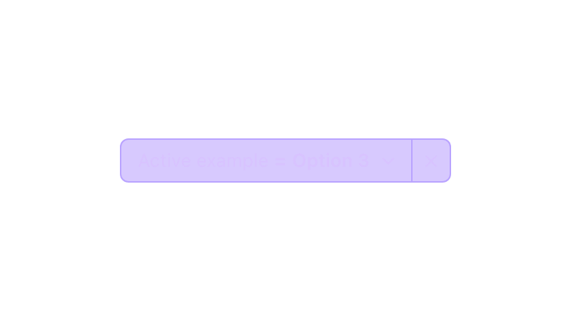
Filter Pill new
A Filter Pill offers a button paired with a popover to show and manage filtering options, the label and content of the filter can be handled through slots and props.
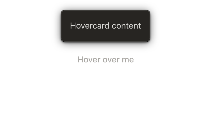
Hovercard
A Hovercard toggles a content overlay when its anchor element is hovered for a minimum amount of time.

Icon
Collection of customizable symbols and sizes

Illustration
The Illustration component provides a set of images to provide context to your application

Image Viewer
Image Viewer lets the user click on an image to see it in a full screen modal.
Input
An input field is an input control that allows users to enter alphanumeric information. It can have a range of options and supports single line and multi-line lengths, as well as varying formats, including numbers, masked passwords, etc.
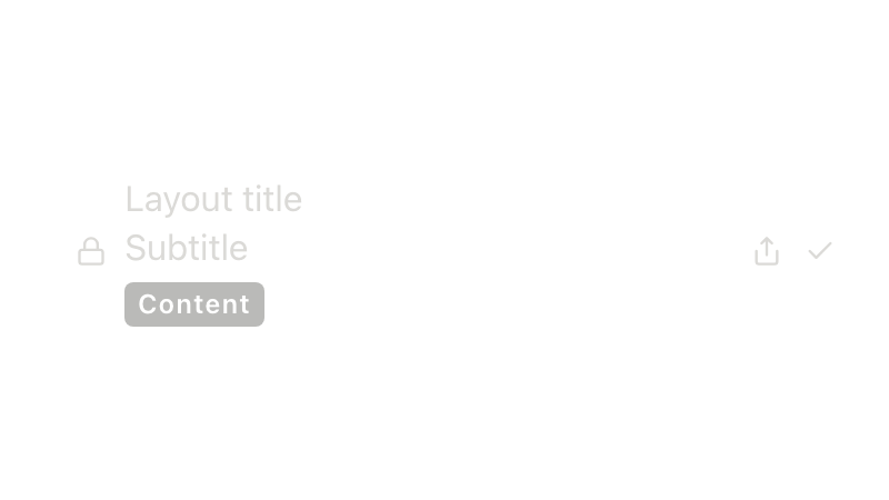
Item Layout
An item layout provides a standardized group of containers to enable developer to use list-item like stack. It is used as base for `dt-list-item` component
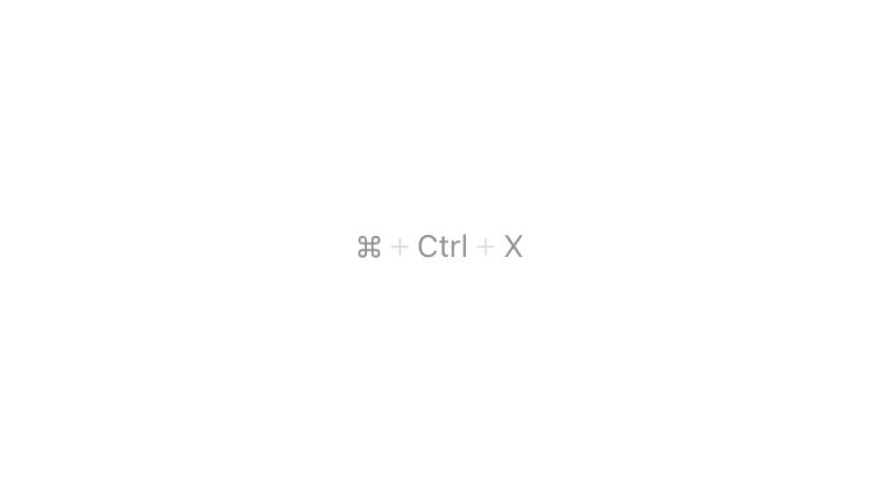
Keyboard shortcut
This component displays a visual representation of a keyboard shortcut to the user.
Lazy Show
Lazy show is a utility component that prevents its children from being rendered until the first time it is shown.
Link
A link is a navigational element that can be found on its own, within other text, or directly following content.
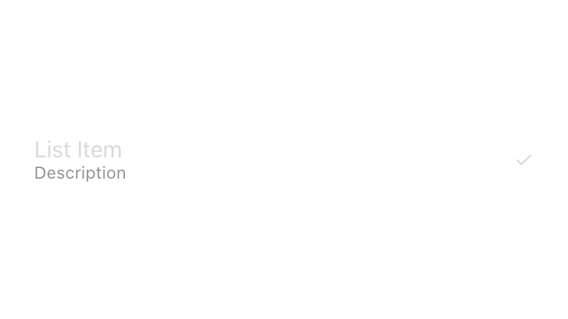
List item
A list item is an element that can be used to represent individual items in a list.
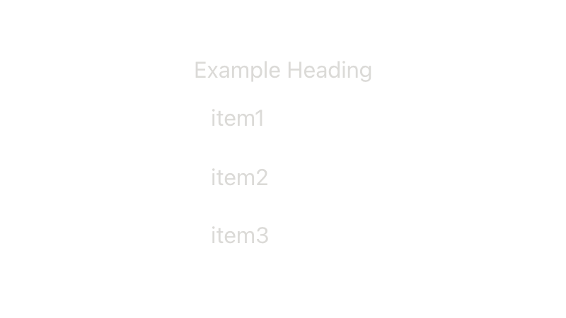
List Item Group
The "List Item Group" component uses a non interactive heading which groups list items.

Loader
A loader is a visual indicator that a task is in progress.
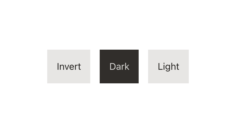
Mode new
Directive to apply light, dark, or inverted color mode to any element or region.
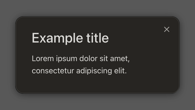
Modal
A modal focuses the user's attention on a single task or message.
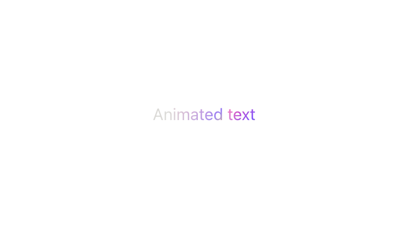
Motion Text new
A versatile, accessible text animation component with multiple animation modes, full accessibility support, and comprehensive customization options.
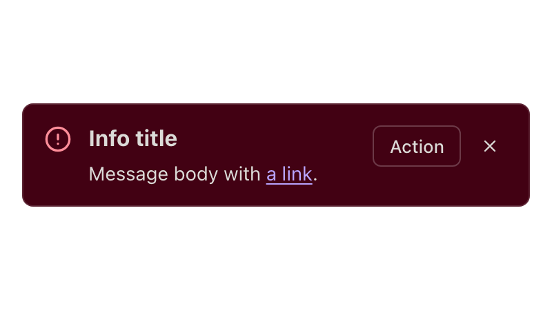
Notice
A notice is an informational and assistive message that appears inline with content.
Pagination
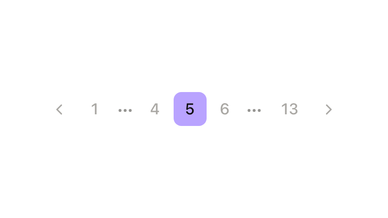
Pagination allows you to divide large amounts of content into smaller chunks across multiple pages.
Popover
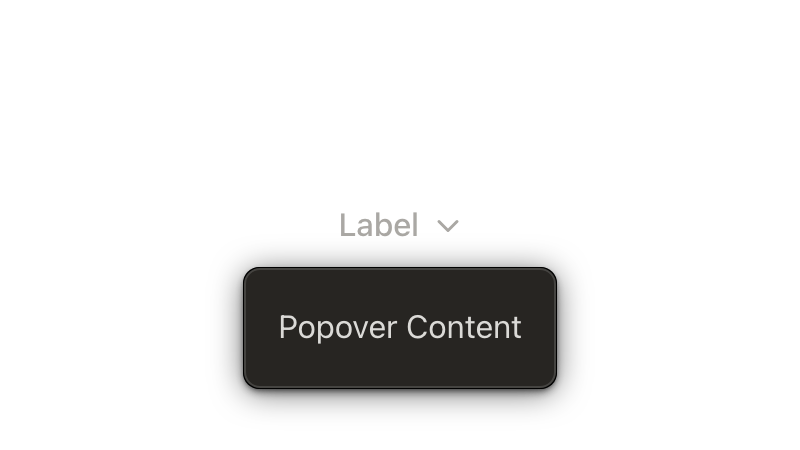
A Popover displays a content overlay when its anchor element is activated.

Progress Circle new
A circular SVG progress indicator for determinate upload or processing progress.

Presence
A visual control element indicating the current status of a user.
Prose beta
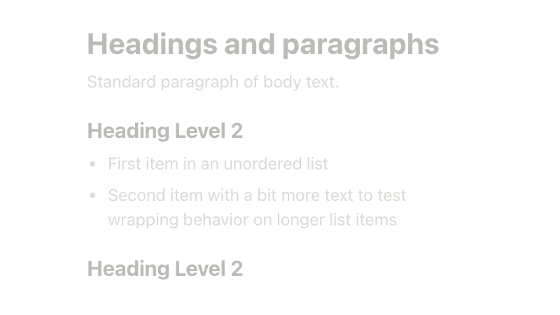
A container that applies typographic defaults to raw HTML content, restoring margins, list styles, heading sizes, and other block-level formatting that the Dialtone reset strips away.
Radio
A radio is an input control that allows users to select only one option from a number of choices.
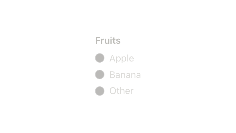
Radio Group
Radio groups are control elements that allow the user to make a single selection from a list of options.
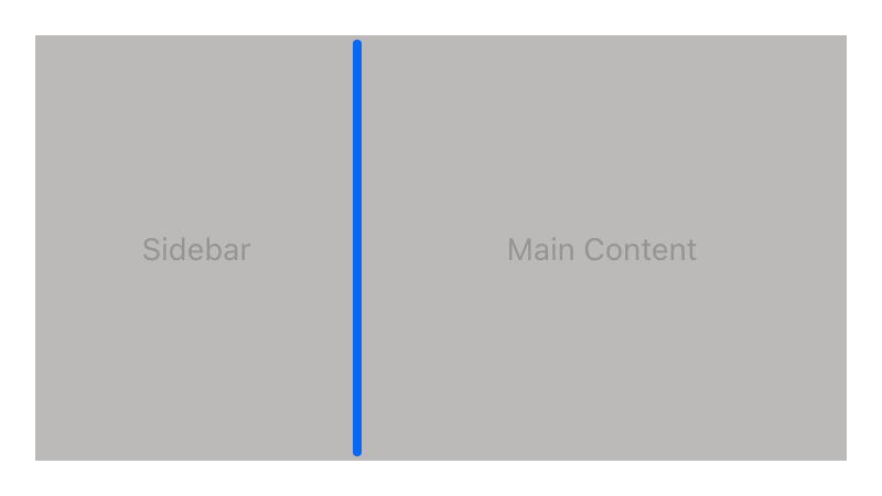
Resizable beta
A layout component that lets users resize adjacent panels by dragging a handle between them.
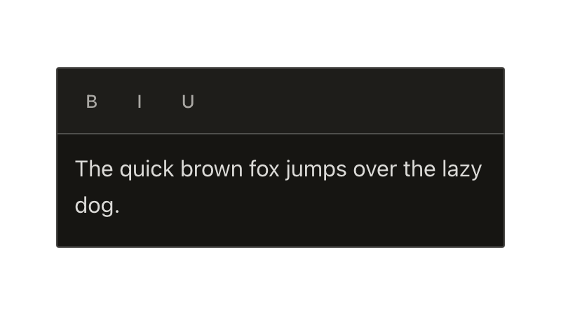
Rich Text Editor
A rich text editor is a component that allows users to format text with a variety of styles. It enables also mixing text with custom components built as extensions, such as links and user mentions.
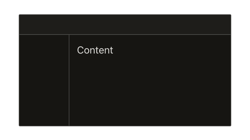
Root layout
A root layout provides a standardized group of containers to display content at the root level.

Scrollbar
A directive that adds a custom overlay scrollbar to any scrollable region.
Scroller
A virtualized list that renders only what's visible, so large datasets scroll without slowing down the page.
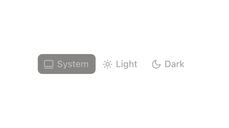
Segmented Control new
Single-select, all-options-visible control for switching views, scopes, or modes within the same context.
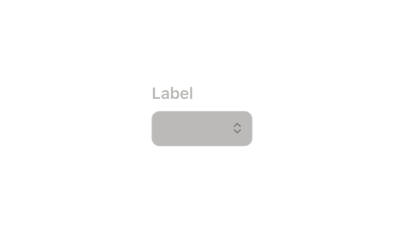
Select menu
A select menu is an input control that allows users to choose one option from a list.
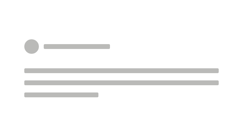
Skeleton
Skeleton loader is a non-interactive placeholder that displays a preview of the UI to visually communicate that content is in the process of loading. Skeleton is used to provide a low fidelity representation of the user interface (UI) before content appears on the page.
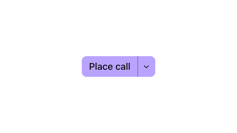
Split Button
A Split Button offers a default action paired with a secondary action to reveal alternate or related actions.
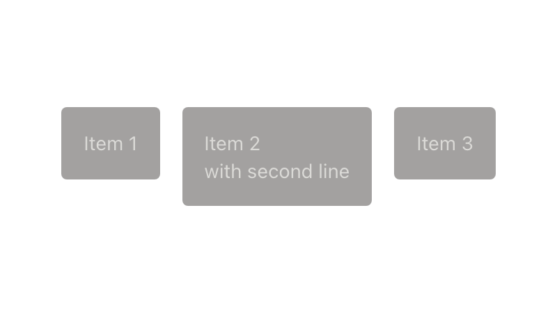
Stack
Foundational layout primitive for elements along a vertical or horizontal axis, with consistent spacing and alignment.
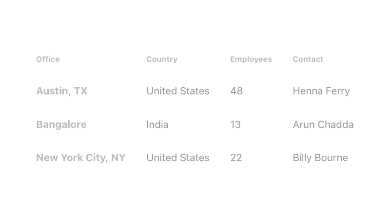
Table
A table is a pattern for organizing data sets. While data visualization helps quickly summarize a data set, a table allows users to compare and analyze individual data rows.
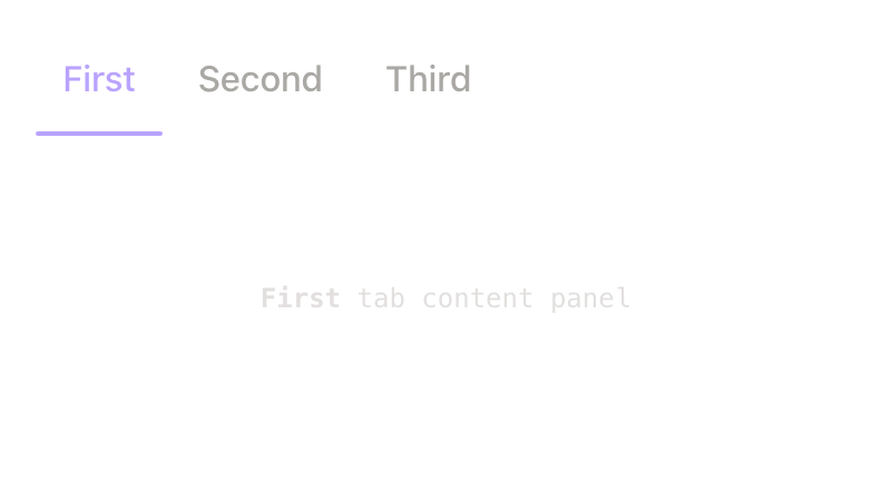
Tabs
Tabs allow users to navigation between grouped content in different views while within the same page context.
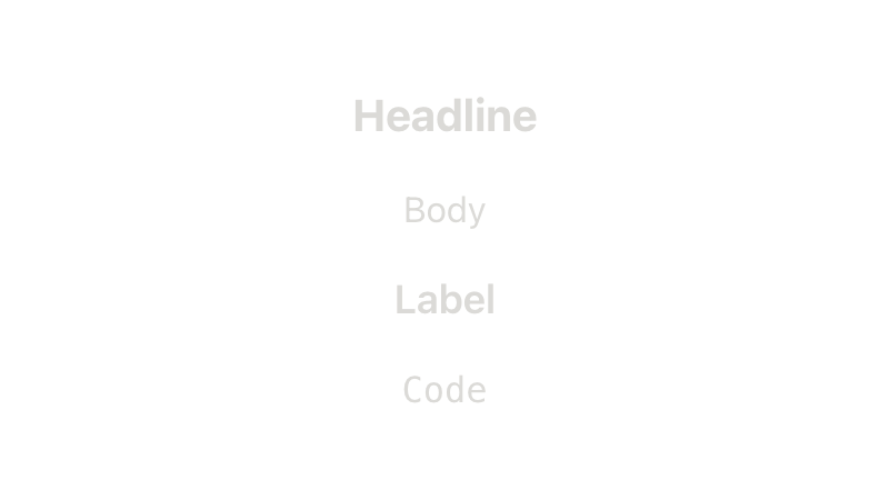
Text new
Consistent typography styling through semantic text kinds and sizes.
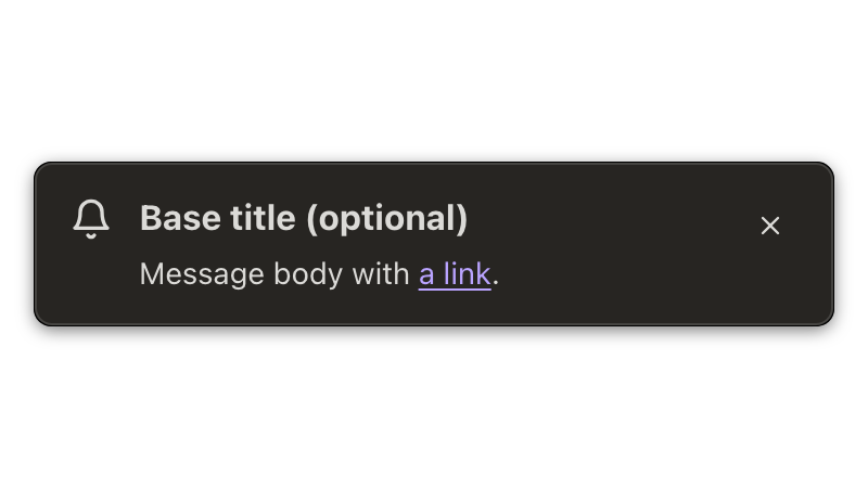
Toast
A toast notice, sometimes called a snackbar, is a time-based message that appears based on users' actions. It contains at-a-glance information about outcomes and can be paired with actions.
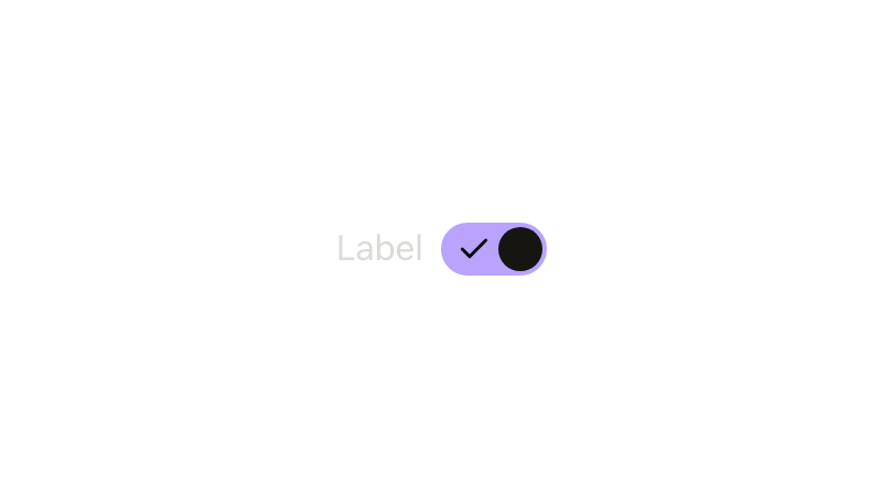
Toggle
A toggle, or "switch", is a button control element that allows the user to make a binary selection.
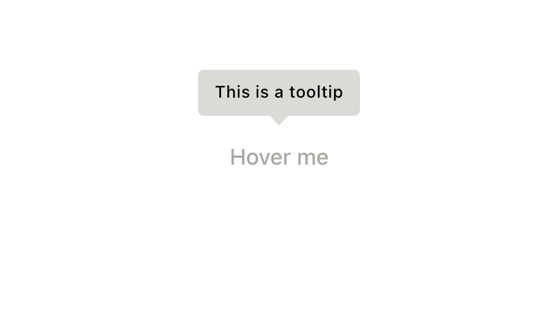
Tooltip
A tooltip is a floating label that briefly explains an action, function, or an element. Its content is exclusively text and shouldn't be vital information for users. If richer media is desired, consider using a popover instead.
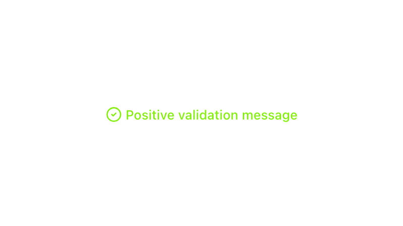
Validation messages
Validation messages are used to convey information to the user about the current state of the input element. These messages can have a critical, warning, positive, or info type.