Visual Changes for Designers
What changed visually in Dialtone Next, what should look identical, and how to tell an intended change from a migration bug during design QA.
This guide is for designers and QA reviewing product surfaces that migrated to Dialtone Next. It shows the most significant intentional visual changes, lists what must look identical, and catalogs the problems that have actually come up during migrations, so you can tell a refresh from a regression before filing a bug. It is not exhaustive: smaller changes aren't pictured, and the guide gets updated as migrations surface more.
The quick triage flow:
- Something looks different → check token changes and redesigned components below. If it's listed, it's intentional; no ticket needed.
- Not listed there → check what must look identical. If it's on that list, any visible difference is a bug.
- Still unsure → check problems we've actually seen for the symptom, then file it under your team's migration epic.
Token changes
The changes in this section need no product code change to appear: a token value changed, so every page shifts at once. They are the most common source of false bug reports: the whole app looks nudged, and it's supposed to.
Body text is bigger (and headlines smaller)
The type scale was rebuilt. Default body text grows from 15px to 16px; this alone touches virtually every screen. Mid sizes shift slightly (19→20px, 27→26px) and the largest headline shrinks from 38px to 32px. Input text grows from 12px to 14px.
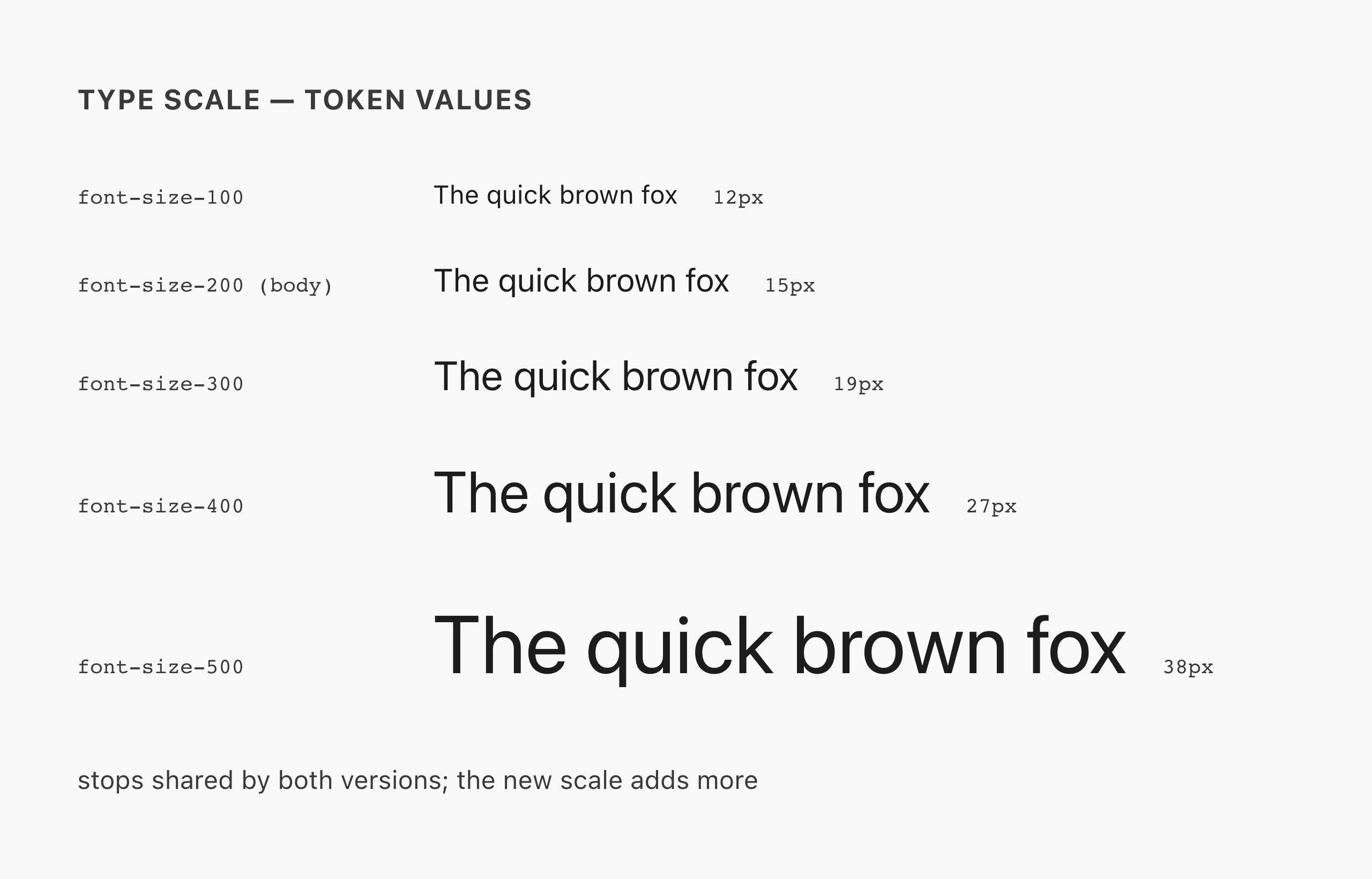
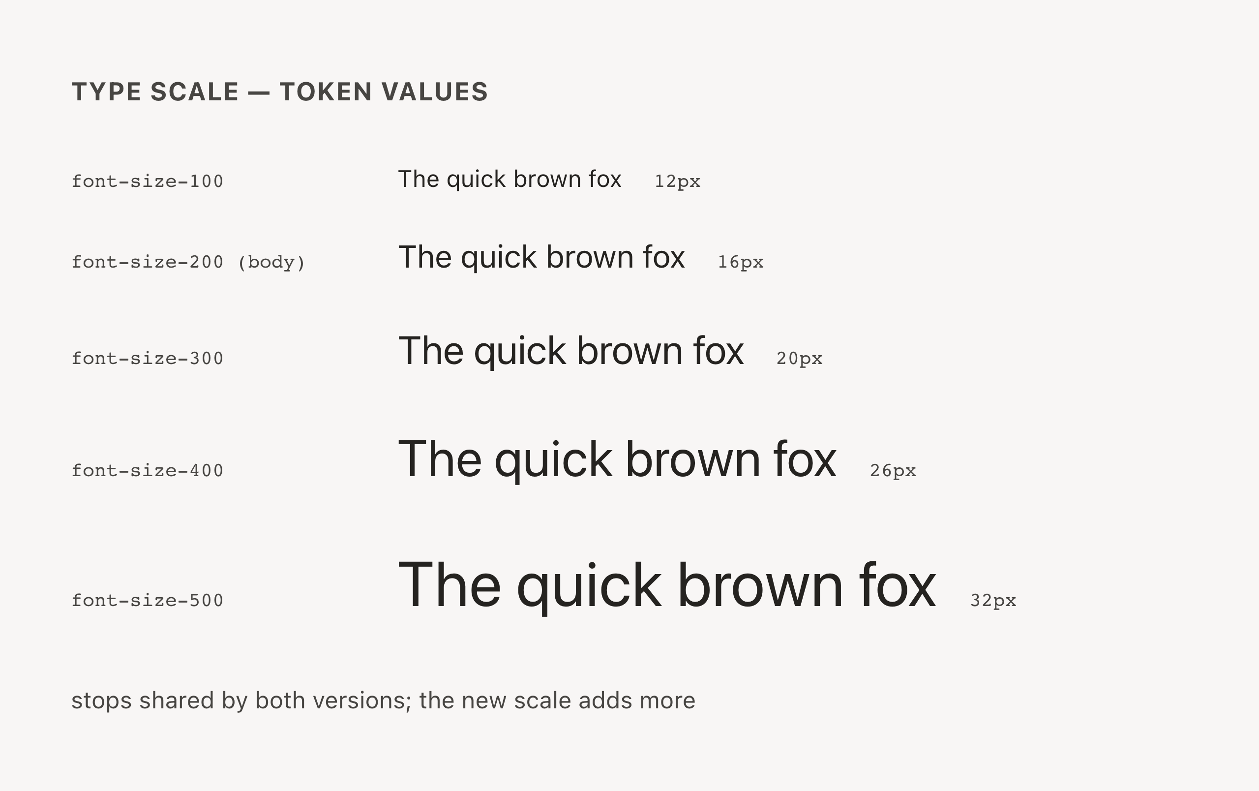
The specimen shows the five stops that exist on both versions and how each one moved. It is not the full Next scale: five intermediate stops (75, 125, 150, 250, 350) are new and have no "before" to compare against. The font size reference lists every stop.
Expect: text wraps differently, rows get slightly taller, dense layouts breathe differently. This is correct. Flag text that becomes clipped or truncated because a fixed-height container didn't accommodate the new size.
Neutrals are warm now
Pure grays are gone. Page backgrounds, cards, borders, and gray text all pick up a faint warm "sandstone" cast, in both light and dark mode, and some grays lighten slightly.
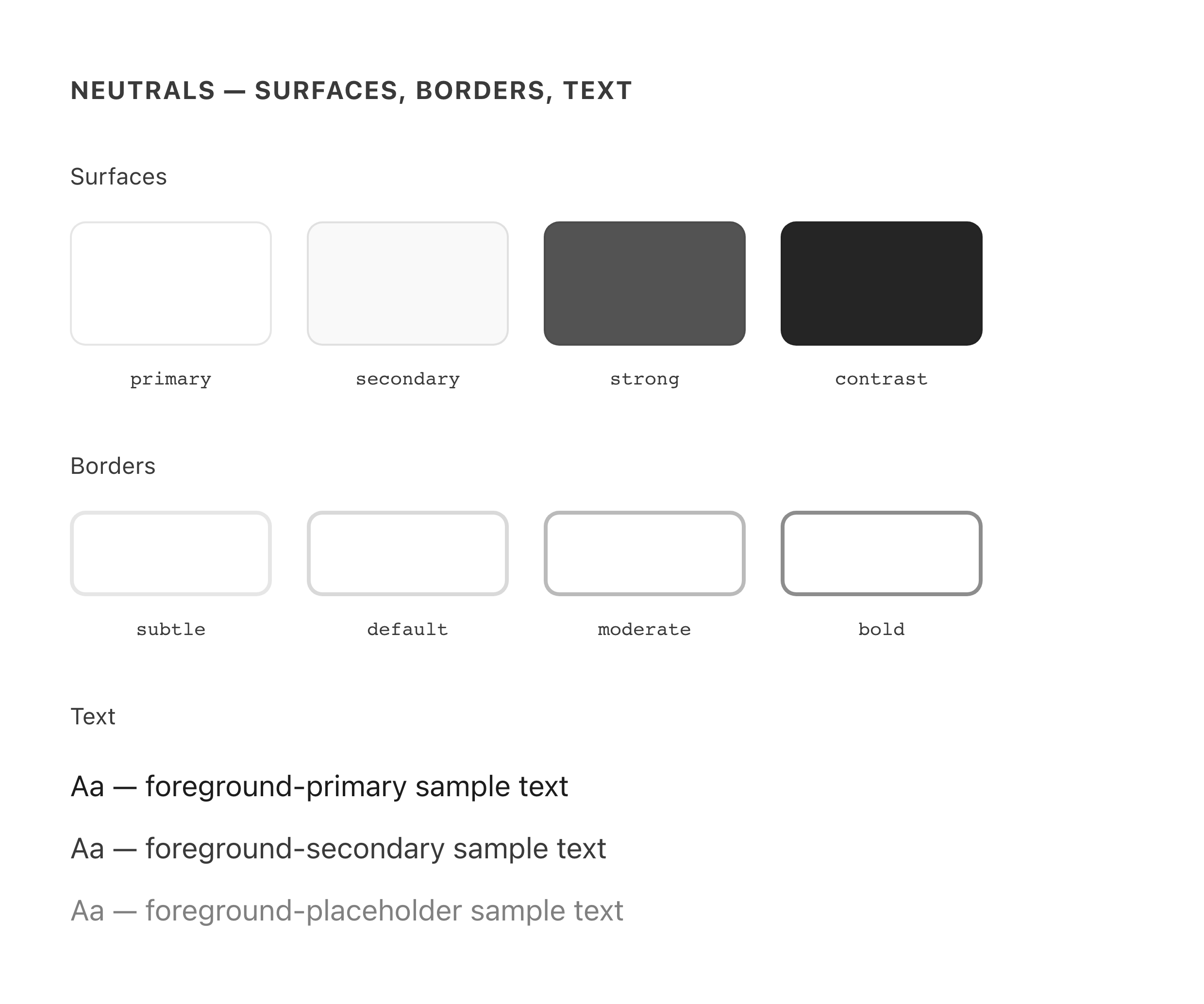
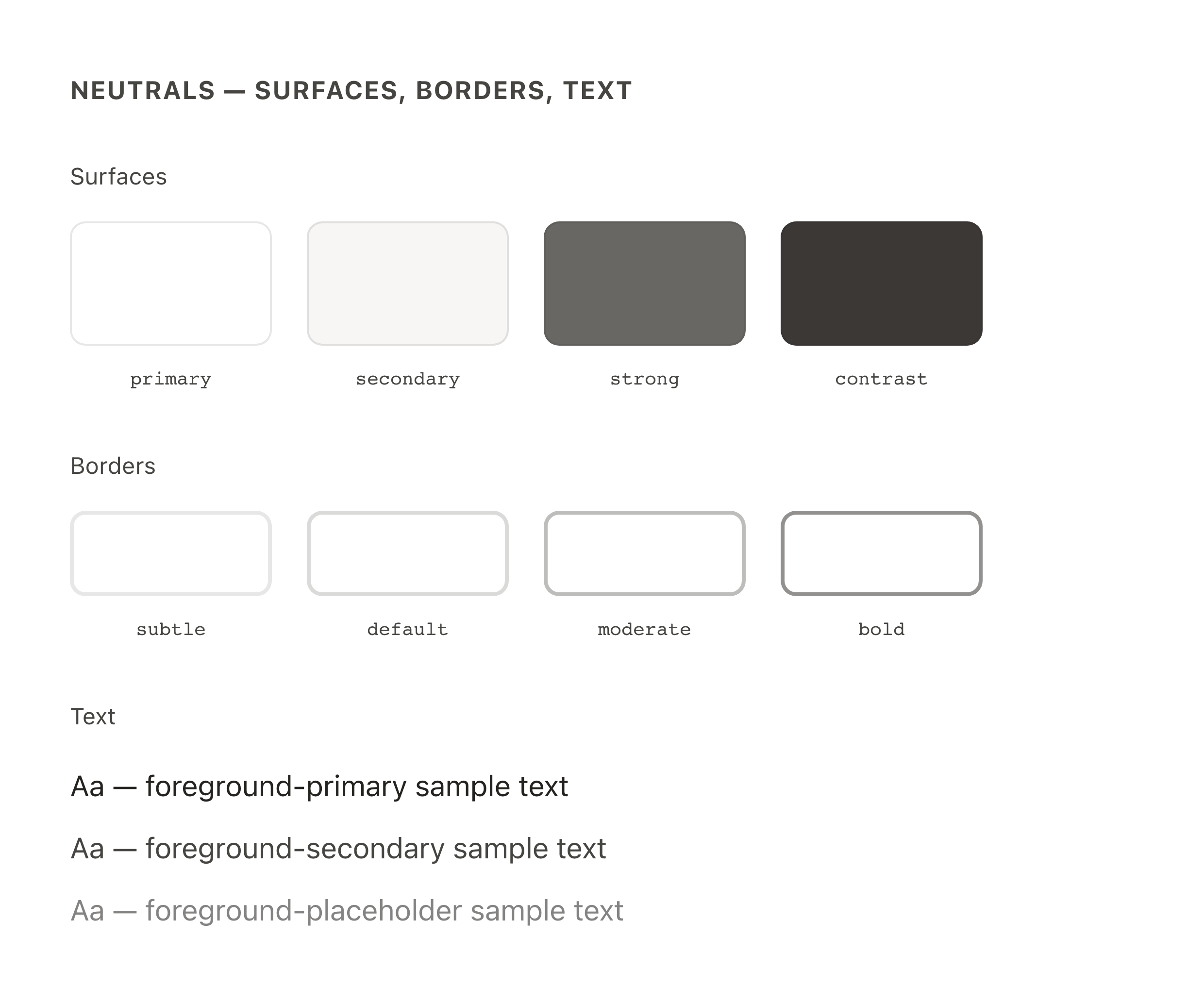
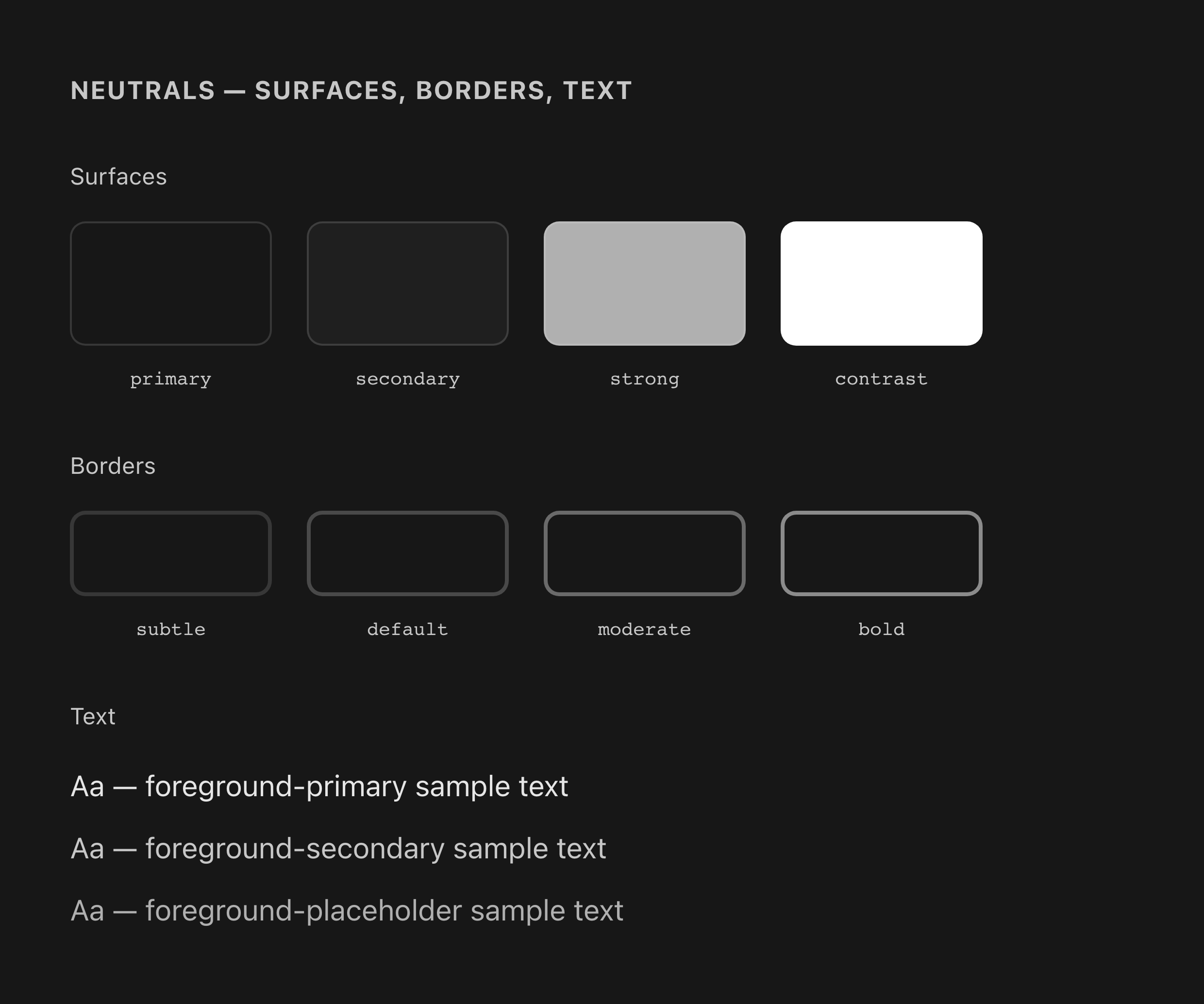
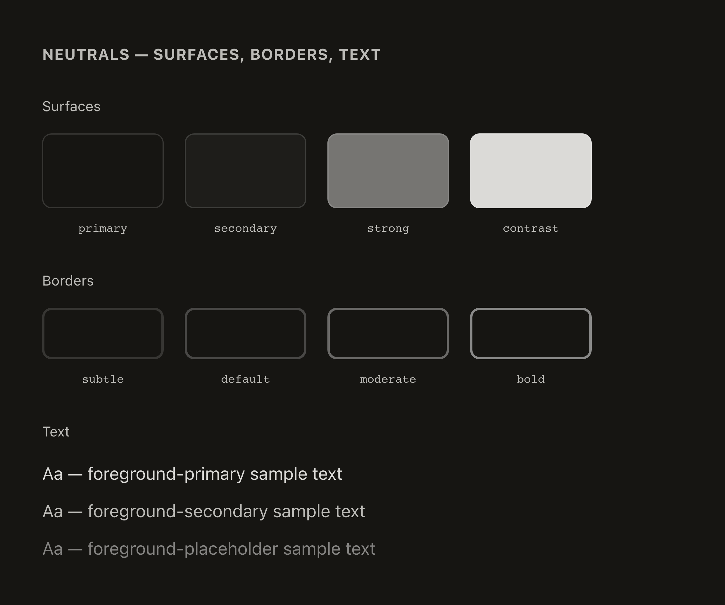
Expect: the whole UI feels slightly warmer/creamier. A surface that changes hue entirely (e.g. gray to blue) is not part of this.
Base colors were re-tuned, not just renamed
Blues rotate toward indigo, greens move from lime toward emerald, warning golds get warmer and deeper. Brand purple buttons and critical reds were deliberately kept visually stable.
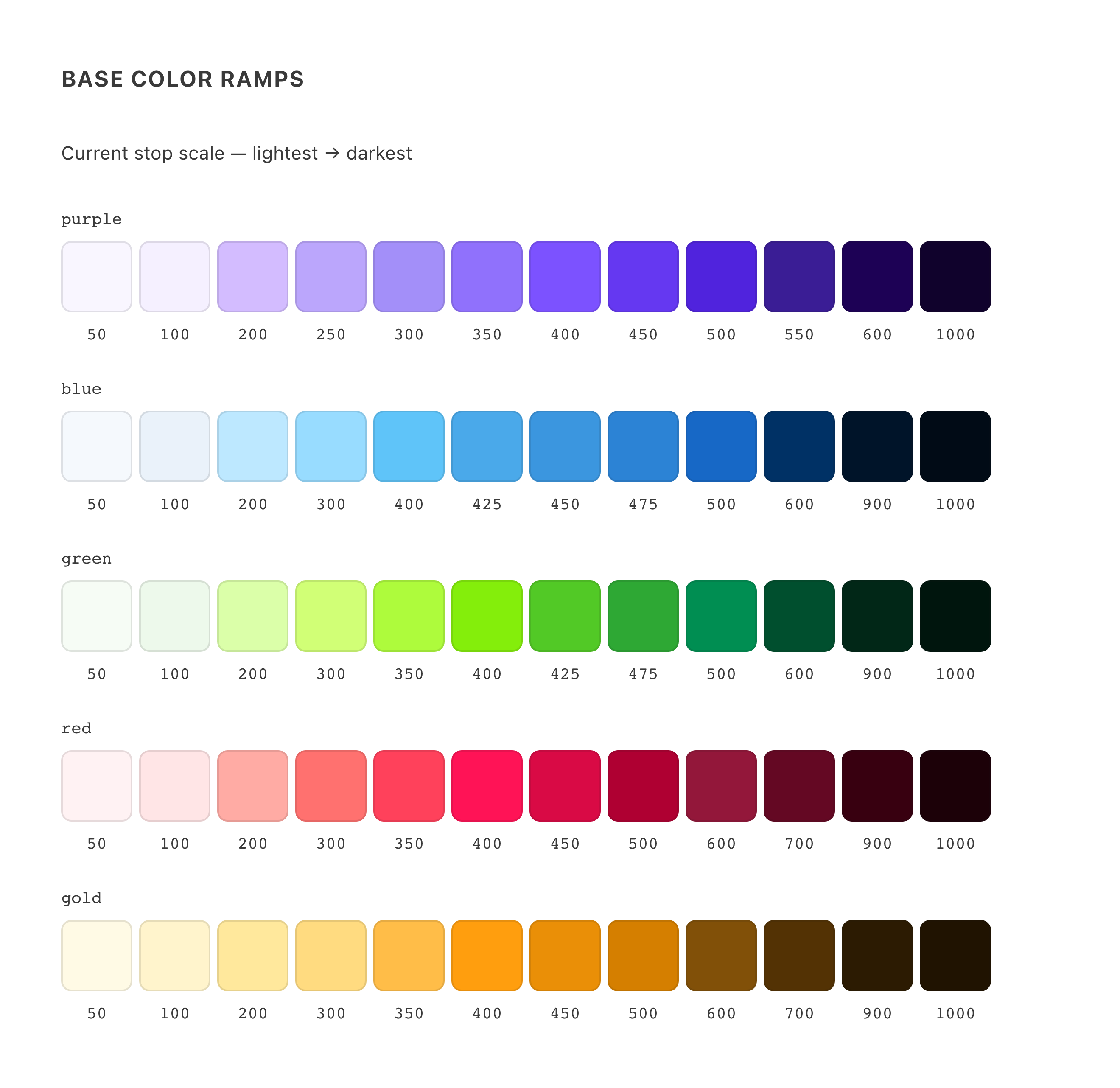
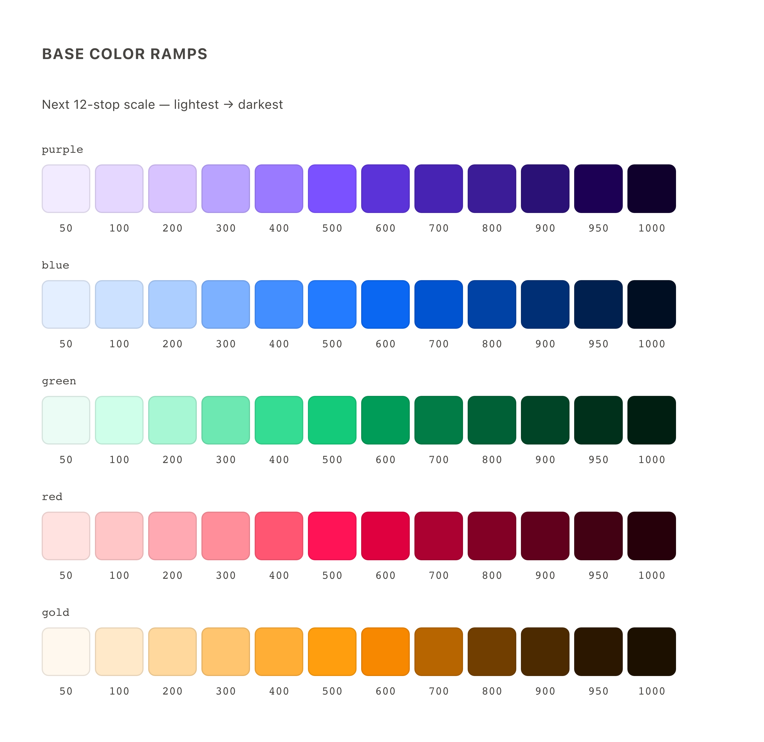
Expect: charts, tags, and accents using base colors look slightly different by design. Status colors also shift: positives are mintier, warnings warmer, dark-mode criticals softer. An element that loses its color entirely (transparent, or inheriting a parent color) is a bug; see problems.
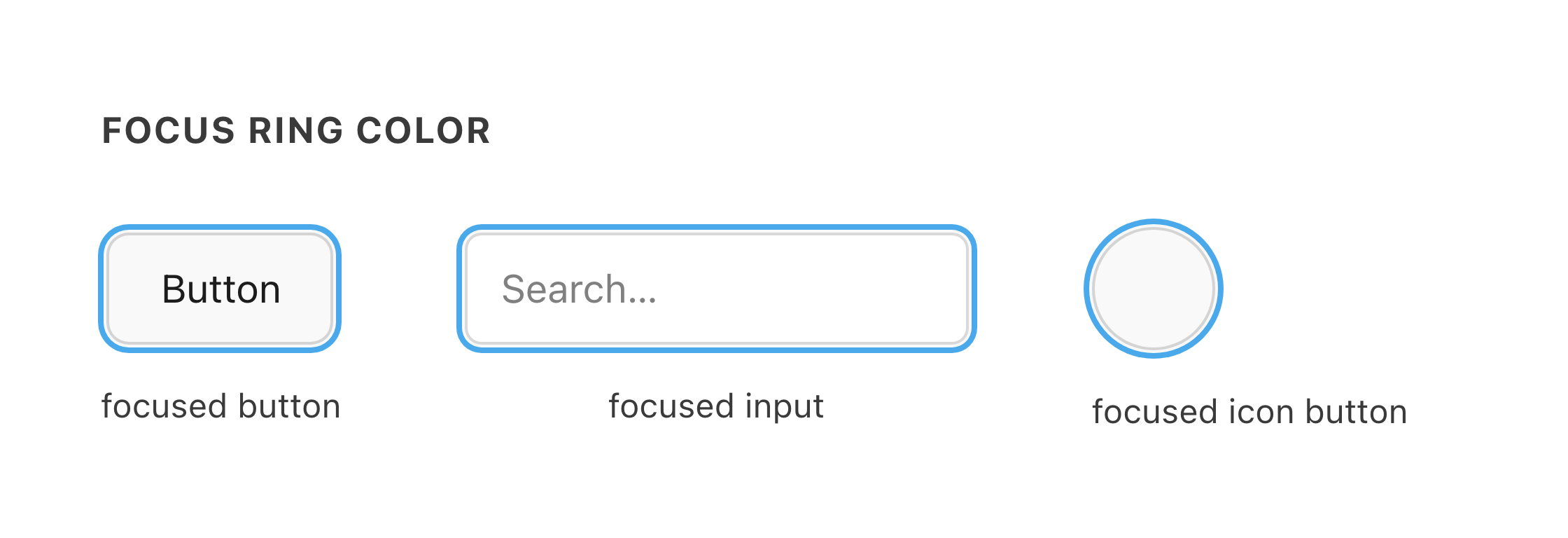
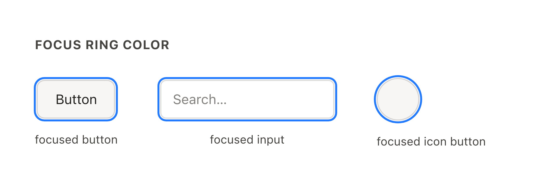
Focus rings are a deeper blue
Every focused control shows a more saturated, slightly darker blue ring, in both modes.
Layered components sit on a new overlay surface
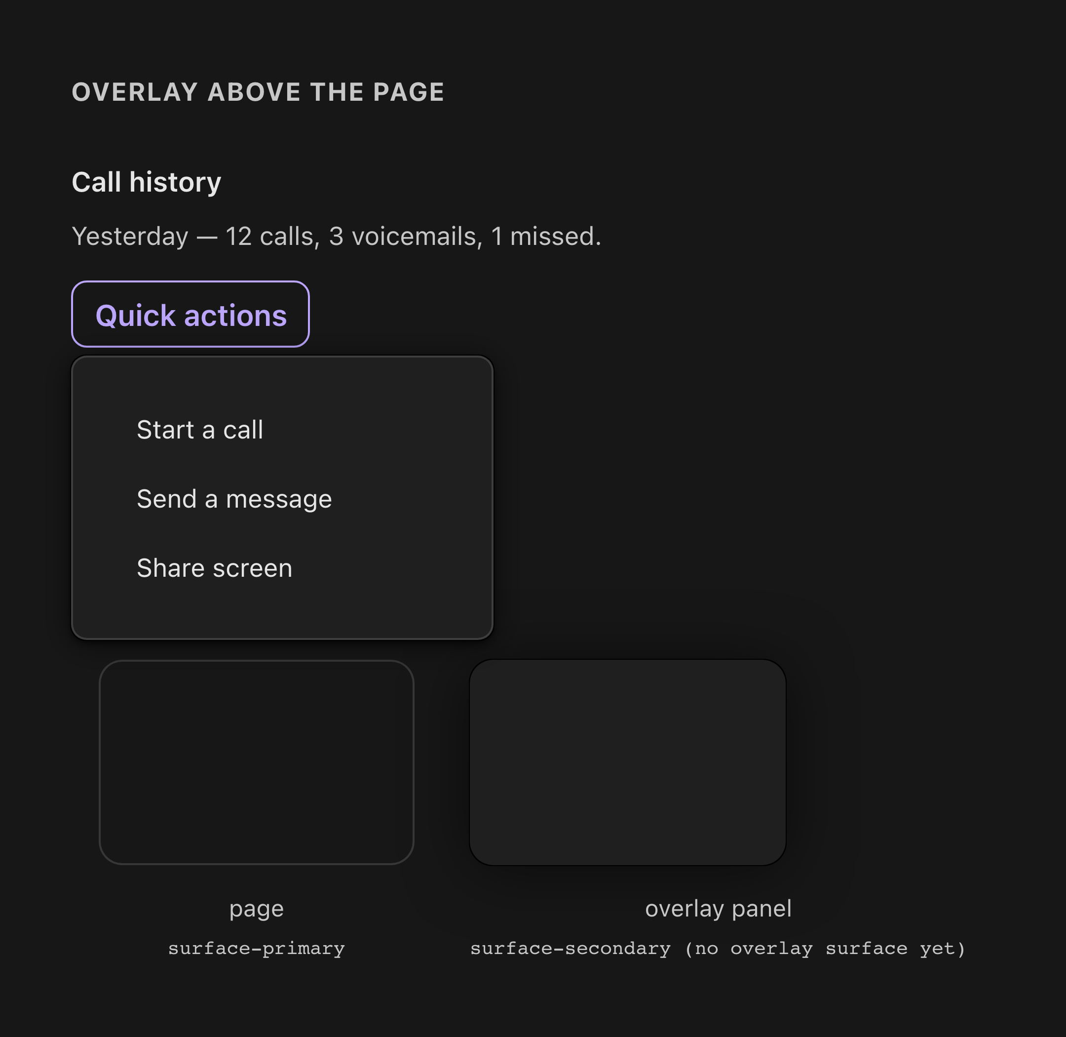
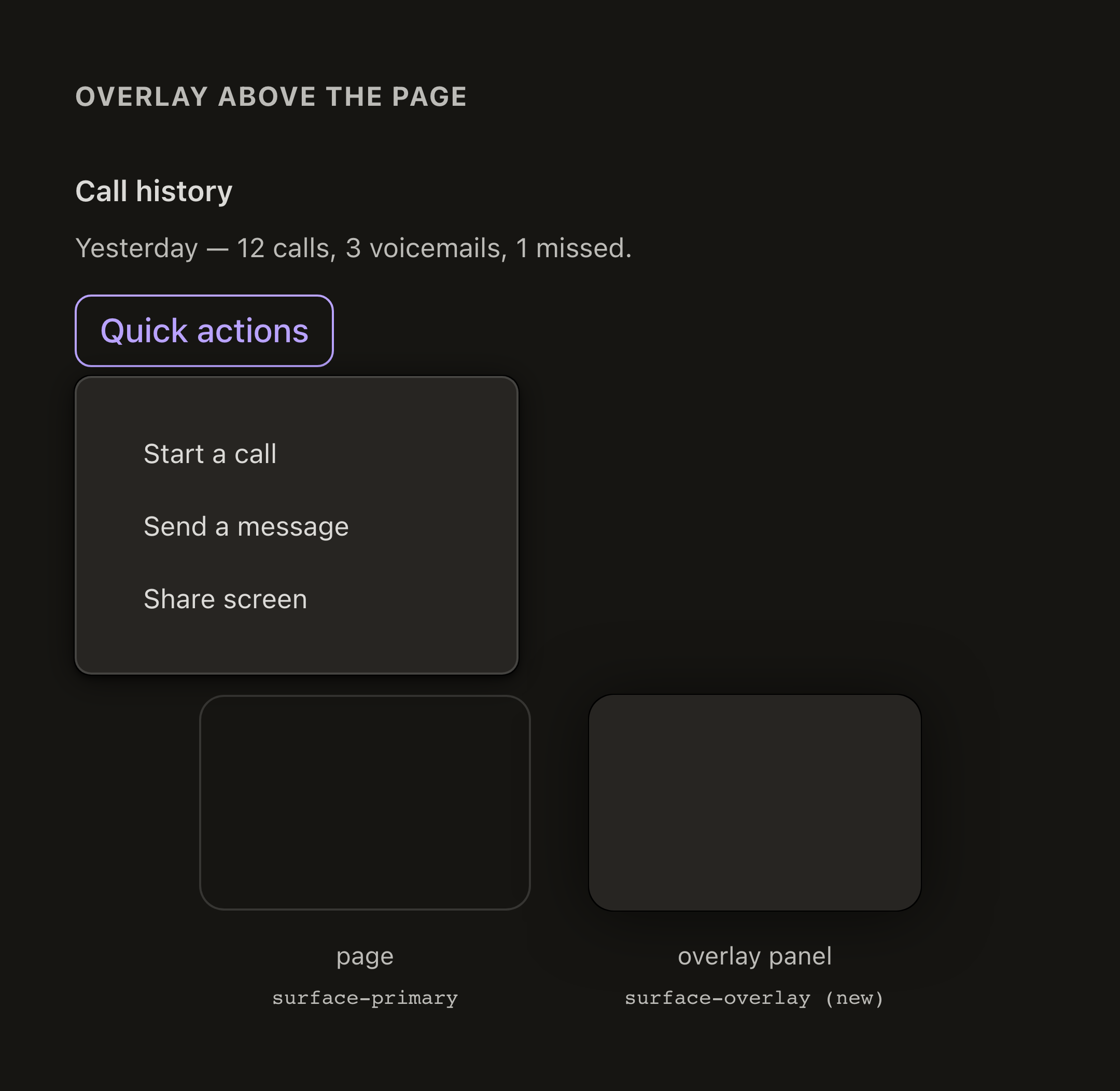
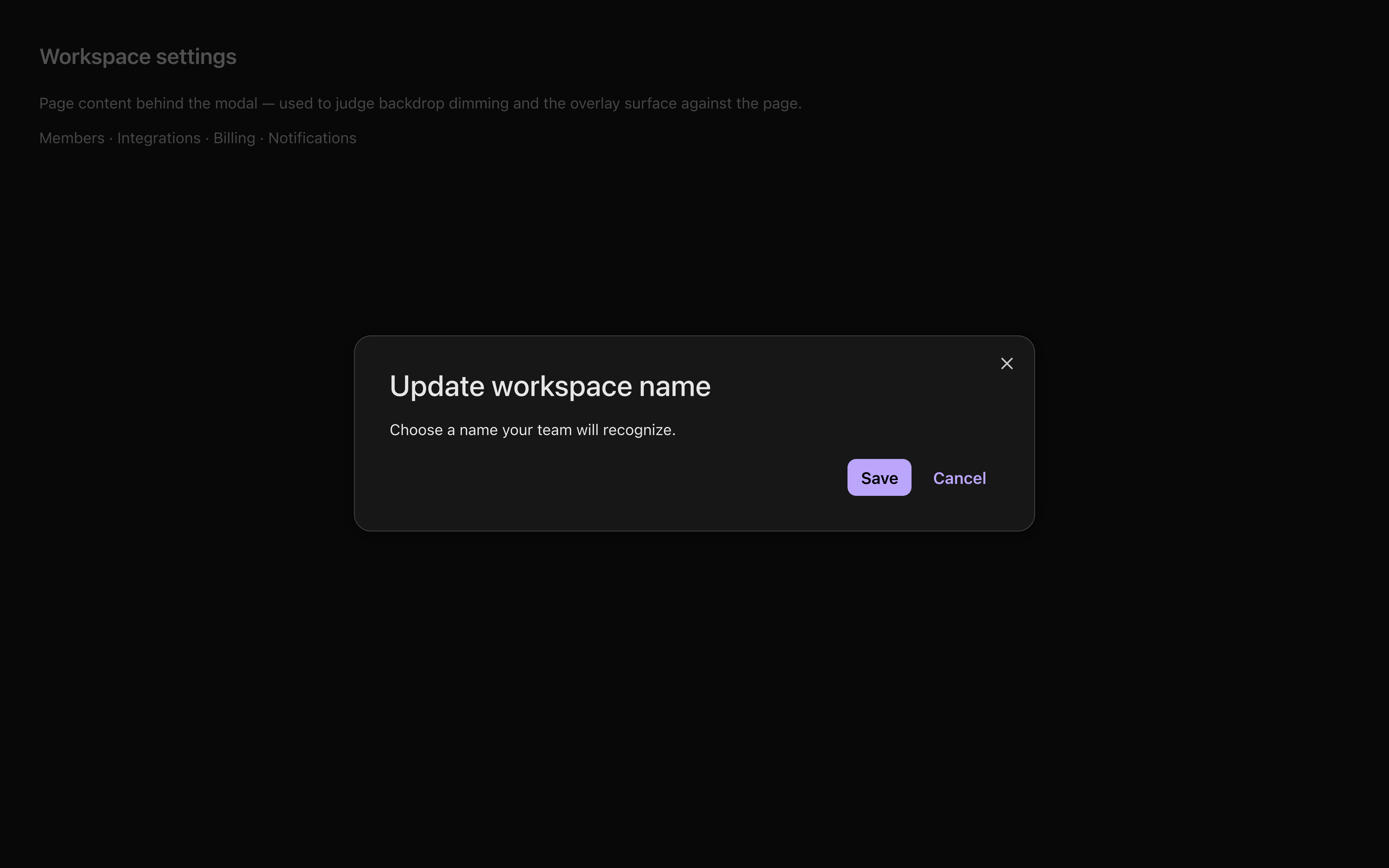
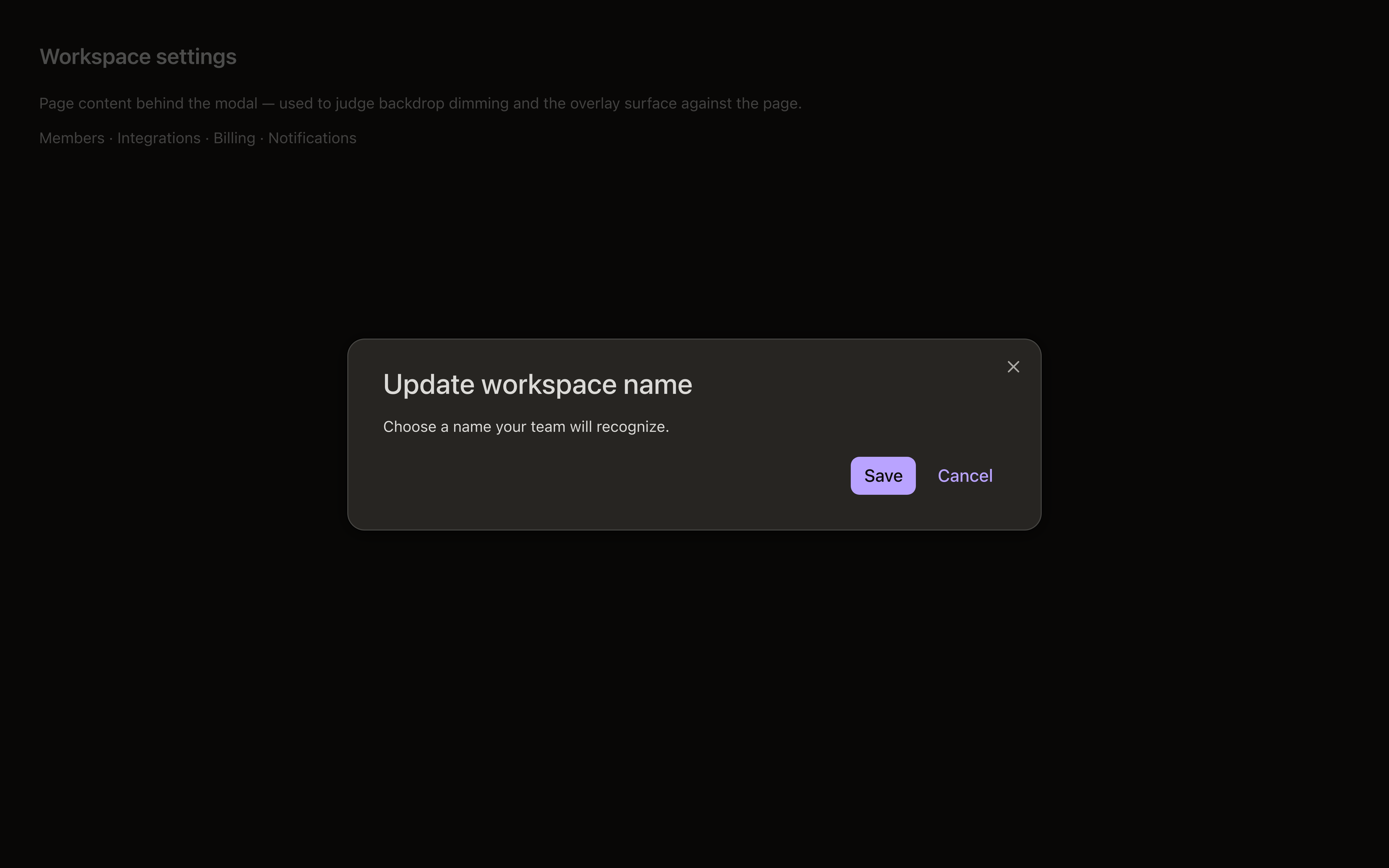
Next introduces an overlay surface color that did not exist before, and layered components (Popover, Dropdown, Hovercard, Modal, menus, toasts) now render on it. Nothing changes in product code. The point is depth: the layered element reads as nearer than the page behind it. In light mode the difference is barely perceptible; in dark mode the overlay is clearly lighter than the page. This is the single most-reported "looks like a bug" change.
Disabled controls change their translucency treatment
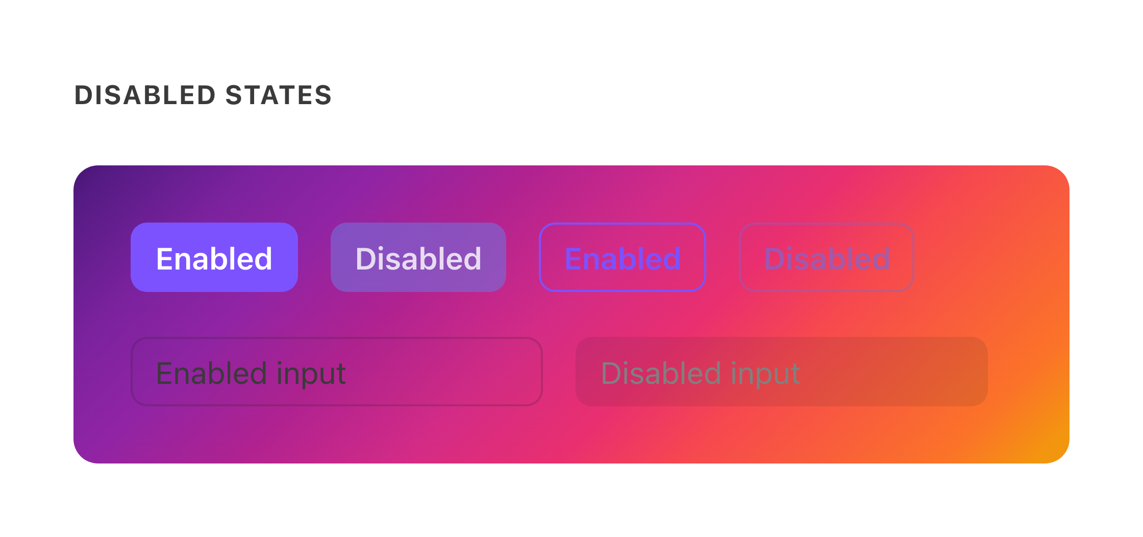
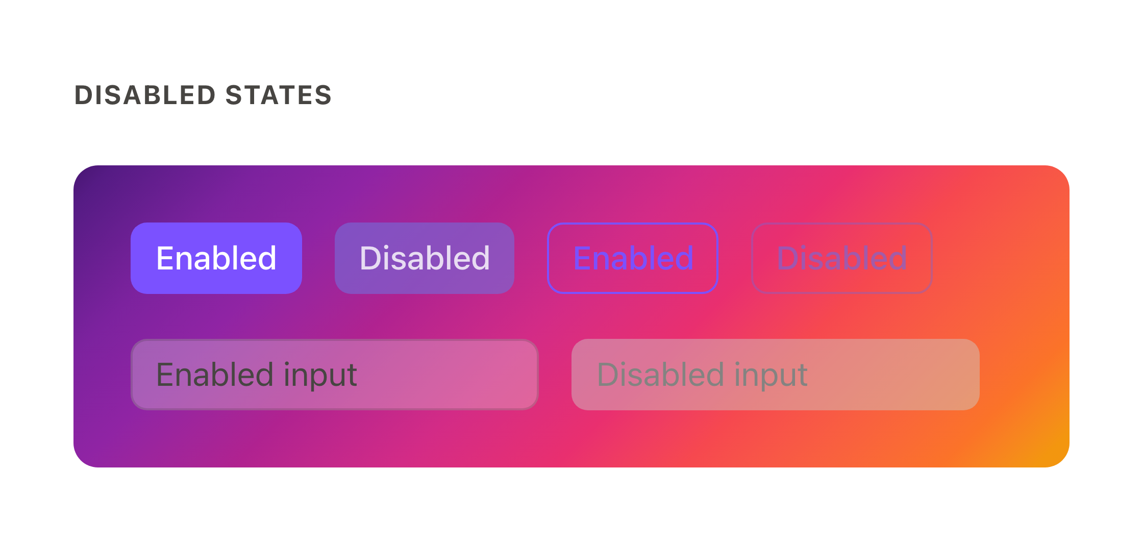
Disabled controls let the background show through on both versions. The pair below renders on Dialtone's AI-surface gradient (identical on both sides) so the translucency is easy to see. What changes in Next: the fade is now a desaturating color-mix rather than a plain opacity drop, so disabled fills read lighter and grayer, and input surfaces shift from fully transparent to a frosted translucent white.
A few fixed sizes move by 4–16px
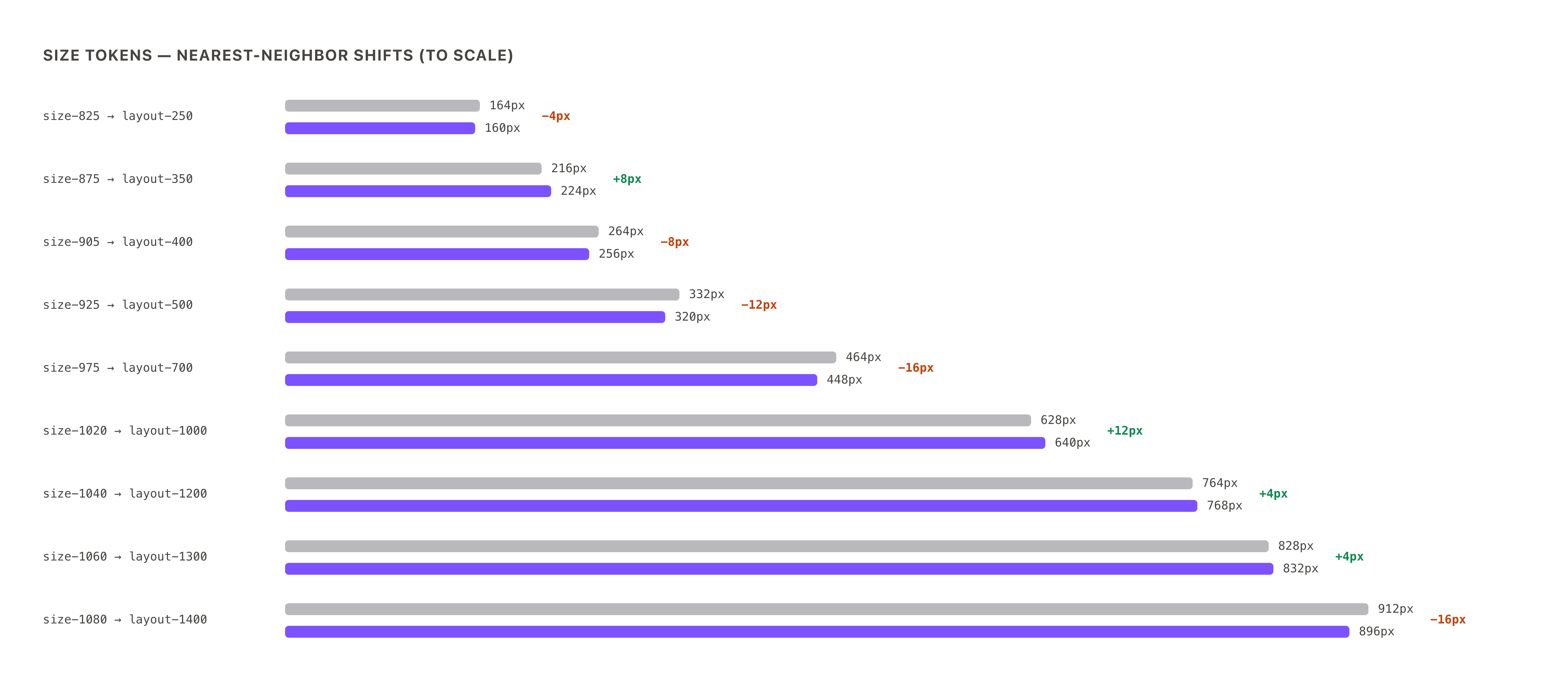
Nine legacy size tokens have no exact match in the new layout scale, so when a surface is migrated its fixed dimensions shift to the nearest stop: sidebars, panels, and modals move by 4–16px (old size in gray, new in purple, to scale below). These small moves are sanctioned; see the full table for every mapping. Un-migrated code keeps rendering the old sizes (the deprecated tokens still resolve for now), so this shift marks migrated surfaces, not broken ones.
Redesigned components
These components changed on purpose (each links to its engineering guide where one exists).
Avatars
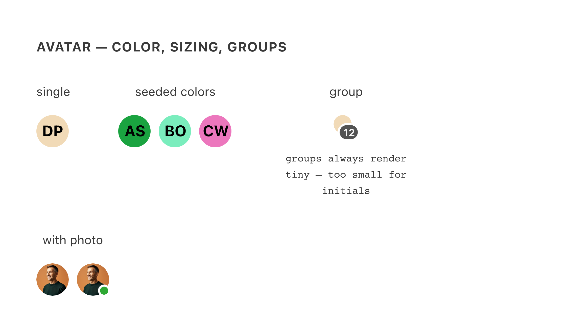
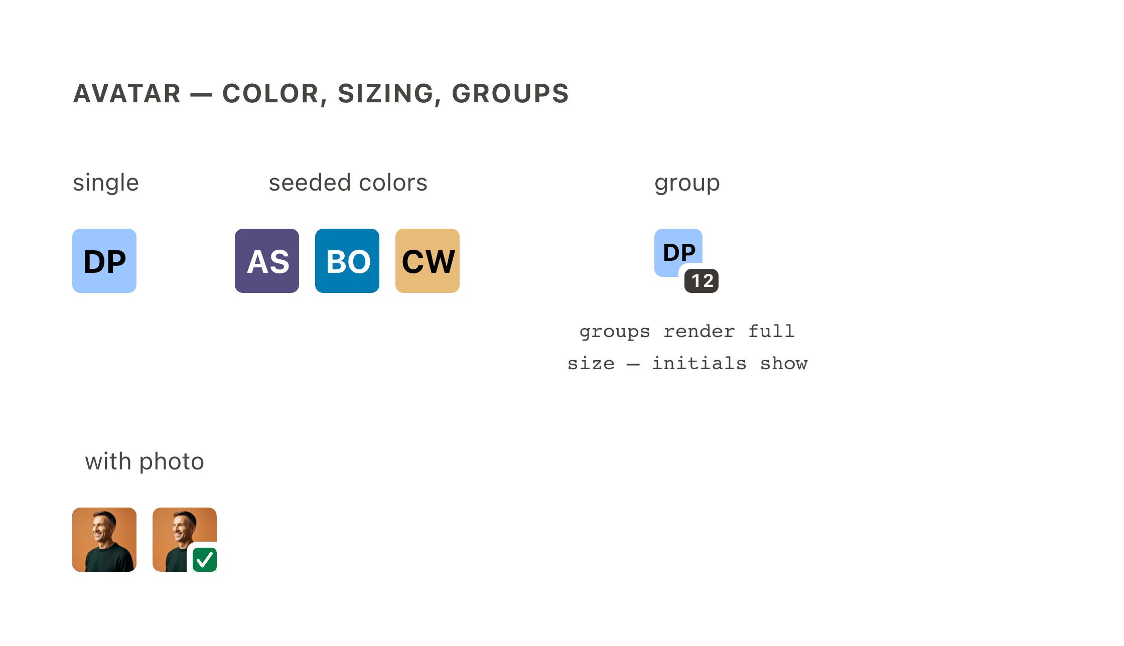
Redesigned color system (12 hue families, deterministically assigned per person), and group avatars now render at full size. Current Dialtone always draws group avatars at the smallest size, and avatars that small never show initials. If you can read initials on a group avatar, that's Next working as intended, not a bug (guide). Photo avatars keep their crop; presence indicators move to the new squircle shapes.
Buttons
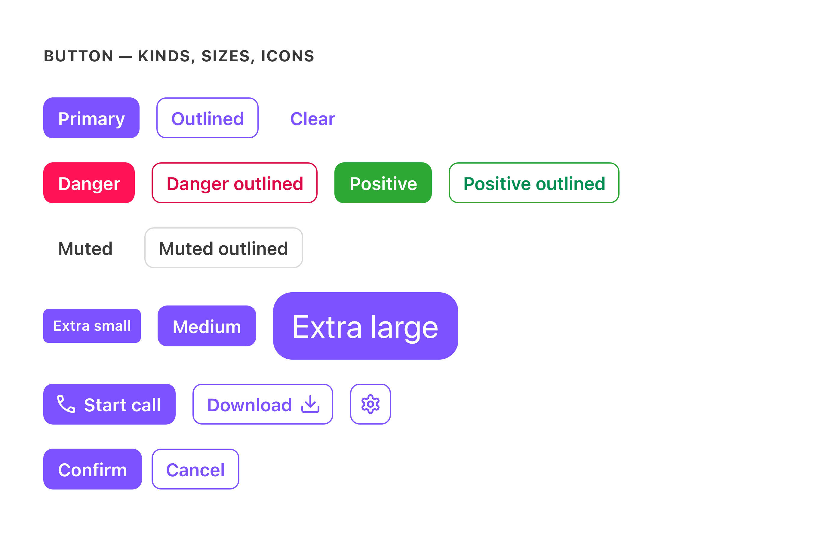
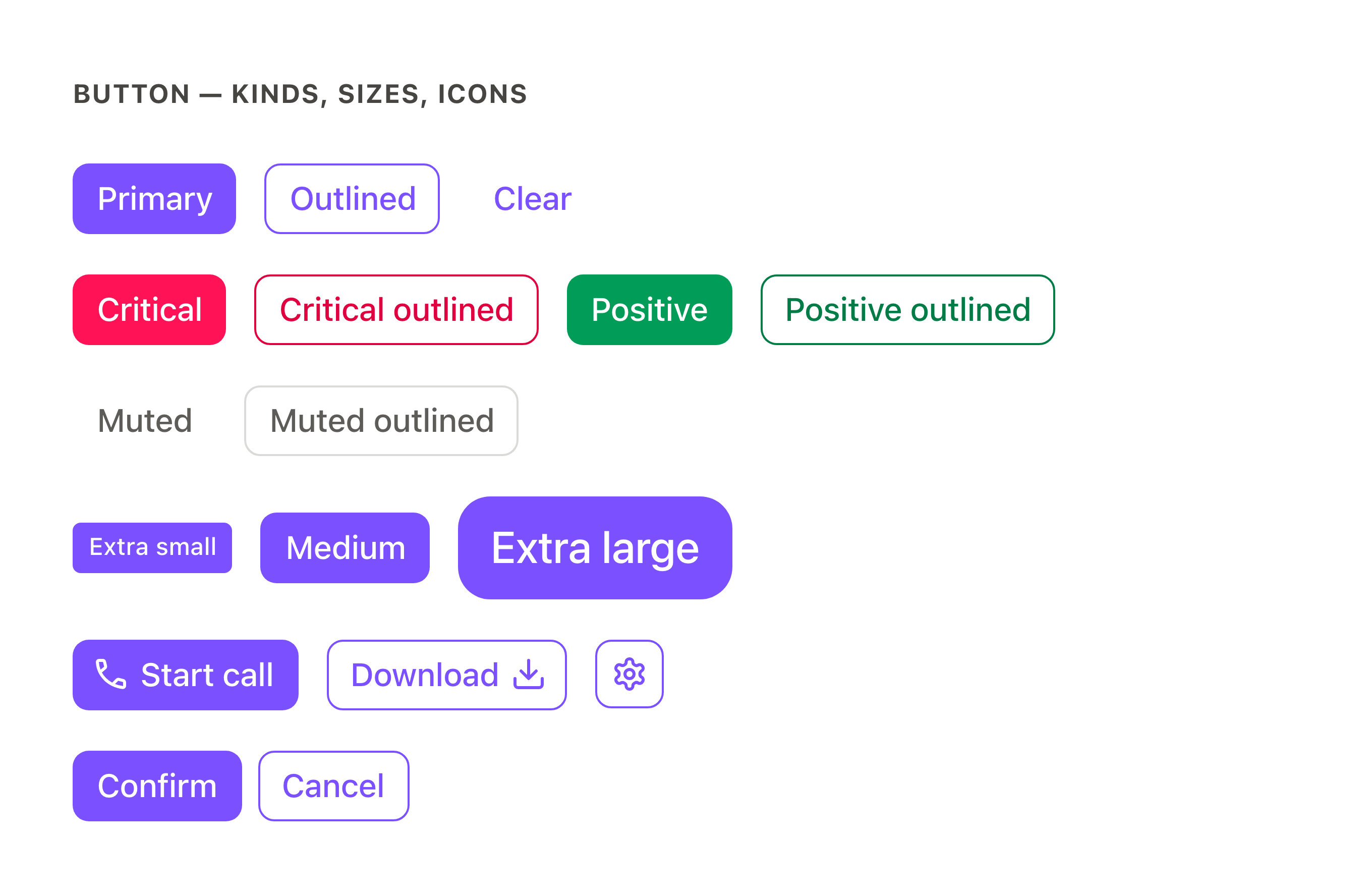
Squarer corners (8px→6px radius), label weight drops from semibold to medium, adjusted label sizes, softer outlined borders, and slightly darker primary hover/active states. The restyle applies across every kind, size, and icon placement. The pair below covers the severity kinds (the destructive kind is also renamed: danger is now critical), the muted treatment, three sizes, and start/end/icon-only placements.
Grouped buttons pick up the same restyle and gain built-in spacing. Current Dialtone's button group has no gap of its own, so products added their own spacing. The Confirm/Cancel row below normalizes that spacing to make the chrome changes comparable.
Paired controls stay aligned
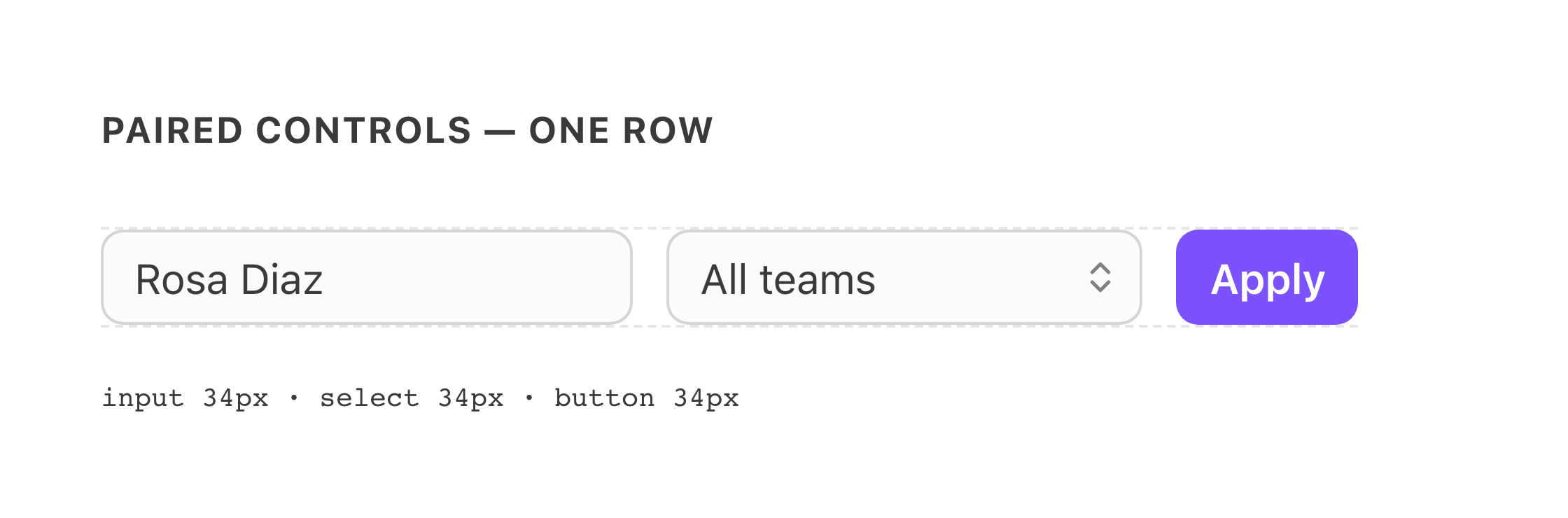
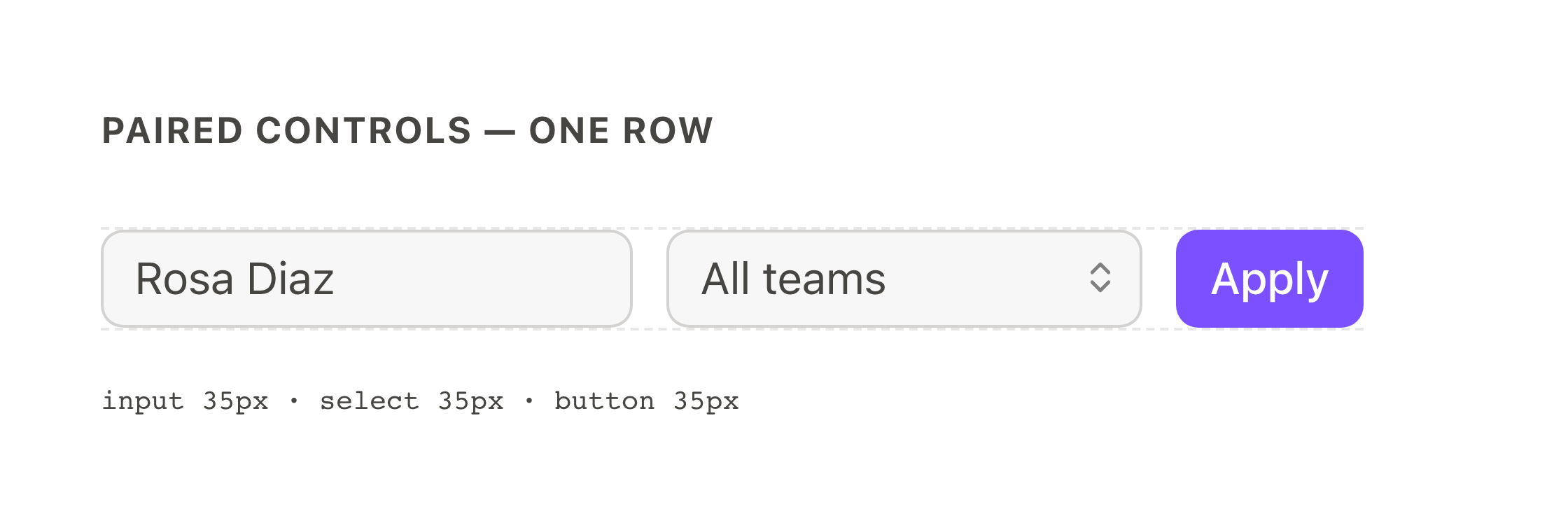
The pass that restyled buttons also covered the form controls that sit next to them: DtInput and DtSelectMenu were updated in step, and all three keep matching heights at matching sizes. The form-field update is quieter than the button restyle: text set with the new type scale, a one-pixel height gain, and input surfaces that go from fully transparent to a frosted translucent white (invisible over white backgrounds, visible over color). The pair below measures a mixed row, with heights printed in-image: every control gains one pixel, and within each row the numbers stay equal. A migrated row where one control stands taller than its neighbors is a bug, usually a size prop that missed the numeric-size migration.
Tabs
Selected/hover colors are re-mapped, and the selected-tab indicator now slides between tabs instead of jumping. The animation isn't visible in a static image; watch for it in the product.


Chips and badges
DtChip and DtBadge are still being restyled; what renders on Next today is not the final treatment, so this guide doesn't picture them yet. A dedicated section will land here once the new styling ships. One behavior change already applies: display-only chips no longer react to hover or show a pointer cursor, and only chips marked :interactive="true" keep the button affordance (guide).
Inputs
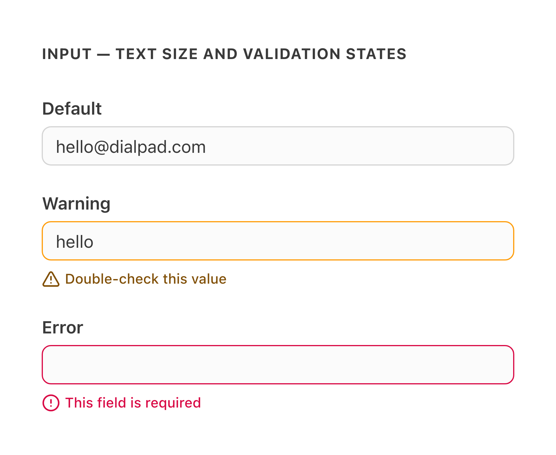
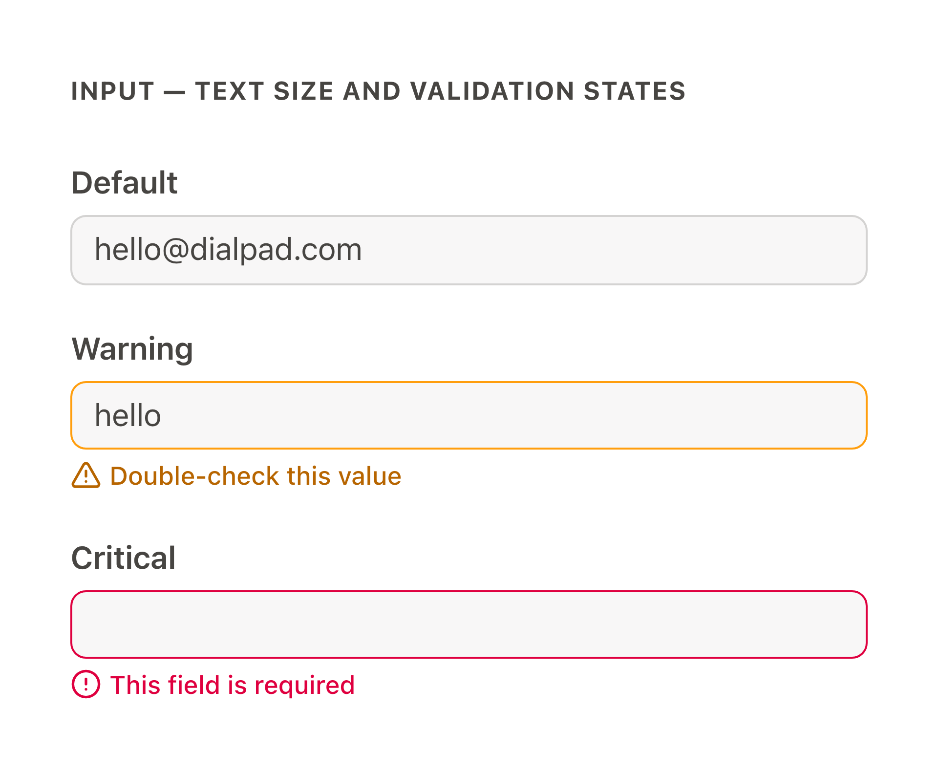
Input text grows from 12px to 14px; on dense forms that is the change you'll notice.
Validation messages
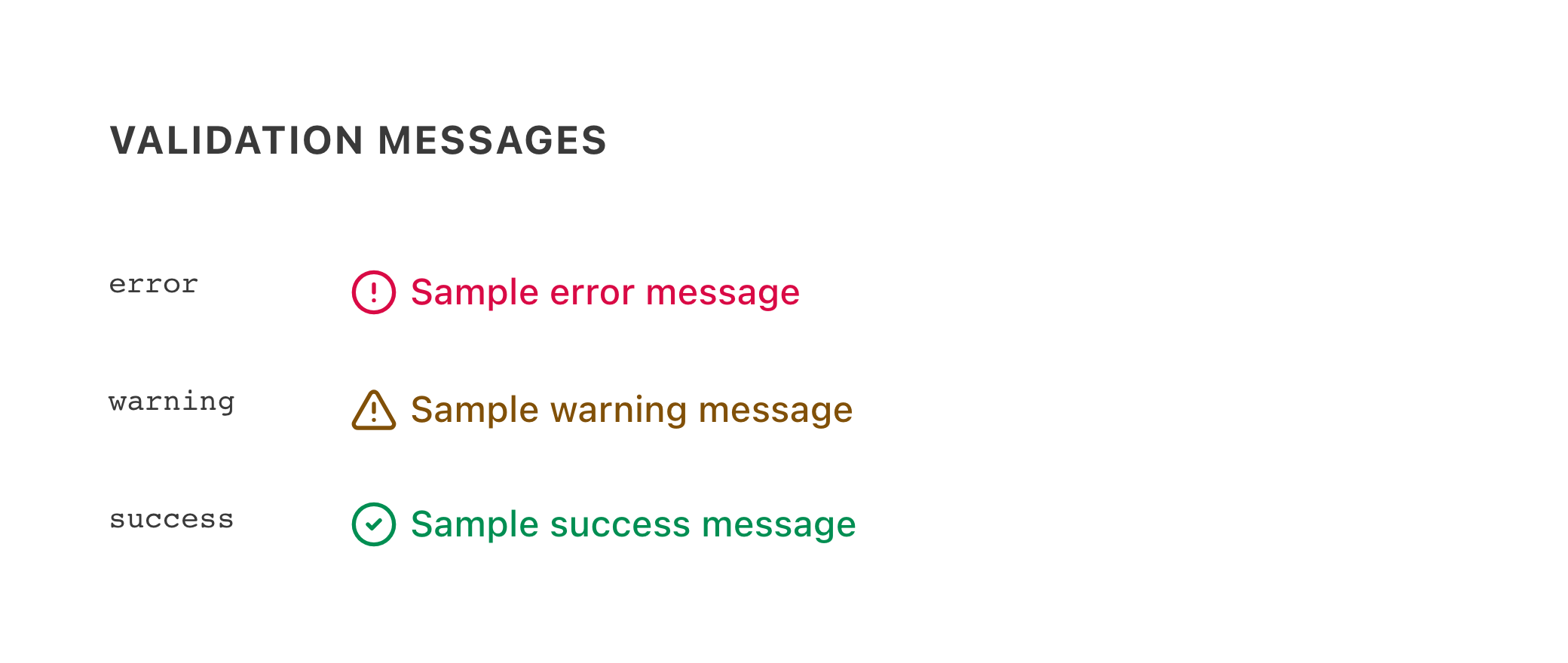
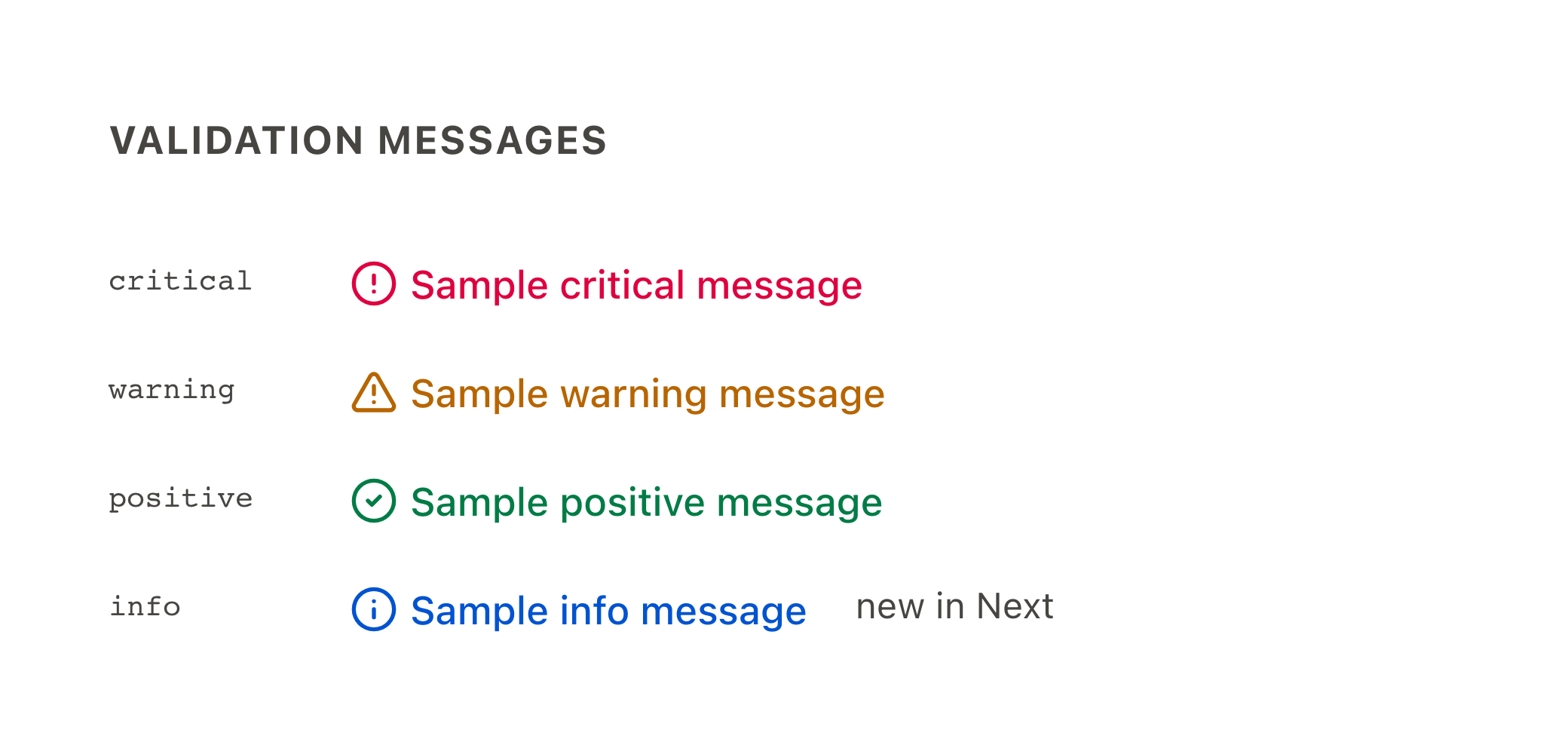
Visually, validation messages are almost unchanged: severity colors shift slightly with the re-tuned ramps, and the icons stay. Two things are new rather than restyled. The blue info variant is a new addition, with no "before" to compare against. And the severity words changed, with identical colors: error is now critical, success is now positive. Each side of the pair renders its own vocabulary.
Notices
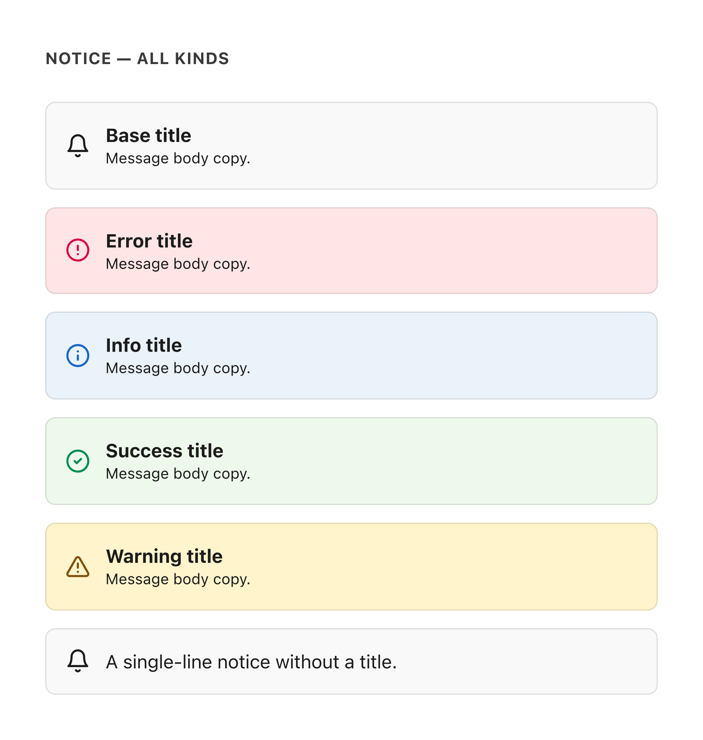
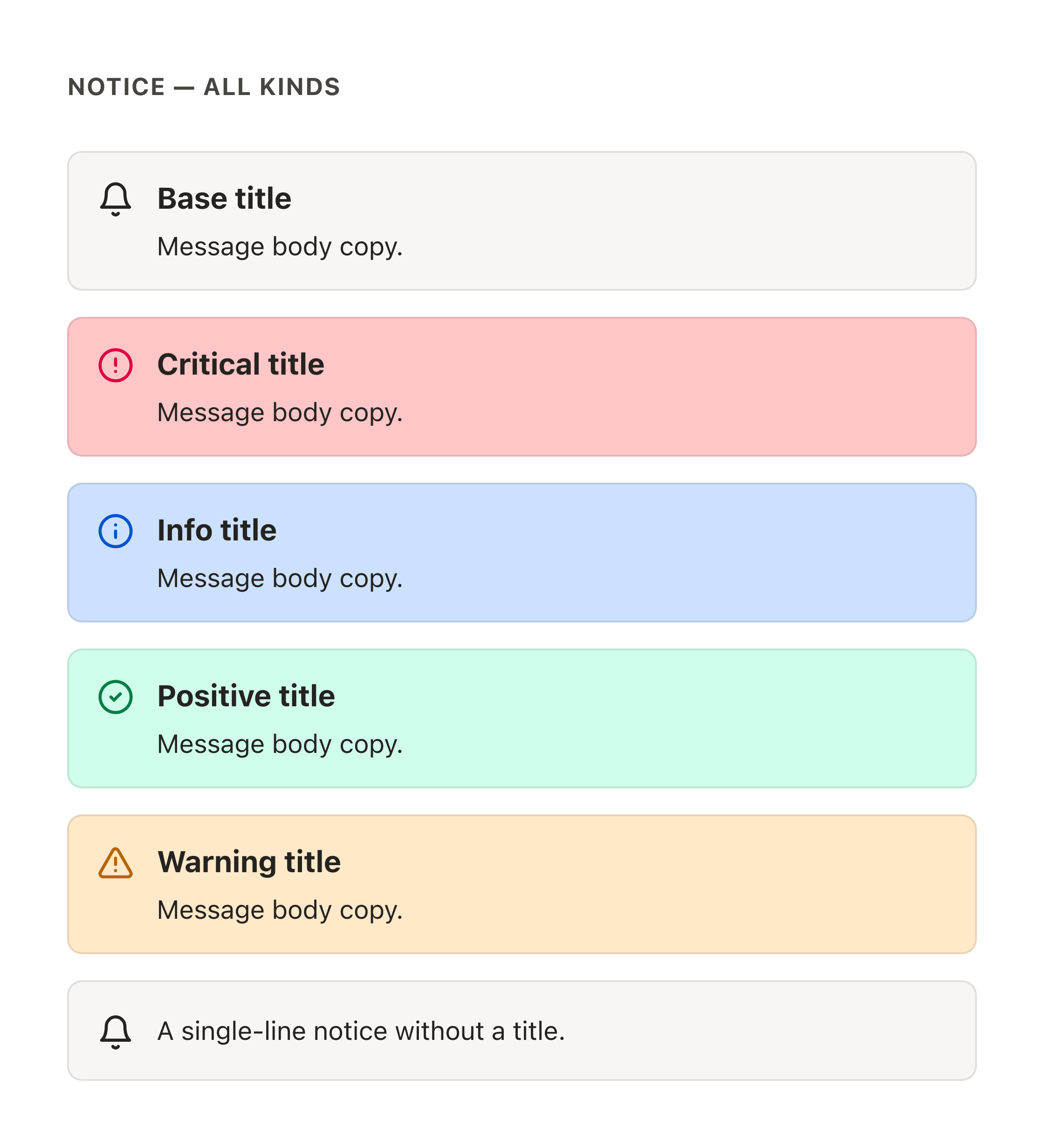
Same palette intent, refreshed typography. The pair below renders identical copy on both sides (with and without a title line) so the type and tint changes are the only differences. Two kind names also changed, with identical colors: success is now positive and error is now critical; an unstyled gray notice in the product means an un-migrated kind name.
Banners and toasts
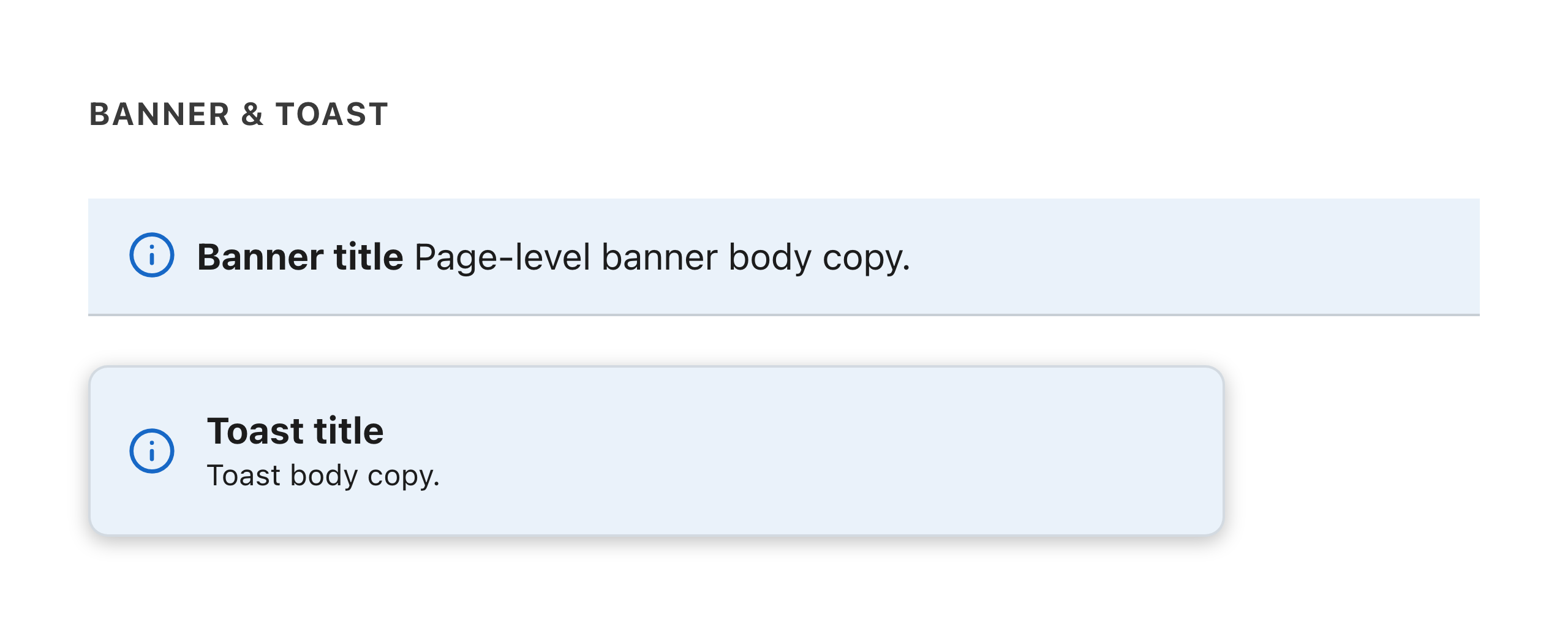
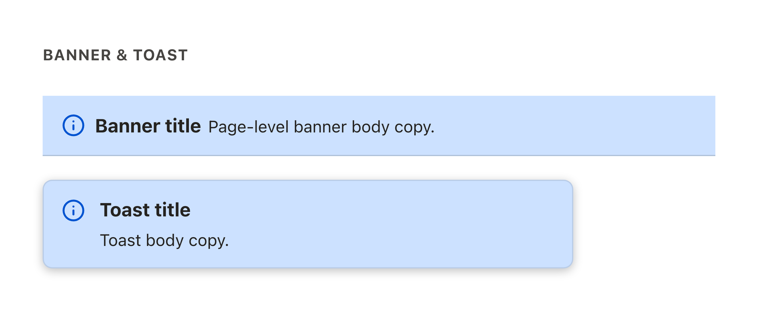
Restyled alongside notices: stronger info-blue tints, DtText typography, and toasts gain the leading kind icon and larger radius.
Empty states
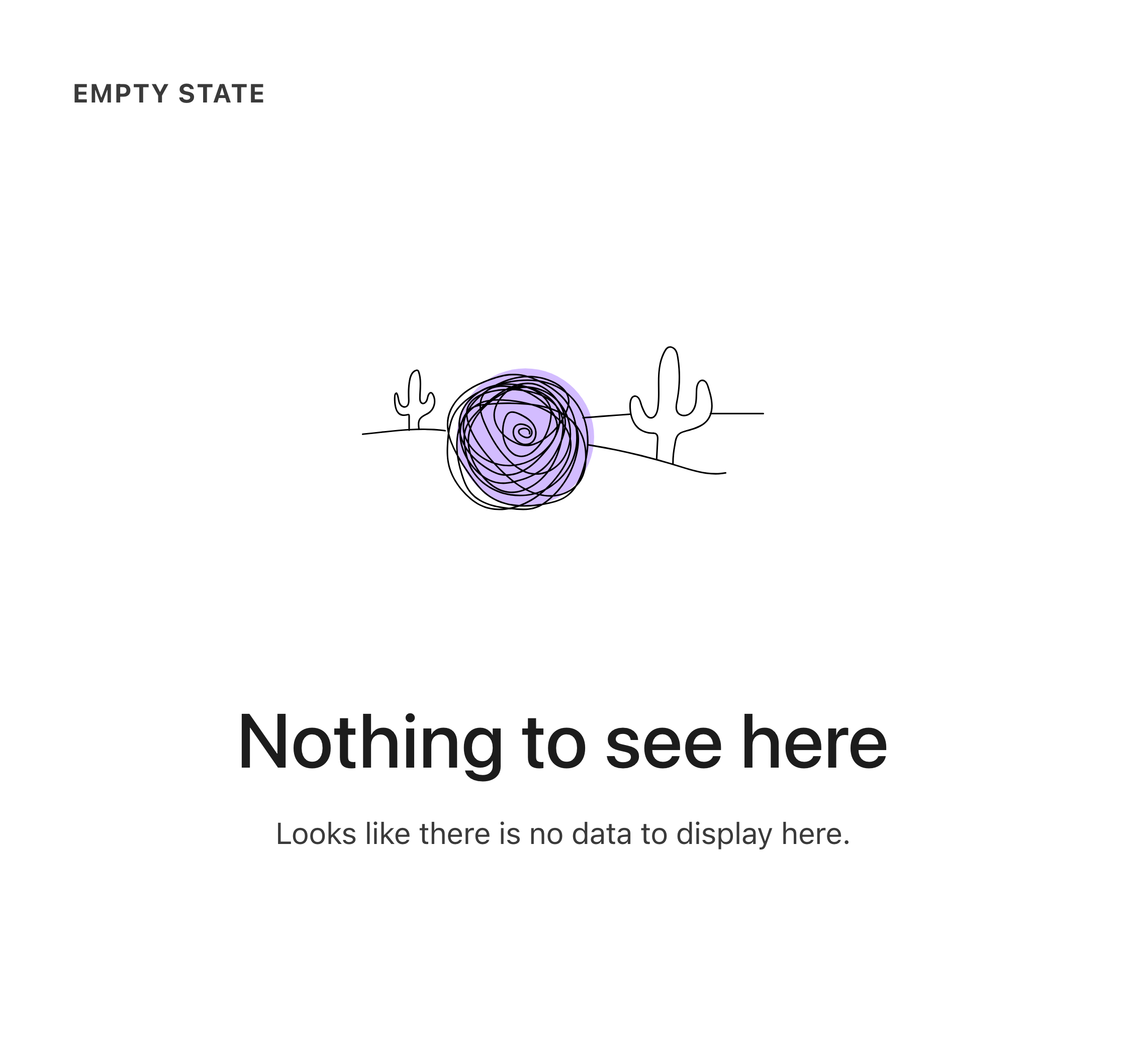
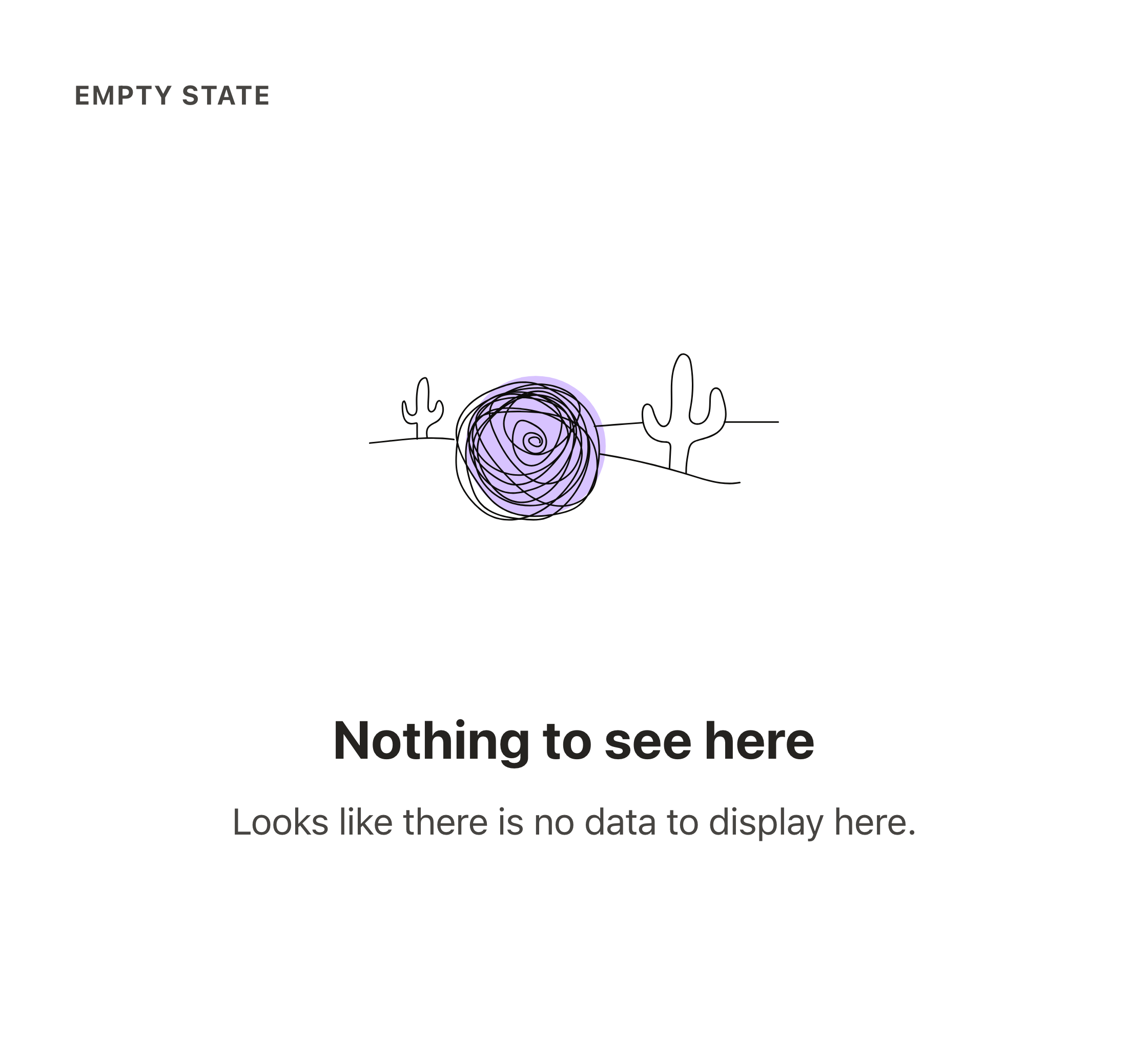
Tighter layout and headline sizes from the new type scale.
Presence
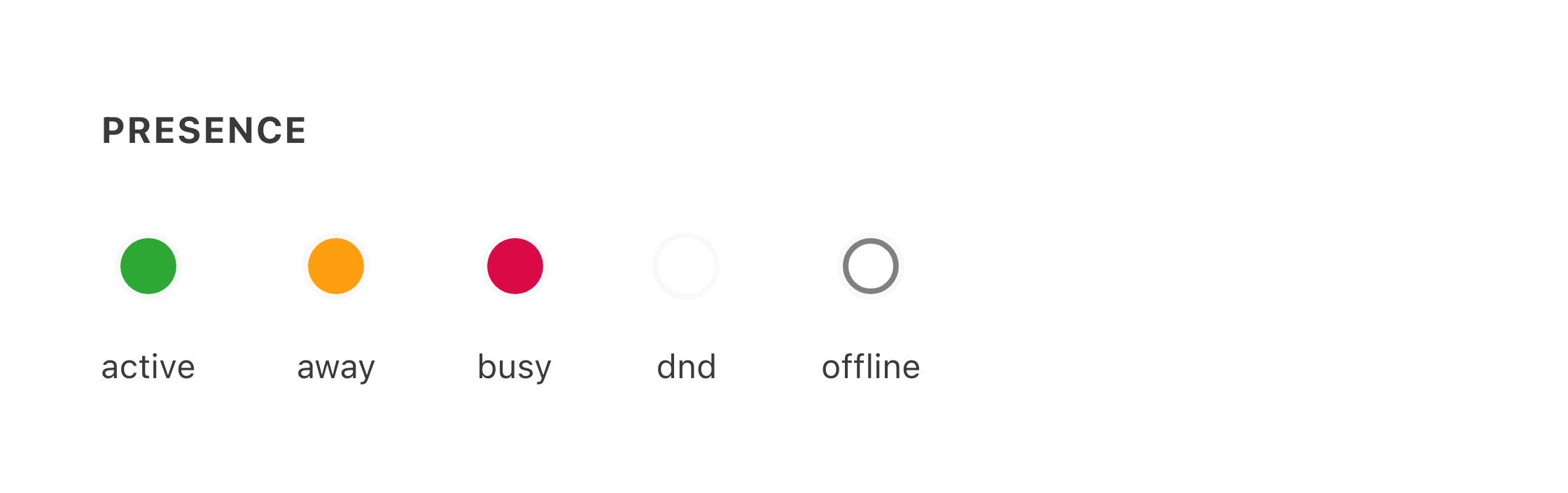
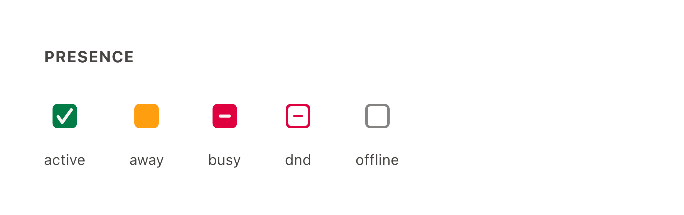
Status indicators change from color-only circles to squircles with internal shapes (check for active, dash for busy and do-not-disturb, outline for offline), so statuses are distinguishable by more than color. The dnd value is also new.
Links
Link rendering is mostly stable. Two changes matter during review.
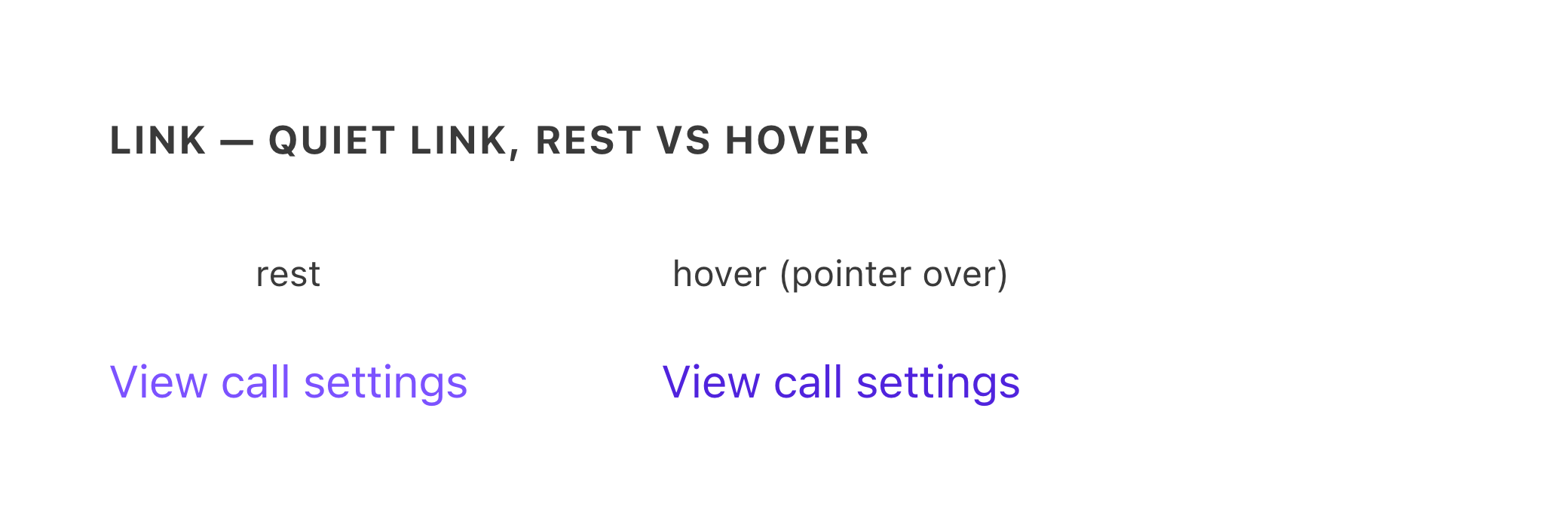
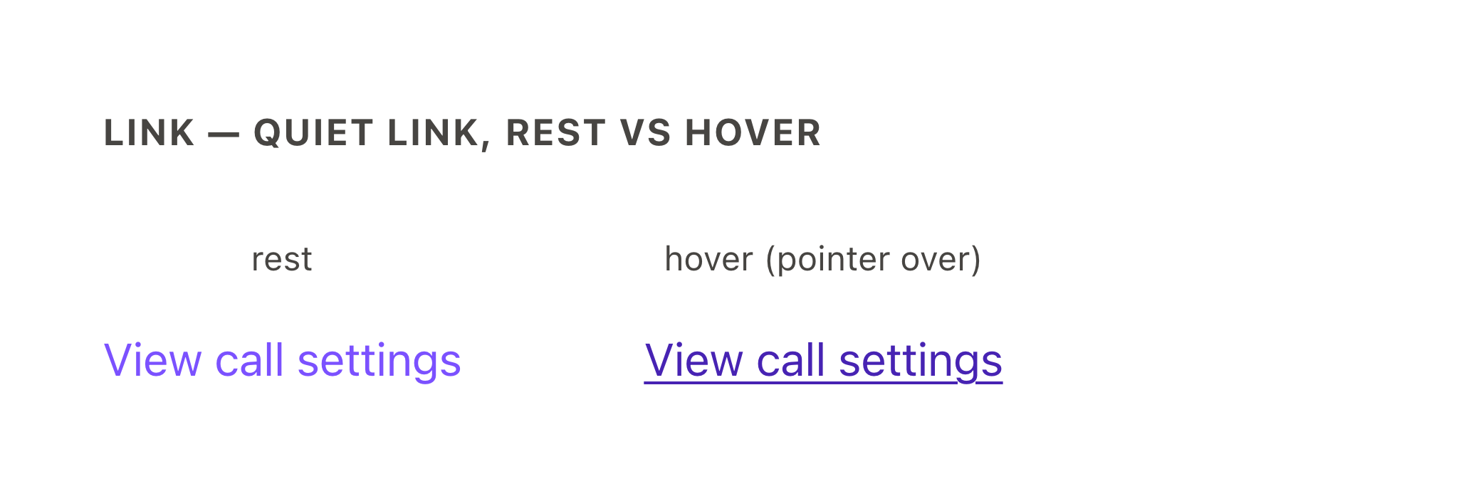
Links that hide their underline now show one on hover. Some links are styled without their usual underline: "quiet" links, done with :underline="false" on Dialtone Next (previously with utility classes like d-td-none). On current Dialtone these stay underline-free in every state; on Next, the underline appears while the pointer is over the link (guide). The right-hand link in each pair below is captured with the pointer over it; an underline appearing on hover is intentional, not a bug.
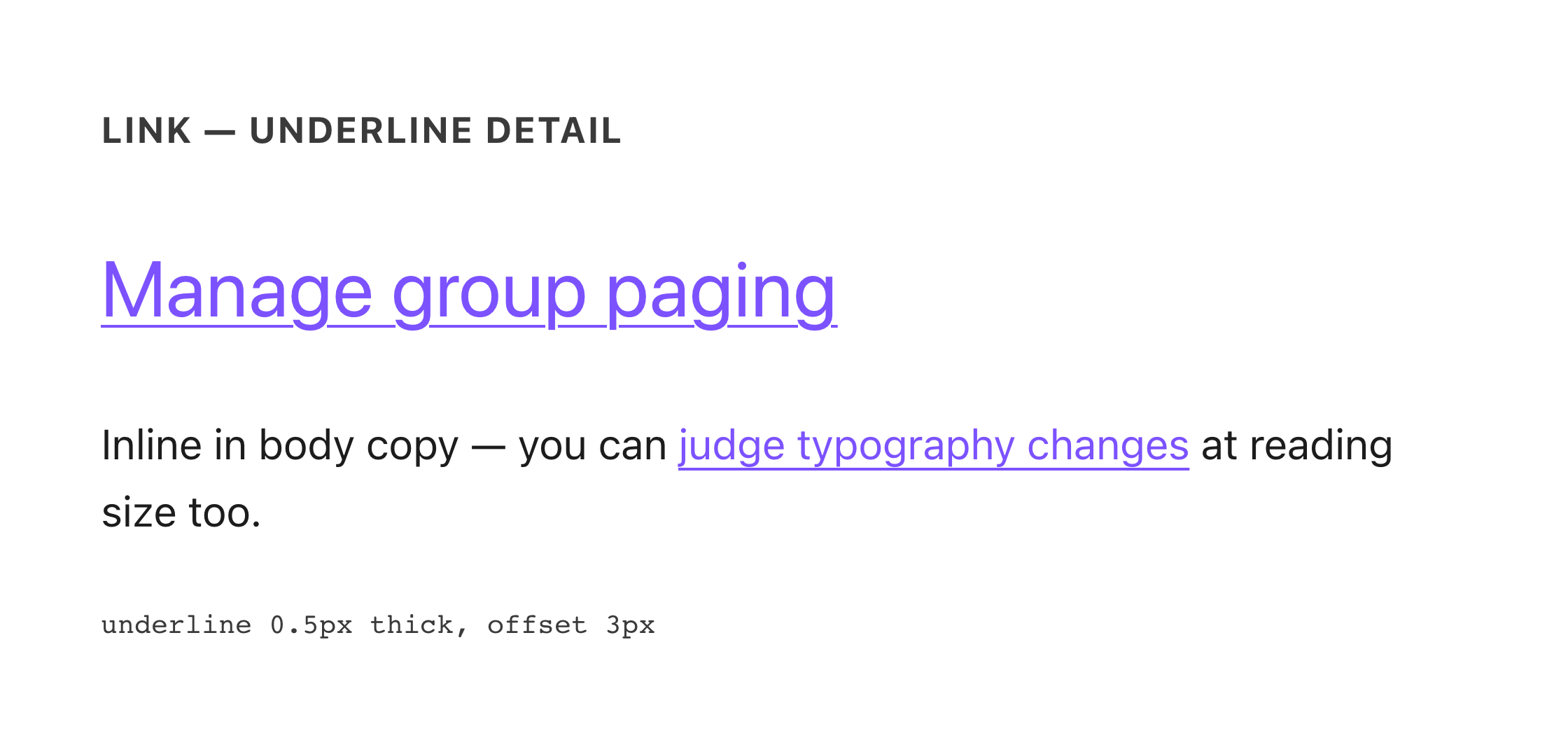
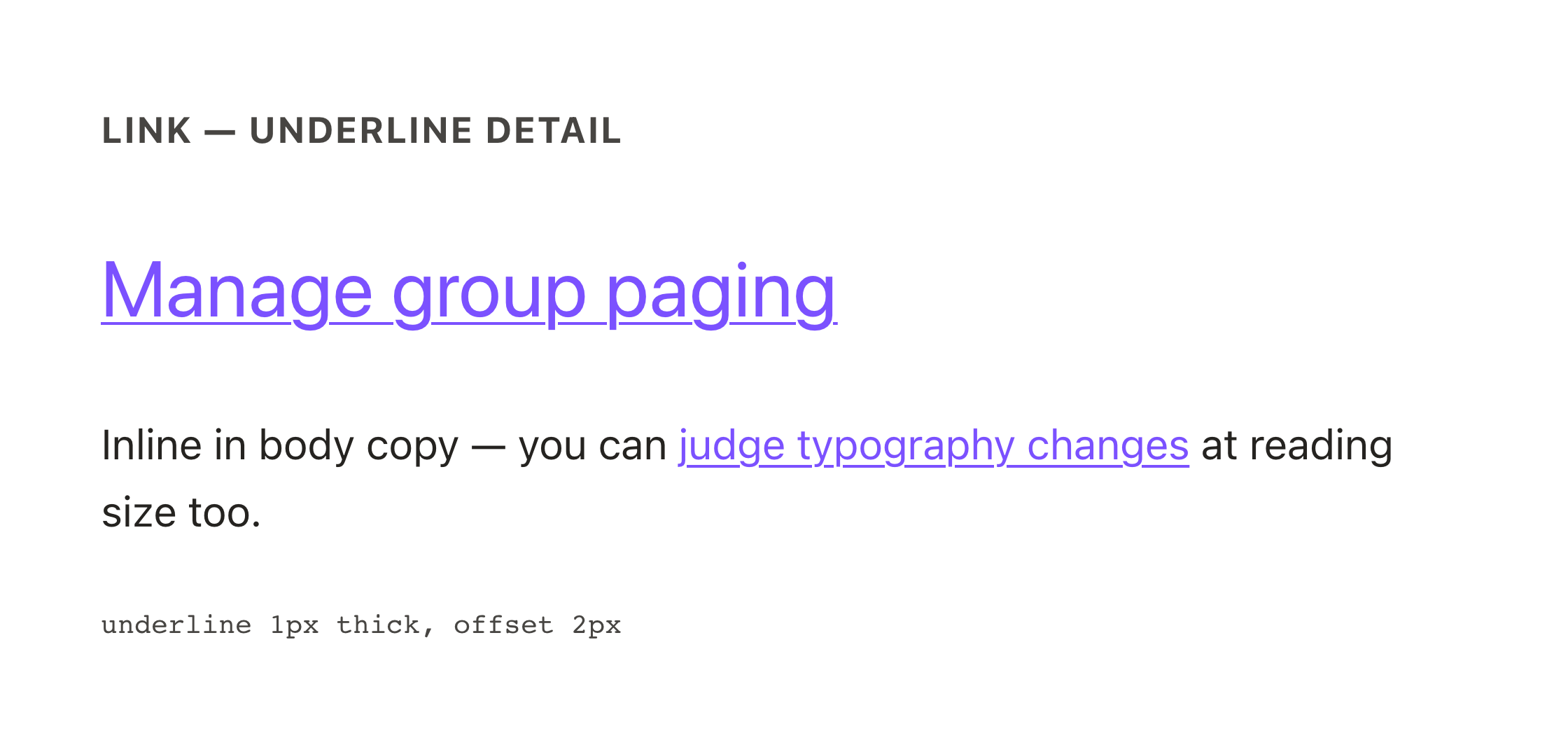
Underlines are redrawn. The line is twice as thick (0.5px → 1px) and sits closer to the text (3px → 2px below the baseline). Because it sits closer, it now overlaps the space descenders occupy, and the browser breaks the line around letters like g, j, p, and y. This is most visible at body-text sizes, where the old hairline ran continuously below the descenders. Gaps in an underline around descenders are expected on Next, not a rendering bug.
Modals
Modals are now native dialogs rendered in the browser's top layer (guide). Light mode is visually near-identical, so the pair below shows dark mode, where the change is real: the modal surface is lighter than the page (see overlays). Tooltips or popovers rendering underneath a modal is a bug.
What must look identical
Most of the migration is renames. After a correct migration, all of the following are pixel-identical; any visible difference here is a bug, not a refresh:
- Border radius — utility classes were renamed to logical names; the radius values did not change.
- Spacing — spacing tokens were renamed; every shared stop keeps its exact pixel value.
- Component sizes — t-shirt sizes (
sm/md/lg) became numeric (200/300/400), mapping to the same rendered sizes. - Severity vocabulary —
dangeranderrorcollapse tocritical, andsuccessbecomespositive, acrosskind,tone, and validation types (guide). Same colors, new names. - Breadcrumbs, pagination, and keyboard shortcuts — touched by the June refresh for DtText integration, but they render near-identically at default sizes; only text metrics shift with the type scale.
- Checkboxes, radios, and select menus — restyle passes landed, but the control drawings themselves are unchanged: same checkbox square and check, same radio ring, same select field chrome. Only label typography and spacing shift with the type scale. (The open select menu is drawn by the operating system, not Dialtone.)
- Renamed props and events —
show→open,title→header-text,hide-*→show-*, logical naming (left→start): behavior-preserving renames with no visual surface. - Scrollbar behavior — "never auto-hide" was renamed to "always visible"; same behavior.
Problems we've actually seen
Patterns from real migration QA (primarily the ubervoice migration, June–July 2026), ordered by how often they occurred.
| What you see | Likely cause | What to do |
|---|---|---|
| Spacing collapsed, elements misaligned, buttons invisible, raw class names visible in the UI, whole pages unstyled | CSS layering conflicts between Dialtone Next and app CSS, the dominant early-migration failure. Dialtone keeps cascade layers in its main build; apps whose own CSS conflicts with the layered cascade can load the no-layers CSS build instead (@dialpad/dialtone-css/no-layers) | If you see these symptoms, escalate in #dialtone-next immediately; don't spend time self-diagnosing |
| Colors don't change when switching theme/mode; "material" setting does nothing | App-level theme tokens not yet migrated to the new theming API | File under your team's migration epic, note which theme you switched from/to |
| Dropdown/popover clipped behind a sidebar or panel | An ancestor gained an overflow-hidden utility; z-index can't save a popup once its container clips it | File it with the exact page; note what the popup was anchored to |
| Charts or embedded content render blank | Downstream code that can't parse OKLCH color values (e.g. analytics charts) | File it; this needs an engineering fix in the embedding code |
| Close buttons or icons reappeared on banners, chips, toasts; modals never open (or never close) | Un-migrated renamed props (hide-close→show-close, show→open, title→header-text); the old prop is silently ignored (guide) | File it; mention which element and what it should look like |
| A row of buttons or a toolbar collapsed into a vertical stack | Flex-to-stack conversion missing its row direction; the new stack defaults to vertical (guide) | File it; quick, mechanical fix |
| A destructive button or link lost its red and looks like a default one | Un-migrated severity word: danger/error were renamed to critical, and the old word no longer styles anything (guide) | File it; one-word fix |
| An element lost its background/text color entirely, or a translucent tint disappeared | Reference to a removed color stop or removed per-channel color variable (color stops, HSL to OKLCH) | File it with a screenshot of the colorless element |
| A scrollbar auto-hides where it used to stay visible | Un-migrated scrollbar setting (guide) | File it |
| A button that was styled as borderless/custom now renders wrong | The old implementation "hacked" a component with utility classes; the migration surfaces the workaround | File it; the fix is using the proper component API, not restoring the hack |
One more pattern: half-expected, half-bug. An intentional color shift can coexist with a real defect it exposed (e.g. a hover state that became unreadable after the token alignment). If part of a change matches this guide but something is broken (contrast, readability, overlap), file the broken part and reference the expected part.
How to review and file
Source of truth: this guide + the running Next build. Not the Figma library (pre-Next), not screenshots from before June 2026. The Dialtone doc site shows every component's intended rendering.
Priorities while migration QA is running: critical visual breakage first (unstyled, invisible, unusable), behavior-affecting changes second, pixel nits last. Small spacing/wrapping differences are mostly the type-scale change doing its job.
When you file, include:
- Page URL and the exact surface (component, section).
- Screenshots in both light and dark mode; several Next changes are mode-specific.
- A before screenshot or stable-environment comparison, if you have one.
- A line confirming you checked this guide ("not listed as expected").
- File under your team's Dialtone Next migration epic, not a general bug board; that's where the migration engineers triage.
Questions or unsure about a diff? Ask in #dialtone-next; a quick check there has repeatedly saved multi-day triage loops.
Visual Changes for Designers documentation last updated Friday, September 4, 2026