Error messages
What happened and how to recover.
Good error messages should:
- Tell users what happened. If there’s a solution, explain it. If possible, offer a one-click fix with a button. If there’s no solution, give troubleshooting instructions.
- Are placed close to the problem source.
- Communicate severity using the appropriate color and tone of voice.
- Use plain language.
- Be specific. For example, use precise numbers and dates.
- Be brief.
Good design can reduce the need for error messages by preventing them in the first place.
Voice and Tone
When writing error content, a common mistake is to lighten the mode or overwhelm users with technical reasons. Avoid these errors. Instead when writing content you should be straight-forward with the user:
- Don’t insert Dialpad into the content unless we are the cause of the error
- Don’t downplay serious problems by telling users to not to worry or try being humorous about it
- Avoid using the word “please”
- Don’t use scary, technical words
- Avoid hyperbolic phrases or words
Do
- Your message couldn’t be sent. We’ll retry in NN seconds.
- Before you can start using your chat bot, you need to attach it to a contact center.
Don’t
- Uh oh! Your message wasn’t delivered!
- Before we can activate your chat bot, we need to know where we should send messages.
Message Types
Think about the error scope when selecting the correct message type. Is something wrong with the entire application, current screen, or a specific screen element?
If the error cause is visible, show the error message as close to the problem source as possible. Error messages should be shown once the user has signaled they’ve finished with their work.
Validation Errors
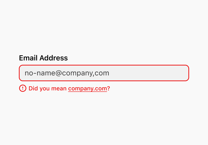
Occasionally it is helpful to provide error feedback to the user while the user is still typing. These type of error messages should not be used for “empty state” errors.
Warnings
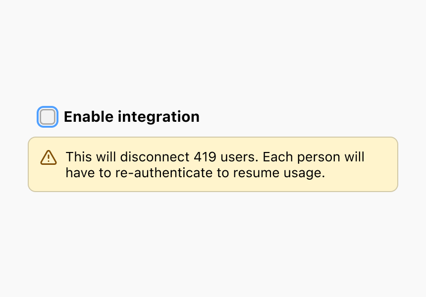
When an input is valid, but has potentially unexpected consequences, inform the user clearly and concisely about the impact(s) of this change.
Placement
Good warning and error messages are placed close to the problem source, however there are instances when this isn’t possible. In these cases, place the message closest to the area it relates to the most.
Lists
Placing a message within or next to a component can help users make better decisions with routine tasks.
Component
Place a message on top of the component when the message relates to multiple areas within the component.
Page
The use of page-level banners should only be reserved for when:
- The message applies to the entire page
- The problem source isn’t visible on the initial page load, but it’s important users see the message
- Multiple problems exist and need to be summarized
- The problem was delayed and you’re informing the user of the issue when they return or reload the page or area
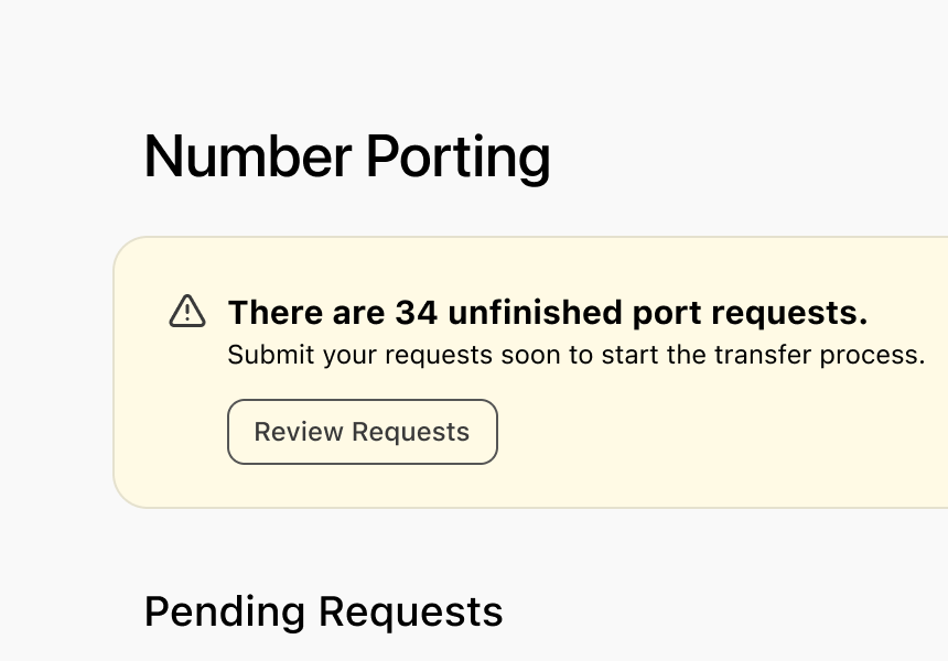
App
Error notifications should be rarely shown on the Launchpad page. Always attempt to display errors to their problem sources. Notifications on the Launchpad page should be:
- A high-priority task that must be completed to continue using Dialpad (e.g., expired billing payment information)
- An active product doesn’t have necessary information to continue working (e.g., broken chatbot knowledge)
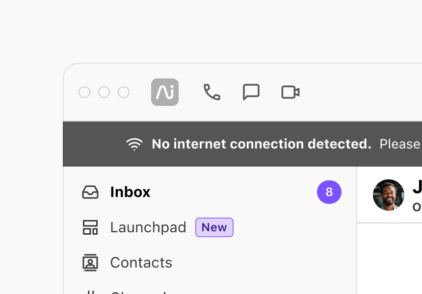
Error Pages
Use an error page when a server error (e.g., 400 or 500-series errors) prevents a page from being displayed or account permissions are preventing a user from accessing a page.
Colors
We use two colors to communicate error message severity.
- Use the color red when needing to communicate critical messages that need to be dealt with immediately to avoid receiving communication, using a feature, or accessing the Dialpad platform.
- Use the color yellow when messages still demand attention, but aren’t blocking access to use Dialpad. This message color is more appropriate for items part of a user’s daily workflow.
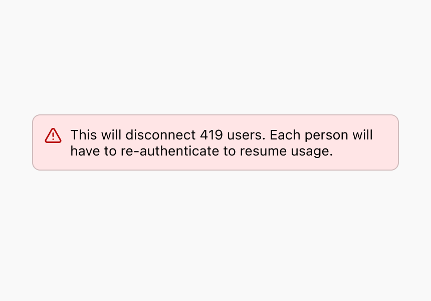
Red (Critical)
Use critical messages to bring attention to tasks that, if not dealt with immediately, will noticeably impact or block access to feature(s) or the Dialpad platform entirely such as when a payment method has expired or an account is past-due.
Do
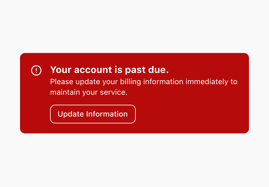
Don’t
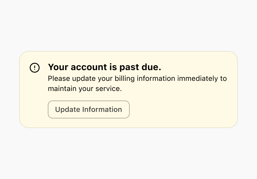
Exceptions to the use of the color red for non-critical messaging are:
- Standard form validation errors since this is the accepted convention for most users
- Destructive actions which impact continued use of a feature or the Dialpad feature (e.g., deleting an office or user)
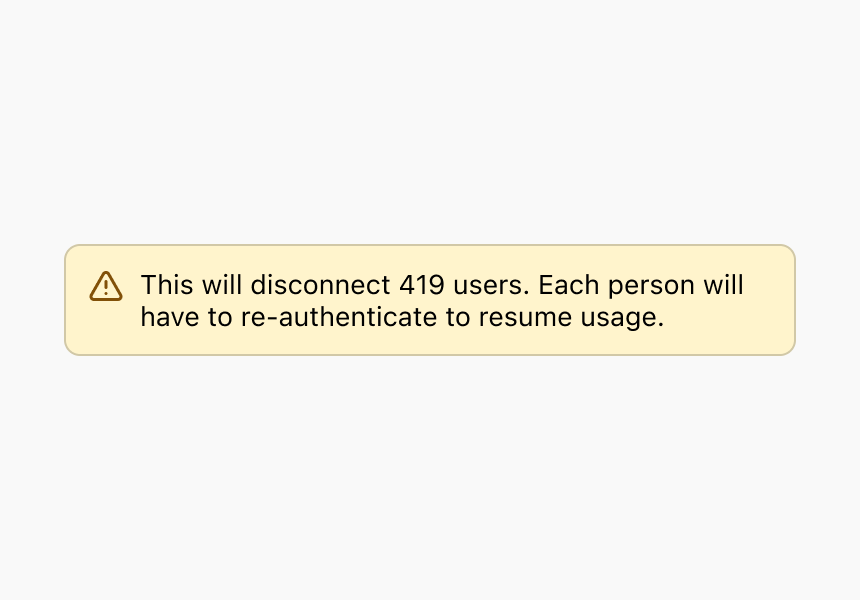
Yellow (Warning)
Use warning messages to help users potentially address non-blocking issues as they complete a workflow or continue to the next step. This can include upcoming expirations or pending requests that if not dealt with in a timely fashion will become critical issues.
Do
Don’t
Anti-Patterns
Using Toasts for Error Messages
Toast messages are short-lived notifications that don’t provide the time or space to accurately explain the problem and how to address the problem. It can be difficult to make toast messages to visually appear close to the problem source and their temporary nature can make them easy to miss by users.
Reserve the use of error toasts for issues not initiated by users such as connection issues. In these instances, the toast time out should be suspended until the issue is resolved. For persistent errors, use a page level banner.
Using Modals for Error Messages
Modals are helpful for focusing a user's attention on completing short workflows or confirming destructive actions—not to tell them an error has occurred. Modals block the user's ability to visibly attach the message to the problem source. They also block access to the rest of the platform.
Using the App for Error Messages
The Dialpad application is where users go to accomplish tasks and communicate with others. Errors should only be shown within the app for high-priority tasks that must be completed immediately to continue using features or the platform.
Validation
Input Fields
Validation messages should only be shown with input fields when there are specific formatting requirements (e.g., email addresses, phone numbers). Where possible, automatically correct issues or suggest corrections for the user such as proactively formatting credit card or phone numbers. Users should be able to undo automatic suggestions though.
Avoid using validation messages when:
- There’s a delay to correctly validate an input as the user might shift their attention to another area and miss the error. Either reduce the validation speed or show the validation after form submission.
- The field is empty. Users may tab through a form before filling it out or shift their focus away from the page. Errors on empty fields can be frustrating or cause confusion.
When writing message copy:
- Use as few words as possible to explain what’s wrong or needed to fix the problem
- Avoid using words such as “invalid” to define an error
- Only need to explain why the error happened. Optionally, the message can clarify next steps or offer one-click fixes.
Perform validation checks once a user finishes typing in the field. Users can be considered to be finished typing only when keyboard focus moves away to another field and at least one character has been added to the field. This helps avoid marking a field as not valid before users have attempted to add information.
All validation messages should appear below the related input field or as close to it as possible.
Once an error has been identified, complete the validation check after each keystroke so we can inform the user as quickly as possible when the issue has been resolved. Once the issue has been corrected, remove the error message.
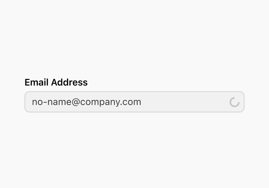
If the validation process takes less than a second but not instant, show a spinner within the field to visually indicate a validation process is in progress.
Forms
When multiple sources are required to properly validate a form, hold off validating until the user clicks the submit button. Most often the button label is “Save”, but it can be another label at times. Be careful to not validate a form submission when there’s no specific data requirements or data being saved. For example, a search returning no results should display an appropriate empty state—not a validation error.
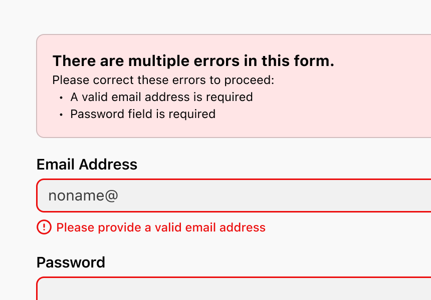
Form submission errors should be displayed as a list at the top of the page. Make the notice heading instructional, providing guidance on how to proceed. When listing each error, start the list item with the field label and describe the action required to correct it. Each input field should follow content guidelines for input field validation.
Don’t point out how many errors occurred, rather explain how to proceed. Be descriptive, but concise. Lead with actionable language.
Always indicate submission progress. If the fields aren’t valid, don’t clear or alter them on the user’s behalf during validation.
If the form submission has a single error, move the scroll position to the field that isn’t valid, focus on the field, and show an error message below the field.
If the form submission has multiple errors, move the scroll position to the top of the page, use a banner to display a summary of the errors, and show an error message below each invalid field so users can quickly scroll through the page and make corrections..
Warnings
Alert users when they might make potential mistakes. When a form input is valid, but you want to warn users of unexpected consequences use a warning message.
Don’t use warnings for error messages.
Ideally prevent warning or error messages from showing at all. Look for opportunities to add helper text or other contextual prompts to surface or highlight potential risks or consequences of taking, or not taking, the action.
Content
Warning messages should appear in close context to the action that triggered it. These messages should be short, explaining the potential risks or consequences for an action that’s about to be taken.
These messages don’t need to start with actionable language. Instead they can start with the word “This” or by noting the action. Then explain the consequence(s).
Do
- This will remove 10 agents.
- Changing your working hours will affect your ability to receive phone calls and notifications.
Don’t
- This will remove some agents from your contact center.
- You won’t receive calls and notifications!
Banners in Cards and Modals
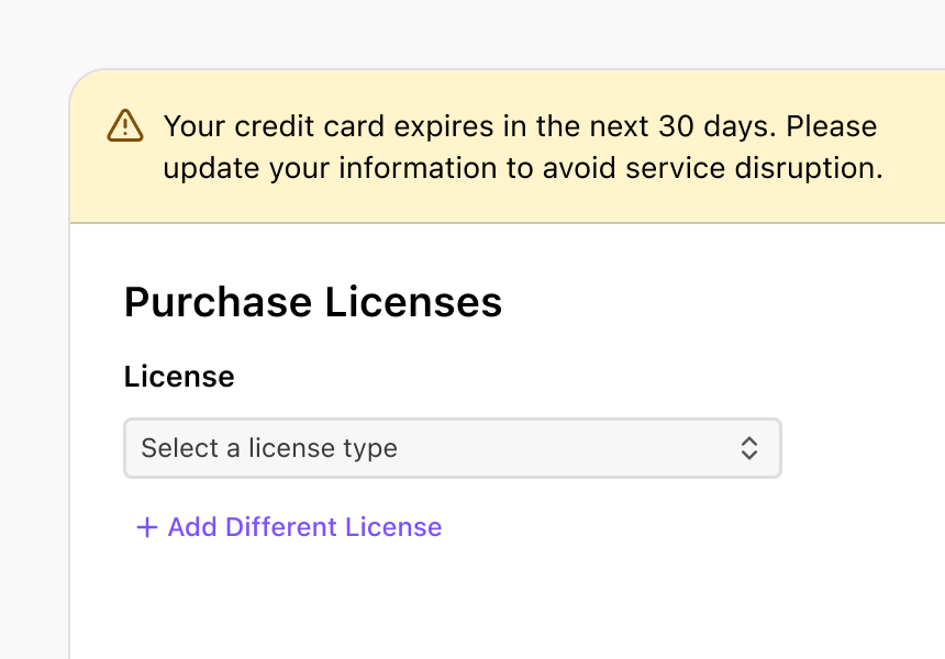
Use banners when users are engaged in a task flow and need to warn them about potential issues with the task at hand, or to inform them something has gone wrong.
You can also use them to direct users to a page with multiple sections and want to visibly call out the section with the issue.
Don’t use banners in a card or modal when:
- The issue applies to the entire screen.
- The error is off-screen and its critical users see the message.
- The error is delayed. For example, an action is taken and the error doesn’t immediately appear in context. In these cases, use the page-level banner.
Content
The more contextual the message, the less you need to say. Explain what happened and how to fix it.
Other considerations:
- Keep messages to a single sentence
- Contextual messages don’t have titles
- Try adding the next step, whether in a button or link
- Use a banner when there is more than one call to action
Lists
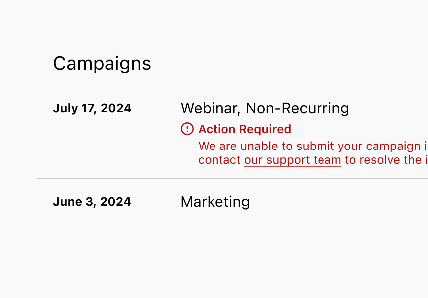
When list items have a noteworthy state that you should make users aware of, like a status, or a piece of information, alert them in the place that’s directly relevant to the information it’s connected to.
Content
Content should highlight an exceptional state that encourages user interaction.
Other considerations:
- Be clear and concise
- Pair content with a warning or error icon
- Always lead with the concern or what went wrong
- A description is required
- A title is optional
- Links are optional, but are not common because the list item is already actionable
App Unavailable Errors
Sometimes Dialpad can’t be displayed due to a network issue, browser limitation, connection problem, or server issue. 400 and 500 series errors fall in this category. In these cases, always explain what went wrong and provide users with a troubleshooting step, such as refreshing the page or verifying their internet connection.
Don’t use these page level errors when the error can be placed in context, next to the problem source. Also don’t use internal language in the error messages and avoid question formats.
Content
- Headings should explain what went wrong
- Body copy should outline next steps or how to troubleshoot the issue
- Call to action should provide the most probable fix, such as reloading the app or going back to the previous page
Errors Without Solutions
When an issue occurs in Dialpad or is caused by a third party, a resolution isn’t always available to offer users. In these cases, always explain what went wrong so they can attempt to troubleshoot. If available, provide users with a troubleshooting step, like refreshing the page or returning later.
Don’t use this approach when we can provide any other potential solution to users.
Error messages documentation last updated Friday, September 4, 2026