Accessibility and inclusive design
Guidance on building products for everyone.
We are committed to usable experiences and products for everyone. Because “everyone” is a lot of people reflecting a variety of backgrounds, abilities, and circumstances, we believe in applying thoughtful and inclusive design and development practices.
Fundamentals
Dialpad strives to maintain WCAG 2.1 AA compliance in our digital products.
Everyone benefits when things are designed accessibly. Simply put: building products for accessibility is simply building products for better usability. Considering 1 in 4 US adults -- that’s 61 million people! -- live with a permanent disability and many more will have temporary or situational throughout their lifetime, accessibility isn’t for just some people. It benefits everyone.
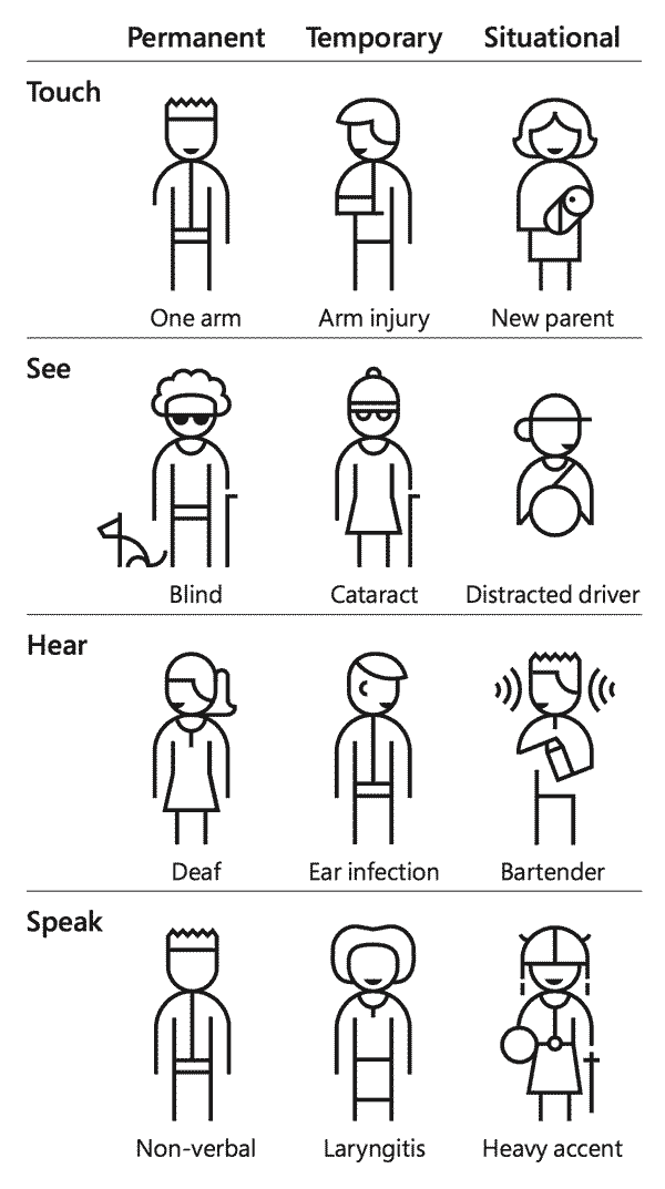
As we consider the entire spectrum of possibilities, the benefits to the people we are designing for goes up dramatically. Accessible design is usable design, for more people in more circumstances.
Principles
Building inclusive product experiences can be boiled down to the P.O.U.R. principles:
- Perceivable.
- Operable.
- Understandable.
- Robust.
Perceivable
The interface and its content are designed and implemented in such a way that it works across a variety of users agents and assistive technologies.
- The handling of media content like video, audio and imagery.
- The handling of text alternatives through things like captioning and sign language.
- The handling of color and contrast.
- The control of text size and audio controls.
- The handling content interactions i.e. hover and focus states.
Operable
Users are able to interact with and navigate the interface and its content.
- Keyboard operability.
- Time allowance.
- Seizures and other involuntary physical reactions.
- Navigation through things like focus order, page titles, links, headings and labels.
- Input methods like touch targets sizing, alternative input methods.
Understandable
The interface and its content use plain language that’s easy to comprehend. Even if users can perceive and navigate content, what if they can’t actually understand the information?
- Predictable and consistent navigation.
- Use of language such as abbreviations, jargon, reading levels.
- Predictable and consistent actionable components.
- Feedback and error handling.
- Help, such as contextual help and error prevention.
Robust
The interface and its content is designed and implemented in such a way that it works across a variety of users agents and assistive technologies.
- Parsing and generally ‘clean’ code like proper heading hierarchy, no duplicate attributes, complete start and end tags for elements.
- Name, role and value.
- Status messages, sending messaging to the user without interrupting their workflow by giving focus to an element. e.g. “added to cart” while shopping online should act as a message and not a redirection of activity and focus for the user.
Types of Assistive Technology
“Assistive technology” is a generic term that describes tools used by people with disabilities to accomplish tasks. Here are some examples:
- Screen readers: Software used by blind or visually impaired people to read the content of the computer screen. Examples include JAWS for Windows, NVDA, or Voiceover for Mac.
- Screen magnification software: Allows users to control the size of text and/or graphics on the screen. Unlike using a zoom feature, these applications allow the user to have the ability to see the enlarged text in relation to the rest of the screen. This is done by emulating a handheld magnifier over the screen.
- Text readers: Software used by people with various forms of learning disabilities that affect their ability to read text. This software will read text with a synthesized voice and may have a highlighter to emphasize the word being spoken. These applications do not read things such as menus or types of elements - they only read the text.
- Speech input software: Provides people with difficulty in typing an alternate way to type text and also control the computer. Users can give the system some limited commands to perform mouse actions. Users can tell the system to click a link or a button or use a menu item. Examples would be Dragon Naturally Speaking for Windows or Mac. Please note both Windows and Mac have some speech recognition utilities, but they cannot be used to browse the web.
- Alternative input devices: Some users may not be able to use a mouse or keyboard to work on a computer. These people can use various forms of devices, such as:
- Head pointers: A stick or object mounted directly on the user’s head that can be used to push keys on the keyboard. This device is used by individuals who have no use of their hands.
- Motion tracking or eye tracking: This can include devices that watch a target or even the eyes of the user to interpret where the user wants to place the mouse pointer and moves it for the user.
- Single switch entry devices: These kinds of devices can be used with other alternative input devices or by themselves. These are typically used with on-screen keyboards. The on-screen keyboard has a cursor move across the keys, and when the key the user wants is in focus, the user will click the switch. This can also work on a webpage: the cursor can move through the webpage, and if the user wants to click on a link or button when that link or button is in focus, the user can activate the switch.
Additional Resources
- Apple - Voiceover/keyboard shortcuts for OS X
- Deque - Accessibility Testing Tools
- Deque University - Web Accessibility Training and Courses
- MDN - Developer Guides
- Microsoft - Narrator keyboard commands for Windows
- Pa11y
- Web Content Accessibility Guidelines (WCAG) 2.1
- WebAim - Constructing a POUR Website
- CDC - Disability Impacts All of Us Infographic
- Berkeley - Types of assistive technology
- UXcellence - Designing for Accessibility: An Introduction
Accessibility Principles by Role
How your role can address accessibility and inclusive design.
Product Management
Product managers can set the tone early in a project's lifecycle, ensuring the team knows their responsibilities and accountability to building accessible products.
- Be aware of each role's high-level accessibility principles.
- Ensure each role on your team is aware of these principles and keep them in mind from the start: Content, Design, and Engineering.
- Build accessibility into project workflows every step of the way, rather than as a retrofit exercise.
- Learn Accessibility basics to understand what makes your team empowered to deliver accessible products and services.
- Understand the diversity of users to better consider how anyone can get the most out of your product.
- Consult an accessibility subject matter expert to review.
Content
Writing accessibly ensures your content is easier for everyone to read.
- Plain Language. Can you quickly understand the main points of the content?
- Scannability. Can you scan the page without significantly pausing through long passages?
- Images. Do your images have descriptive alt text?
- Links. Do link sufficiently describe its destination?
- Information Architecture. Are the application’s parts organized such that any can navigate easily?
Design
Accessibility is usability for everyone, regardless of ability, situation, or circumstance. Treat accessibility as a core principle of Product Design.
- Adopt a mentality of Inclusive Design.
- Is there sufficient contrast between foreground and background content?
- Is textual information easy to read and parse?
- Are navigation shortcuts available for keyboard and screen readers to reach key regions?
- Familiarize yourself with assistive technologies. These include screen readers, screen magnification, ergonomic keyboards, or even zoom capabilities in browsers.
- Do your designs imply a logical tab order for those using a keyboard to navigate throughout.
- Are all interactive elements reachable through the tab key, and reflect a perceivable focus indicator?
- Do your designs reflect a perceivable focus indicator for interactive parts?
- When a view changes significantly, is it clear to the user where focus has moved to (independent of a perceived focus order)?
- Can any user understand and fill out forms? Are they as simple as possible and require only what’s needed for task completion?
- Is imagery easily distinguished as meaningful content or decorative?
- Is content understandable for content associated with images and icons?
- Are data visualizations easy to grasp?
- Are touch targets large enough and easy to reach?
- Can a screen reader access all functionality and content?
Engineering
Pretty much everything above plus…
- Do heading elements (e.g.
<h1>through<h6>) accurately reflect a logical hierarchy of content and features? - Are semantic HTML elements being used appropriately, and extended where appropriate with ARIA attributes and roles?
- Does your automated accessibility testing tools provide accurate results?
Best Practices
Color Contrast Ratio
Dialpad strives to maintain WCAG 2.1 AA compliance in our digital products, including color contrast. WCAG guidelines require a minimum of 4:51 ratio for all content in regular-weight fonts.
For easy reference, our color references are displayed alongside a contrast rating. Note that these are calculated using either a white or black background, and contrast between type and background should always be verified when using different background colors.
To check color contrast combination, try one of these tools:
- Colorable
- WebAim
- Figma plugin: Stark
Semantics
One of the simplest things we can do to make more accessible sites is to build with semantic HTML. Creating semantic HTML, or “semantic markup” is the practice of using the appropriate HTML element to convey information about the meaning and context of each element. For example, for a paragraph or bulleted list, you would use p or ul tags, respectively. In places where there is no HTML element which has a matching semantic meaning for what you are creating, you will want to employ the use of an inline span, or division element div.
Semantic markup also maintains the separation between the semantics and the visual presentation. For example, it’s common to choose which heading element to use based on its style, but that would be incorrect. The proper way would be choosing the semantic heading level and then applying CSS to style it, thus not using your mark-up as a means to style.
Inversely, there may be times when you want a button, select, etc. element, but also want it to have just slightly different behavior or non-native styling. In these cases, we generally choose to use a div or less semantic implementation. Be so careful when you decide to do this. We forget how much native functionality is built in a button, link, select, etc. and re-creating that exact implementation so a screen reader user or keyboard-only user can still interact with the element appropriately can be complex and time consuming.
As an example, to recreate a button with a div, you would need to add in multiple ARIA attributes, manage focus, and then also add additional JavaScript to allow you to click it, or use the spacebar and enter key to activate it. You can learn more by watching “Just Use a Button,” as explained by Rob Dodson from the Google Chrome Team.
Structural Semantics and Landmarks
The following HTML elements should be used to identify common elements of our products.
<header>
<nav>
<main>
<article>, <aside>
<form>
<footer>
Headings
There are two easy rules that only apply to heading elements that we should adhere to for the best accessibility practices:
The first: use one h1 per page. The h1 is typically the page title and use of more than one h1 can confuse browsers and assistive technology.
The second: when employing multiple heading levels, do not skip heading levels in a section. For example, if you’re writing an article, you could do:
<h1>
<h2>
<h3>
<h2>
<h3>
<h4>
But you should never do:
<h1>
<h2>
<h4> // This is problematic since you skipped the <h3> in the same section
<h2>
<h3>
<h4>
Headings taken out of context, such as accumulated together in a list for a screen reader, should logically represent the page content for users who choose this option as a way to browse.
Lists
Do not underestimate the power of list elements. When there are more than two or three similar items next to one another on the page, consider putting them in either an order list ol or unordered list ul for screen readers.
By using a list element, a screen reader user knows how many items they can expect to go through, and where they are in the list. A screen reader will announce, “1 of 3 list items,” which is helpful context that allows a user to orient themselves and have a better expectation of what will come next.
Tab Order
Like the name suggests, tab order is the order in which elements receive focus when a user is navigating with a keyboard. The tab order should match the visual order, so users are able to logically navigate through content. This is important. The default keyboard navigation order must be logical and intuitive, which generally means that it follows the page’s visual flow: left to right, top to bottom -- header first, then main navigation, then page navigation (if applicable), and finally the footer.
Ideally, the visual tab flow will match the flow of the code. There are cases when something must be coded in an illogical order. In these cases, we can use tabindex to override the default order. By applying a tabindex value to each element in the flow, we can control the element order.
For example:
<a href=”#” tabindex=”2”>First Element</a>
<a href=”#” tabindex=”1”>Second Element</a>
Because “Second Element” has a lower tabindex, keyboard users will focus it before “First Element.”
Though it sounds convenient, tabindex should be used only in cases where there is no other option.
By default, users can only navigate to links, buttons, and form controls with a keyboard. These natively-accessible elements should be used whenever possible, although there are times when HTML falls short and custom “widgets” are necessary. Complex menus, sliders, dialogs, tab panels, etc. must all be built to support keyboard accessibility.
Tabindex=”0” can be used to add non-interactive elements into the tab flow. This is useful when coding custom elements that are not natively focused.
Visible Focus
It is often difficult for keyboard users to tell where they are on the page. We must take care to ensure that it is easy to tell which item on the page currently has keyboard focus. All browsers by default display a visible outline around the element that currently has focus. Some browsers (i.e. Chrome and Safari) show an easy-to-see blue outline as their visible focus. However, other browsers show a thin, dotted line, which can be very difficult to see.
Dialtone provides visible focus on all components. However, we cannot anticipate the various contexts in which each component will be inserted. Be sure to remember that focus indication can occur on different colored backgrounds and a minimum contrast ratio of 3:1 is required.
Skip Navigation Links
A site or product’s main content is not usually the first thing on the page. Keyboard users generally must navigate a long list of navigation links, dropdowns, logos, search inputs, and other elements before ever arriving at the main content. This is particularly difficult for users with some forms of motor disabilities. Without some sort of system, for bypassing the long list of links at the top, some users are at a huge disadvantage. Consider users with no arm movement, who use computers by tapping their heads on a switch or that use a stick in their mouth to press keyboard keys. Requiring users to perform any action perhaps 100s of times before reaching the main content is simply unacceptable.
The “skip navigation” idea was invented to give keyboard users the same capability as sighted mouse users to go directly to the main content. The idea is simple: provide a link at the top of the page which jumps the users down to an anchor or target at the beginning of the main content.
Often developers hide the skip navigation link so it is available for screen reader users only. Ensure that the link is visible, or becomes visible when the keyboard user tabs to it.
Form Best Practices
Forms can be difficult, high-friction points for sighted and able users, which means if not done correctly, they can be simply unusable for users reliant on keyboard navigation or assistive technology. Users should be able to fill in forms, press buttons, use range sliders, select options, and operate controls with ease. Forms that use JavaScript to manipulate form data, set focus, change form elements, or submit forms can often create interactions that only work with a mouse. Ensure your forms can be understood and operated with the keyboard alone.
Labeling is also important. Input labels describe the function of a form control (i.e. checkbox, radio button, etc.) and generally appear adjacent to it. While sighted users make the connection visually, users reliant on a screen reader or other assistive technology may not. The label element programmatically associates a text label to its form control, creating a connection that doesn’t rely on vision.
Groups of form controls, such as checkboxes and radio buttons, sometimes require a higher-level label. This information can be associated with the group of form controls using fieldset and legend. The fieldset defines the group and the legend contains the description. Screen readers announce the legend when users navigate into the group.
List-based inputs, such as select, comboboxes, or custom dropdown menus can be tricky for keyboard navigation. Users should be able to navigate through the options using their arrows, not their tab key.
Focus vs Focus-visible
User agents can choose their own heuristics for when to match :focus-visible; however, the following (non-normative) suggestions can be used as a starting point:
- If a user has expressed a preference (such as via a system preference or a browser setting) to always see a visible focus indicator, the user agent should honor this by having
:focus-visiblealways match on the active element, regardless of any other factors. (Another option may be for the user agent to show its own focus indicator regardless of author styles.) - Any element which supports keyboard input (such as an input element, or any other element which may trigger a virtual keyboard to be shown on focus if a physical keyboard is not present) should always match
:focus-visiblewhen focused. - If the user interacts with the page via the keyboard, the currently focused element should match
:focus-visible(i.e. keyboard usage may change whether this pseudo-class matches even if it doesn’t affect:focus). - If the user interacts with the page via a pointing device, such that the focus is moved to a new element which does not support user input, the newly focused element should not match
:focus-visible. - If the active element matches
:focus-visible, and a script causes focus to move elsewhere, the newly focused element should match:focus-visible. - Conversely, if the active element does not match
:focus-visible, and a script causes focus to move elsewhere, the newly focused element should not match:focus-visible.
User agents should also use :focus-visible to specify the default focus style, so that authors using :focus-visible will not also need to disable the default :focus style.
In general, a rule of thumb is that: if an element is going to need the keyboard (ex. inputs) that element should use focus, otherwise, it should use focus-visible. Here is a list of elements that use focus vs focus-visible:
Focus
- Input
- Select menu
Focus Visible
- Button
- Link
- Checkbox
- Radio
- Dropdown menu
- List item
- Tab
References
- The Focus-Indicated Pseudo-class: :focus-visible.
- Understanding Success Criterion 2.4.7: Focus Visible.
Tooling
Browser Extension
Chrome and Firefox
WebAim - WAVE Browser Extensions
Checklists
Android Accessibility Checklist
iOS Accessibility Checklist
Web Accessibility Checklist
Figma Plugins
Adee Comprehensive Accessibility Tool
Stark
Screen Readers
To learn more about the various combinations of operating systems and screen reader software, read WebAim’s 2021 Screen Reader User Survey.
VoiceOver for Apple Computers
Narrator Shortcuts for Windows
NVDA for Windows
This is free software that can be installed on any Windows machine.
JAWS for Windows
This software is not free and costs from $95/year for home use.
VoiceOver on iOS
Talkback for Android
Accessibility and inclusive design documentation last updated Friday, September 4, 2026