Icon Usage
Guidance on using icons in Figma and Vue, with best practices for icon selection and sizing.
In Figma
Find a list of available icons in DT Core: Icons, or search the icons in the search library within your Figma file.
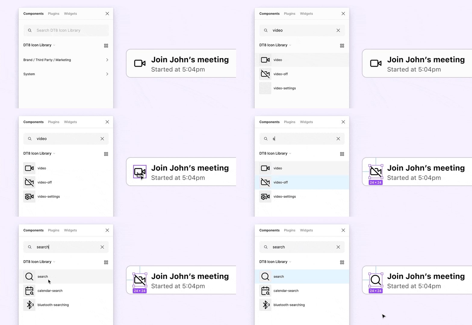
Swap instances in Figma by holding ⌘ + ⌥ on Mac, or Ctrl + Alt on Windows.
In Vue
For detailed instructions on using the icons, check the DtIcon component.
Vue 2
import { DtIconCreditCard } from '@dialpad/dialtone-icons/vue2';
<dt-icon-credit-card size="500" aria-label="Description" />
Vue 3
import { DtIconCreditCard } from '@dialpad/dialtone-icons/vue';
<dt-icon-credit-card size="500" aria-label="Description" />
Choosing the Right Icon
Some icons are linked to specific actions, like the Settings gear or the Edit pencil . For actions without a dedicated icon, avoid reusing icons that are already associated with other actions, this helps prevent confusion and ensures clear understanding. Instead, select an existing icon from the Icon Catalog without a specific action meaning or consider creating a new one that clearly represents the intended action.
Sizing
The icon size is defined based on the context and text size next to it. These are the only available size options and no overrides should be needed to properly size the icons.
Icon Usage documentation last updated Friday, September 4, 2026