Usage
In Figma
Find a list of available icons in DT Core: Icons, or search the icons in the search library within your Figma file.
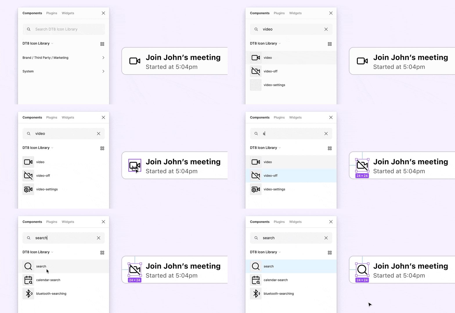 Swap instances in Figma by holding ⌘ + ⌥ on Mac, or Ctrl + Alt on Windows.
In Vue
For detailed instructions on using the icons, check the Icon component.
import { DtIconCreditCard } from '@dialpad/dialtone-icons/vue';
<dt-icon-credit-card size="500" aria-label="Description" />
Choosing the Right Icon
Some icons are linked to specific actions, like the Settings gear or the Edit pencil . For actions without a dedicated icon, avoid reusing icons that are already associated with other actions, this helps prevent confusion and ensures clear understanding. Instead, select an existing icon from the Icon Catalog without a specific action meaning or consider creating a new one that clearly represents the intended action.
Sizing
The icon size is defined based on the context and text size next to it. These are the only available size options and no overrides should be needed to properly size the icons.
Sample Pairings
Crafting an Icon
Our icons are designed for easy recognition and understanding. They are a visual support, helping people navigate the experience more effectively.
On Figma
Go to the Icon Builder page in Figma and follow the instructions. Remember to work on a branch and send a review when the icons are ready.
- Use simple lines and shapes. Avoid creating overly literal, complex icons.
- Utilize the icon grid while maintaining the style of each icon.
- The icon's content should remain within the 2px padding (on size 500/24px); no part of the icon should extend beyond this area.
- Both exterior and interior corners should be 2px (on size 500/24px).
- The stroke style should be
solid, end pointsround, and joinround.
Exporting
- Create a new branch in dialtone repo starting with "dlt-xxxx-" in the name.
- Export the SVG from the 12px (size 100) Figma component. For standard icons (all categories except
brand-full-color), prepare the SVG before placing it:- Run Edit > Outline Stroke in Figma to ensure the icon is fill-based (no strokes).
- Normalize fill colors to
fill="black". Figma often exportsfill="#1C1C1C"or other near-black hex values that the build pipeline won't convert tocurrentColor. - Remove no-op
<clipPath>wrappers — Figma adds these when "Clip content" is enabled, but they are unnecessary when the clip rect matches the viewBox. - Consider combining multiple
<path>elements into a single<path>where they share all attributes (fill, fill-rule, opacity, etc.). Do not combine paths that differ in any attribute beyondd. - Icons in
brand-full-colormay use solid brand hex colors, gradients, and other attributes — preserve these as-is.
- Place the exported SVG file(s) in the appropriate folder category inside
./src/svg/, file names should be in kebab-case. - Run
nx run dialtone-icons:build - Add keywords related to the icon(s) in the
packages/dialtone-icons/src/keywords-icons.jsonfile. - Commit and push your branch to dialtone, and open a pull request.
Icons documentation last updated Friday, September 4, 2026